
With version 16, Odoo continued its migration to its Component Oriented frontend framework OWL (version 2). Thanks to a solid legacy Framework adapter you could still write your fields widget the old way, but now is a good time to migrate your code. Now even the field widgets are written in OWL and this is what we will discuss here.
Let's go step by step and create a basic field widget.
A field Widget is now a pure OWL Component
We will make the most basic widget. A presentation widget with no interaction for now.
This widget will simply display the content of a field (preferably Text) inside a <pre> tag, to make it look like it's a Code block:
The JavaScript Field Component
This widget can be written with a very small amount of JavaScript, let's create a file called "static/src/js/code_field.js" with this:
/** @odoo-module **/
const {xml, Component} = owl;
import { standardFieldProps } from "@web/views/fields/standard_field_props";

export class CodeField extends Component {
    setup() {
        // This setup is useless here because we don't do anything
        // But this is where you will use Hooks
        super.setup();
    }
}

CodeField.template = xml`<pre t-esc="props.value" class="bg-primary text-white p-3 rounded"/>`;
CodeField.props = standardFieldProps;
This looks like a standard OWL Component, except that it has standardFieldProps as props. We will look more into it later in that course.
Add the field to the "fields" registry
What is shown above is just a Component, now we need to add that Component to the "fields" registry. For that we have to import the registry and add our field to it:
/** @odoo-module **/
const {xml, Component} = owl;
import { standardFieldProps } from "@web/views/fields/standard_field_props";
// Import the registry
import {registry} from "@web/core/registry";


export class CodeField extends Component {
    setup() {
        super.setup();
    }
}

CodeField.template = xml`<pre t-esc="props.value" class="bg-primary text-white p-3 rounded"/>`;
CodeField.props = standardFieldProps;

// Add the field to the correct category
registry.category("fields").add("code", CodeField);
The name you choose here "code" is very important because this is what you will use on the field : <field ... widget="code"> .
Adding the JS to the manifest.
Now in our __manifest__.py we add that JavaScript file:
{
    # ...
    "depends": ["base", "web"],
    "data": [],
    "qweb": [],
    "assets": {
        "web.assets_backend": [
            "/my_module/static/src/js/code_field.js",
        ]
    },
	# ...
}
And this is enough! You can use it directly on your field inside a view like so:
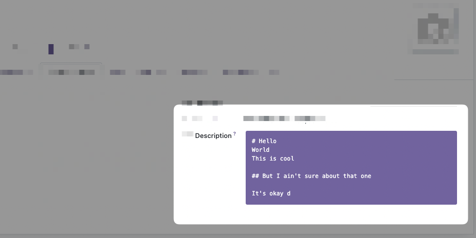
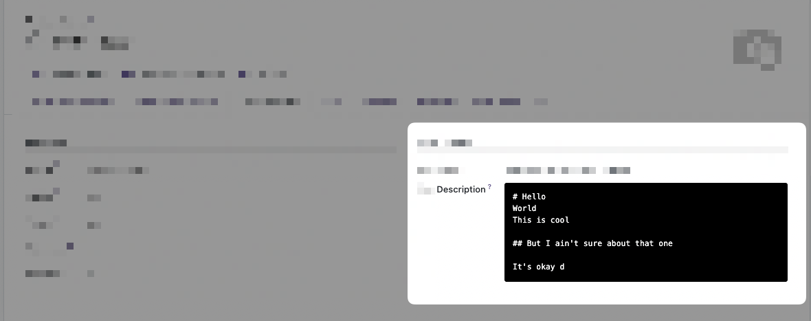
<field name="description" widget="code" />How did we get the value?
You may have noticed on the inlined template that we use props.value:
<pre t-esc="props.value" class="bg-primary text-white p-3 rounded"/>With t-esc we display props.value which is the content of the Field, in the database/from python, for that record, that we are visualizing.
That means that the parent Component of our Field widget gave us data, or props, at one point inside the Component Tree. The parent in question differs from contexts, but is usually the View Component, think FormView, TreeView, etc.
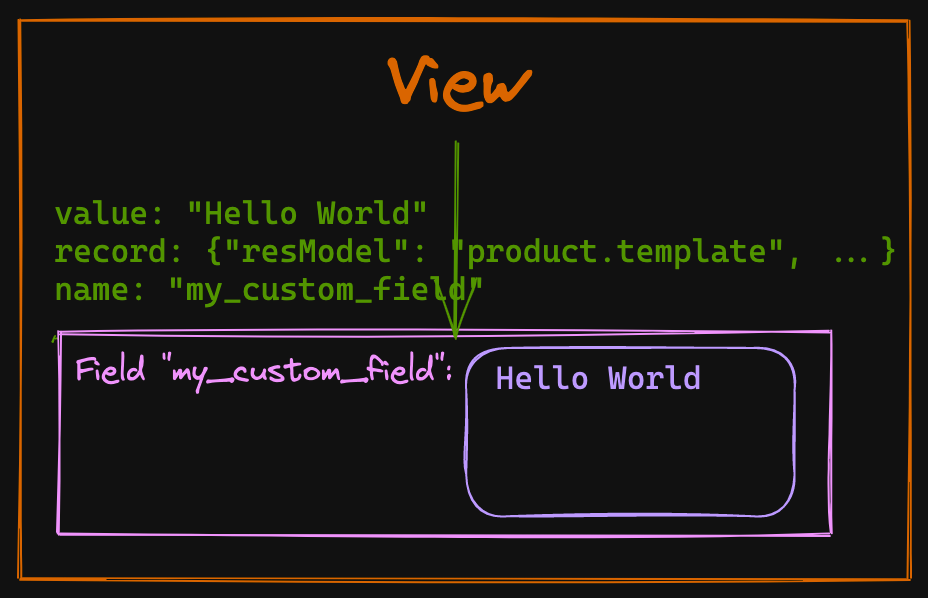
Our widget will then use these props and do whatever is needed to render the data adequately, allow editing of that value, save that value, etc. So what are these props we are dealing with?
A field widget gets the standardFieldProps "props".
Value is not the only prop given to your custom Field widget by default, there is an interface of props that are always passed to any field widget, they are called standardFieldProps.
These standards props can be seen in the file odoo/addons/web/static/src/views/fields/standard_field_props.js
export const standardFieldProps = {
    id: { type: String, optional: true },
    name: { type: String, optional: true },
    readonly: { type: Boolean, optional: true },
    record: { type: Object, optional: true },
    type: { type: String, optional: true },
    update: { type: Function, optional: true },
    value: true,
    decorations: { type: Object, optional: true },
    setDirty: { type: Function, optional: true },
};
Understanding all these props and what they do will make it easier for you to create new awesome fields, so let's list them.
id, name
The props id, and name will often be the same and corresponds to the name of the Field on your Odoo model.
readonly
This very useful prop is a boolean coming in true or false with the result of all the combinations of ACL (access control layer, or security), actual readonly attribute, or other server-side computation that makes a field read-only or editable. This prop will be used almost every time you create a new interactive widget because it will help you switch between edit and read-only mode.
Odoo 16 comes with an "always on" edit mode, but this prop should still be used to conditionally render different templates. A basic example of a template using these props:
<?xml version="1.0" encoding="UTF-8"?>
<templates id="template" xml:space="preserve">

    <t t-name="my_module.CodeField" owl="1">
        <t t-if="props.readonly">
            <pre t-esc="props.value" class="bg-primary text-white p-3 rounded"/>
        </t>
        <t t-else="">
            <textarea class="o_codeview" t-att-value="props.value"/>
        </t>
    </t>
</templates>
Note: If you have a hard time testing the readonly mode of your Component, remember that you could just add readonly="1" on the <field> in your Form/Tree View.
record
The props.record is a Record object defined in odoo/addons/web/static/src/views/basic_relational_model.js it contains a lot of info related to the current record displayed in the view. The notable properties of that object are:
datacontains all the actual data of the given record.modeof the record view, "edit" or "read-only".fieldsa key, value store of all the other fields.activeFieldsthe fields used in the view.resModelfor example "product.template".modelthe actual JavaScript classRelationalModelwith all its methods.contextcontains the Odoo usual "context" object with the user id, timezone, etc.
type
The type of field derived from the Field definition in python, "text", "binary", etc.
value
Self-explanatory, the value of that field coming from the server, and corresponding to that current record. Probably the most important of the props, given that a widget should display the value!
decorations
This prop contains a {key: value} store of "decoration" and their respective boolean evaluated value. Let's take our CodeField example, which is put on the product.template Form view, we can add these attributes to our widget:
<field
    name="description"
    widget="code"
    decoration-warning="type=='product'"
    decoration-success="type=='service'"
/>
If our product.template is of type product and we check the content of this.props.decorations this is what we will get:
// inside a method of our class CodeField
// myMethod() {
//   console.log(this.props.decorations)
// }

// output
{
    "warning": true,
    "success": false,
}
You can use these props.decorations in your templates and conditionally add CSS classes to your Component and have different styles.
This is a great way to give customization possibilities from the XML View declaration to the user of your widget.
setDirty
This optional prop is a function accessible from your Field Component (or your Widget, as you prefer to call it) that takes a boolean as a parameter. Its job is to signal that the value of a field has been touched or has changed. It is not always used in every View (meaning that it can be undefined), and if you create your own view you will have to implement it yourself if you need to.
But when it is present, it becomes an important function that will help the parent View know that it should save the value contained in that field for that record!
// Inside your Widget Component, in a method that should update the value

async updateValue() {
    const value = this.getMyDerivedValue();
    const lastValue = (this.props.value || "").toString();
    if (value !== null && !(!lastValue && value === "") && value !== lastValue) {
        if (this.props.setDirty) {
            this.props.setDirty(true);
        }
        // continue updating
    }
}
update
This function is the most important one if your Widget should edit values.
Remember that the actual value of your field is a prop and as we know, props should never be modified directly, they are given by the parent Component in the tree and are used as is.
The Fields usually don't hold their own state so the way to notify that the value change, is to use the asynchronous props.update function that is given to our Field, for example
// Example async function that lives inside your Component
async updateValue() {
    const value = this.currentValue;
    const lastValue = (this.props.value || "").toString();
    if (value !== null && !(!lastValue && value === "") && value !== lastValue) {
        // calling the update function with await
        await this.props.update(value);
    }
}
This function will do the heavy lifting of really updating the data, then the value will come back inside props on the next willUpdateProps.
Soon we will see a complete example of where we will use this props.update function.
Field custom props and attributes parsing.
On top of the Field standard props, you can add your custom props like any other OWL Components.
Let's say we want to give the possibility to change the background color of our CodeField widget, for that we will change the props of our Component to add a backgroundColor prop:
export class CodeField extends Component {}

// Update the template to have t-attf-class compute color
CodeField.template = xml`<pre t-esc="props.value" t-attf-class="bg-#{props.backgroundColor} text-white p-3 rounded"/>`;

// defaultProps in case the user doesn't set a backgroundColor prop
CodeField.defaultProps = {
    backgroundColor: "primary",
};
// We spread standardFieldProps and add our own props
CodeField.props = {
    ...standardFieldProps,
    backgroundColor: {type: String, optional: true},
};
registry.category("fields").add("code", CodeField);
Extracting props from attributes
At that point, our widget works precisely the same way as before, but we would like the user to be able to give background_color attribute to the field like that:
<field
	name="description"
    widget="code"
    background_color="black"
/>
How to get background_color ? For that Odoo gives us the extractProps static function that you define on the Component:
export class CodeField extends Component {}
CodeField.template = xml`<pre t-esc="props.value" t-attf-class="bg-#{props.backgroundColor} text-white p-3 rounded"/>`;
CodeField.defaultProps = {
    backgroundColor: "primary",
};
CodeField.props = {
    ...standardFieldProps,
    backgroundColor: {type: String, optional: true},
};
// Extract backgroundColor from the attributes
CodeField.extractProps = ({attrs, field}) => {
    return {
        // We are looking for attr "background_color", snake case
        backgroundColor: attrs.background_color,
    };
};
registry.category("fields").add("code", CodeField);
With that done the user of our Field can now customize the backgroundColor:
Okay, that's it for the basic overview of the Field widget, let's now create a more realistic example. With edit mode this time!
A full example, widget Markdown Editor Field
- Lifecycle hooks `onWillUpdateProps`, `onMounted`, `onWillStart`
- Bus event for emergency save with `useBus`
- Async external libs loading.
- Committing changes.
- Extracting props from XML attrs.
In this example, we will migrate the Markdown Field widget we made in another series. If you want the starting code in Odoo 15 this is the repository: https://github.com/Coding-Dodo/web_widget_markdown/tree/15.0
And the series about creating that widget:
Introduction and goals
Let's take a look at the final result.
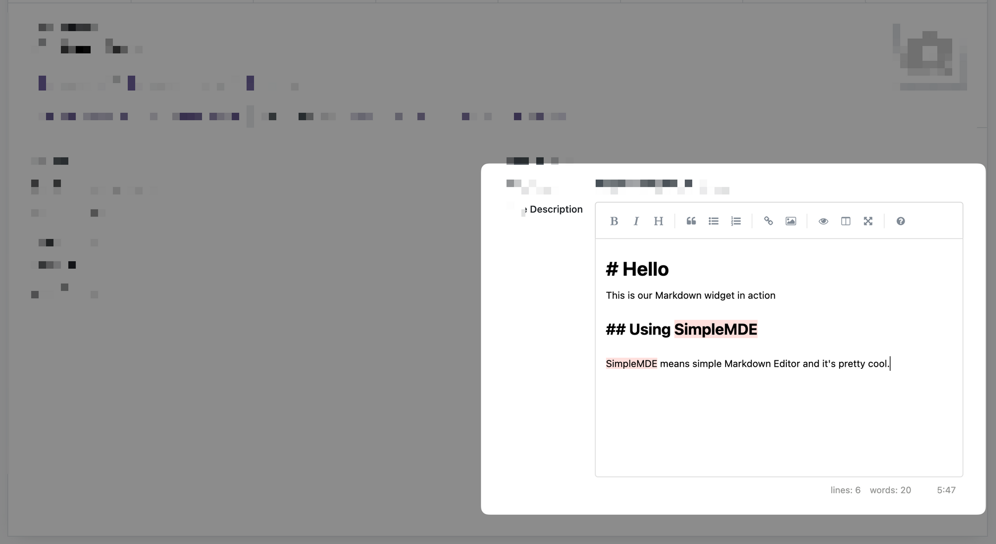
We will not go over the explanation of the library used "SimpleMDE" (Simple Markdown Editor) again, please check the articles linked just before. But to give a quick overview of the objectives:
- This widget has 2 modes, in read-only, it will show the HTML version of the markdown. In Edit mode it will show the markdown editor.
- The SimpleMDE is an Editor which will be embedded inside the Odoo Form view which itself is also an Editor!
- Changes of value inside the markdown Editor should be pushed to the actual OWL Component on "blur" (out of focus) and different events.
- Should play correctly with the auto-save feature of Odoo 16 and prevent loss of data.
Creating the MarkdownField template
]]>
Odoo 15 is out, and big internal rework has been done to the WebClient. You can still write Views in the old MVC Architecture but now you also can write pure OWL Component Views.
The architecture is a bit different from the old MVC but with some helpers, and the good rewrite of the WebClient, it is actually not that hard, as you will see in this follow-along tutorial.
As an example, we will completely migrate the module we created in our JavaScript 101 Series, Creating an OWL View that was a Hierarchical Tree View, let's go!
Introduction
This article is meant to be followed along, so please consider pulling the Odoo 14 version of our Module and coding along with each change. To pull directly the main branch:
git clone https://github.com/Coding-Dodo/owl_tutorial_views.gitThen cd into the folder and create a new branch that will be your basis of work:
cd owl_tutorial_views
git checkout -b 15.0-mig-owl_tutorial_views
Finally, try to run the module again often so you can see from your own eyes what breaks and how we fix it.
Updating our assets bundling to the manifest
The first action is to use the new assets key in the __manifest__ file. Let's take everything that was inside our assets.xml (and remove the call to that file) and put it inside the manifest file inside the web.assets_backend bundle.
--- a/__manifest__.py
+++ b/__manifest__.py
@@ -4,14 +4,24 @@
     "author": "Coding Dodo",
     "website": "https://codingdodo.com",
     "category": "Tools",
-    "version": "14.0.1",
+    "version": "15.0.1",
     "depends": ["base", "web", "mail", "product"],
     "qweb": [
         "static/src/components/tree_item/TreeItem.xml",
         "static/src/xml/owl_tree_view.xml",
     ],
     "data": [
-        "views/assets.xml",
         "views/product_views.xml",
     ],
+    "assets": {
+        "web.assets_backend": [
+            "/owl_tutorial_views/static/src/components/tree_item/tree_item.scss",
+            "/owl_tutorial_views/static/src/owl_tree_view/owl_tree_view.scss",
+            "/owl_tutorial_views/static/src/components/tree_item/TreeItem.js",
+            "/owl_tutorial_views/static/src/owl_tree_view/owl_tree_view.js",
+            "/owl_tutorial_views/static/src/owl_tree_view/owl_tree_model.js",
+            "/owl_tutorial_views/static/src/owl_tree_view/owl_tree_controller.js",
+            "/owl_tutorial_views/static/src/owl_tree_view/owl_tree_renderer.js",
+        ],
+    },
 }
Now for the Qweb XML files
The qweb key in the manifest should also be emptied, instead, the QWeb templates will go inside the web.assets_qweb bundle:
--- a/__manifest__.py
+++ b/__manifest__.py
@@ -6,14 +6,14 @@
     "category": "Tools",
     "version": "15.0.1",
     "depends": ["base", "web", "mail", "product"],
-    "qweb": [
-        "static/src/components/tree_item/TreeItem.xml",
-        "static/src/xml/owl_tree_view.xml",
-    ],
     "data": [
         "views/product_views.xml",
     ],
     "assets": {
+        "web.assets_qweb": [
+            "/owl_tutorial_views/static/src/components/tree_item/TreeItem.xml",
+            "/owl_tutorial_views/static/src/xml/owl_tree_view.xml",
+        ],
         "web.assets_backend": [
             "/owl_tutorial_views/static/src/components/tree_item/tree_item.scss",
             "/owl_tutorial_views/static/src/owl_tree_view/owl_tree_view.scss",
We would be tempted to try and run the module right now but we would get an error:
Missing dependencies: ["web.patchMixin"]PatchMixin disappeared!
The patchMixin doesn't exist anymore in Odoo v15, it was a temporary solution in v14. So we have to remove import statements and usage reference from our OWLTreeRenderer and our TreeItem Components:
--- a/static/src/components/tree_item/TreeItem.js
+++ b/static/src/components/tree_item/TreeItem.js
@@ -3,7 +3,6 @@ odoo.define(
   function (require) {
     "use strict";
     const { Component } = owl;
-    const patchMixin = require("web.patchMixin");
     const { useState } = owl.hooks;

     class TreeItem extends Component {
@@ -67,6 +66,6 @@ odoo.define(
       template: "owl_tutorial_views.TreeItem",
     });

-    return patchMixin(TreeItem);
+    return TreeItem;
   }
 );
Same for the OWLTreeRenderer:
--- a/static/src/owl_tree_view/owl_tree_renderer.js
+++ b/static/src/owl_tree_view/owl_tree_renderer.js
@@ -2,7 +2,6 @@ odoo.define("owl_tutorial_views.OWLTreeRenderer", function (require) {
   "use strict";

   const AbstractRendererOwl = require("web.AbstractRendererOwl");
-  const patchMixin = require("web.patchMixin");
   const QWeb = require("web.QWeb");
   const session = require("web.session");

@@ -52,5 +51,5 @@ odoo.define("owl_tutorial_views.OWLTreeRenderer", function (require) {
     template: "owl_tutorial_views.OWLTreeRenderer",
   });

-  return patchMixin(OWLTreeRenderer);
+  return OWLTreeRenderer;
 });
Migrating to the Native JavaScript Module system
Odoo 15 introduced a new way of defining our JavaScript module instead of the usual odoo.define, we can now use a syntax similar to ES6 modules and import.
According to the official documentation:
Most new Odoo javascript code should use the native javascript module system. This is simpler, and brings the benefits of a better developer experience with a better integration with IDE.
So let's migrate the syntax.
Basic conversion for the TreeItem Component
So, let's change our TreeItem Component accordingly.
--- a/static/src/components/tree_item/TreeItem.js
+++ b/static/src/components/tree_item/TreeItem.js
@@ -1,11 +1,8 @@
-odoo.define(
-  "owl_tutorial_views/static/src/components/tree_item/TreeItem.js",
-  function (require) {
-    "use strict";
+/** @odoo-module **/
 const { Component } = owl;
 const { useState } = owl.hooks;

-    class TreeItem extends Component {
+export class TreeItem extends Component {
   /**
    * @override
    */
@@ -65,7 +62,3 @@ odoo.define(
   },
   template: "owl_tutorial_views.TreeItem",
 });
-
-    return TreeItem;
-  }
-);
Now that our TreeItem is converted to odoo-module how do we import it? Let's update OwlTreeRenderer:
--- a/static/src/owl_tree_view/owl_tree_renderer.js
+++ b/static/src/owl_tree_view/owl_tree_renderer.js
@@ -4,6 +4,9 @@ odoo.define("owl_tutorial_views.OWLTreeRenderer", function (require) {
   const AbstractRendererOwl = require("web.AbstractRendererOwl");
   const QWeb = require("web.QWeb");
   const session = require("web.session");
+  const {
+    TreeItem,
+  } = require("@owl_tutorial_views/components/tree_item/TreeItem");

   const { useState } = owl.hooks;

@@ -23,9 +26,7 @@ odoo.define("owl_tutorial_views.OWLTreeRenderer", function (require) {
     }
   }

-  const components = {
-    TreeItem: require("owl_tutorial_views/static/src/components/tree_item/TreeItem.js"),
-  };
+  const components = { TreeItem };
   Object.assign(OWLTreeRenderer, {
     components,
     defaultProps: {
Notice the conversion to @owl_tutorial_views/components/tree_item/TreeItem
This is the rule:
@name_of_your_module- + relative path beginning inside
static/src. - don't put the
.jsextension
So for a file inside owl_tutorial_views/static/src/components/tree_item/TreeItem.js, we get @owl_tutorial_views/components/tree_item/TreeItem
Aliased JavaScript Module conversion for the OWLTreeRender Component.
To reduce some of the friction caused by redefining the import/require that are already here in the code, as described before, you can alias your odoo-module so it keeps the same name as before.
Let's update our OWLTreeRenderer to the new odoo-module syntax but, this time, we use an alias corresponding to the old name of the module.
First, for the owl_tree_renderer.js file:
--- a/static/src/owl_tree_view/owl_tree_renderer.js
+++ b/static/src/owl_tree_view/owl_tree_renderer.js
@@ -1,16 +1,11 @@
-odoo.define("owl_tutorial_views.OWLTreeRenderer", function (require) {
-  "use strict";
-
-  const AbstractRendererOwl = require("web.AbstractRendererOwl");
-  const QWeb = require("web.QWeb");
-  const session = require("web.session");
-  const {
-    TreeItem,
-  } = require("@owl_tutorial_views/components/tree_item/TreeItem");
-
+/** @odoo-module alias=owl_tutorial_views.OWLTreeRenderer default=0 **/
 const { useState } = owl.hooks;
+import AbstractRendererOwl from "web.AbstractRendererOwl";
+import QWeb from "web.QWeb";
+import session from "web.session";
+import { TreeItem } from "@owl_tutorial_views/components/tree_item/TreeItem";

-  class OWLTreeRenderer extends AbstractRendererOwl {
+export default class OWLTreeRenderer extends AbstractRendererOwl {
   constructor(parent, props) {
     super(...arguments);
     this.qweb = new QWeb(this.env.isDebug(), { _s: session.origin });
@@ -51,6 +46,3 @@ odoo.define("owl_tutorial_views.OWLTreeRenderer", function (require) {
   },
   template: "owl_tutorial_views.OWLTreeRenderer",
 });
-
-  return OWLTreeRenderer;
-});export default. The default will allow us to directly require the object and not have to destructure it like { ComponentToImport } = require(...). There is less friction like that.
As you can see we also transformed every require into import.
Now inside the main View file owl_tree_view.js we don't have to change anything, our old require will still work.
const OWLTreeRenderer = require("owl_tutorial_views.OWLTreeRenderer");Refresh your page and your module should now work correctly.
That's it for the minimal migration path that we could take on our JavaScript Module. The module is functional and no features were lost in the process but it still uses the old MVC architecture...
Transitioning from old MVC View to full OWL
This is where things are going to change a lot in our code. Let's have an overview of what we will do, then we will go through each step:
- Migrate our Model to the
@web/views/helpers/modeland use theuseModelhook. - Use the
LayoutComponent, so our View has access to the SearchPanel and ControlPanel. - Getting rid of the Controller, the View will now react to events and call Model functions.
Doing this will bring a lot of changes mainly in the Model and View files but it is important to note that all the other files should be very lightly impacted by this transition.
What I want to highlight here is that, if you wrote your OWL Component from Odoo 14 version, you should be able to migrate your code to v15 with minimal friction.
Migrating to the new Model class
Switch to odoo-module and new Model Class.
Let's migrate our OWLTreeModel Class to the new Model from @web/views/helpers/model and transform the file into an odoo-module file.
Odoo 15 is out, and with that comes a big rewrite of the WebClient, a new Odoo JavaScript module ES6-like system, registries, hooks, new Model, and the possibility to write new Views as OWL Component.
This article will go over some of the biggest additions, give a quick overview or full analysis, and some basic usage examples.
Odoo module ES6-like syntax
Odoo 15 introduced a new way of defining our JavaScript module instead of the usual odoo.define, we can now use a syntax similar to ES6 modules and import.
/** @odoo-module **/
import { someFunction } from './file_b';

// Your modules should always export something.
export function otherFunction(val) {
    return someFunction(val + 3);
}
The comment section /** @odoo-module **/ is essential for Odoo to understand that it will have to convert that module into old syntax after.
Be careful, this conversion is not done via Babel or any JavaScript transpiler. It's actually all happening a python file called odoo/odoo/tools/js_transpiler.py and can be quite fragile and with some caveats and limitations that are detailed here.
So, you shouldn't use more advanced ES6 Syntax or things like static class properties (not compatible with Safari or iOS), hoping that it will be converted.
Example
Let's say we have a file in coding_dodo_module/static/src/components/MyComponent.js with the new syntax:
/** @odoo-module **/
const { Component } = owl;

export class MyComponent extends Component {
  setup() {
	super.setup();
  }
}
Sometimes you will see export and other times, export default. If your module file contains multiple classes/functions use export for each of them. You may have to destructure to import what you want (import { FunctionTest, MyClass } from "my_package").
If your module file contains only one class/function use export default so it can be imported directly without destructuring.
How to import that file?
If you import from an old syntax module (with odoo.define and require)
const { MyComponent } = require("@coding_dodo_module/components/MyComponent");And if you import it from a new module syntax
import { MyComponent } from "@coding_dodo_module/components/MyComponent";Using aliases for a smoother transition
Let's say that you want to upgrade a file to the new odoo syntax but this file is imported in many other files like that:
const MyComponent = require("codingdodo_module.MyComponent");You don't want to change all the require yet, so you will have to alias your odoo-module and use export default like that to make the migration:
/** @odoo-module alias=codingdodo_module.MyComponent **/
const { Component } = owl;

export default class MyComponent extends Component {
  setup() {
	super.setup();
  }
}
With that syntax, you will not have to change any of the other imports/require in the other files.
The new Assets management
In Odoo 15 you have to declare your assets directly in the __manifest__.py file in the assets key grouped into bundles.
List of available bundles
This is a list of different bundles you can place your statics assets into:
'assets': {
    # -----------------------------
    # MAIN BUNDLES
    # -----------------------------
    'web.assets_qweb': [
    	# EXAMPLE: Add everyithing in the folder
        'web/static/src/**/*.xml',
        # EXAMPLE: Remove every .xml file
        ('remove', 'web/static/src/legacy/**/*.xml'),
    ],
    'web.assets_common_minimal': [
        # EXAMPLE lib
        'web/static/lib/es6-promise/es6-promise-polyfill.js',
    ],
    'web.assets_common': [
        # EXAMPLE Can include sub assets bundle
        ('include', 'web._assets_helpers'),
        'web/static/lib/bootstrap/scss/_variables.scss',
    ],
    'web.assets_common_lazy': [
		# ...
    ],
    'web.assets_backend': [
        # EXAMPLE Any files
        'web/static/src/core/**/*',
    ],
    "web.assets_backend_legacy_lazy": [
        # ...
    ],
    'web.assets_frontend_minimal': [
		# ...
    ],
    'web.assets_frontend': [
		# ...
    ],
    'web.assets_frontend_lazy': [
		# ...
    ],
    'web.assets_backend_prod_only': [
		# ...
    ],
    'web.report_assets_common': [
        # ...
    ],
    'web.report_assets_pdf': [
		# ...
    ],

    # --------------------------------
    # SUB BUNDLES
    # --------------------------------
    # These bundles can be used by main bundles but are not supposed to be
    # called directly from XML templates.
    #
    # Their naming conventions are similar to those of the main bundles,
    # with the addition of a prefixed underscore to reflect the "private"
    # aspect.
    #
    # Exemples:
    #   > web._assets_helpers = define assets needed in most main bundles

    'web._assets_primary_variables': [
		# ...
    ],
    'web._assets_secondary_variables': [
		# ...
    ],
    'web._assets_helpers': [
		# ...
    ],
    'web._assets_bootstrap': [
		# ...
    ],
    'web._assets_backend_helpers': [
		# ...
    ],
    'web._assets_frontend_helpers': [
        # ...
    ],
    'web._assets_common_styles': [
        # ...
    ],
    'web._assets_common_scripts': [
        #...
    ],

    # Used during the transition of the web architecture
    'web.frontend_legacy': [
        # ...
    ],

    # -----------------------------------
    # TESTS BUNDLES
    # -----------------------------------

    'web.assets_tests': [
        # ...
    ],
    'web.tests_assets': [
    	# ...
    ],
    'web.qunit_suite_tests': [
        # ...
    ],
    'web.qunit_mobile_suite_tests': [
		# ...
    ],
    # Used during the transition of the web architecture
    'web.frontend_legacy_tests': [
        # ...
    ],
},
Overview of the new WebClient
Before we begin creating our own View we need to take a look at the WebClient to understand where our custom View will fit in the grand scheme of things.
This is a schema of the whole architecture, everything on this drawing is a Component. If a Component is inside another, it means that it is one of its sub-Component.
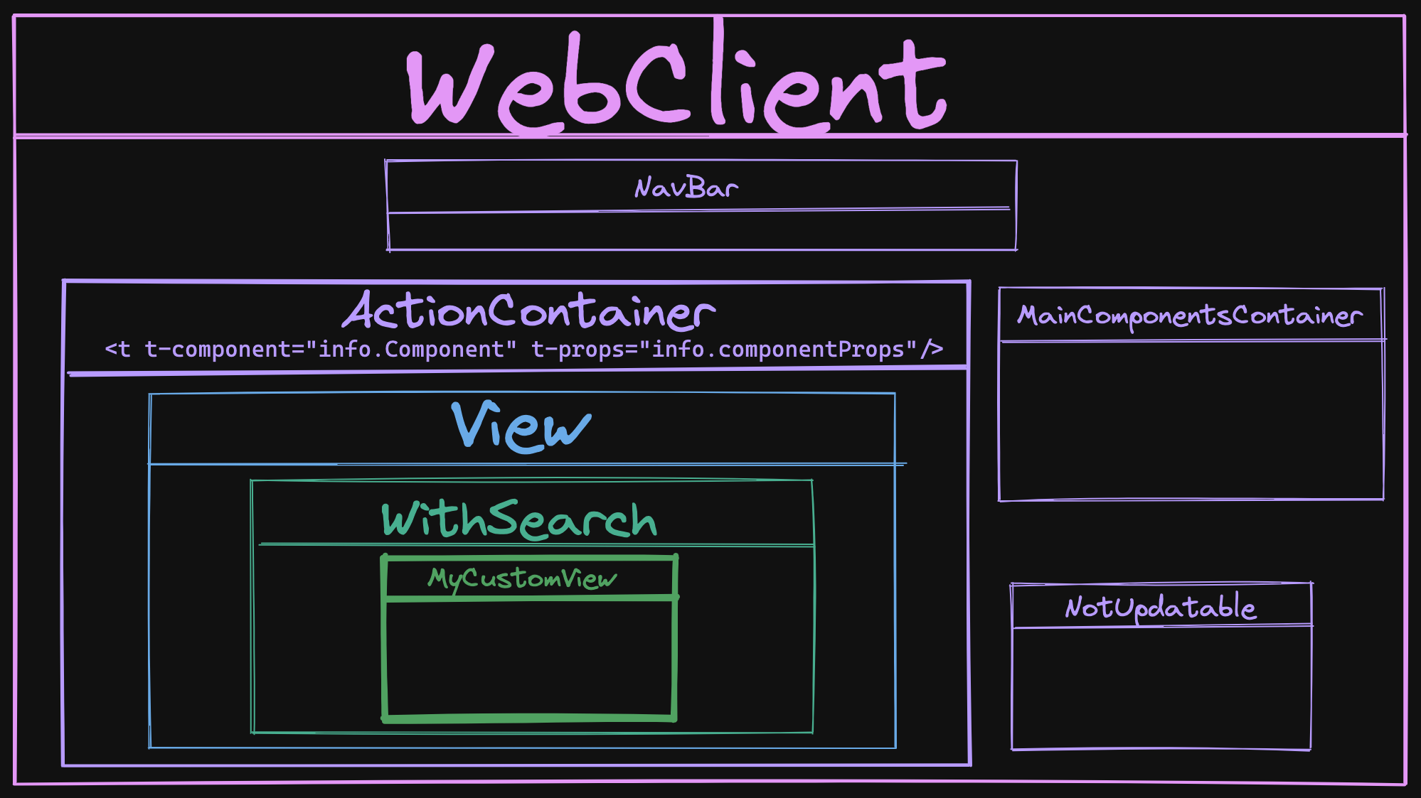
The WebClient Component
The WebClient is the main Component that is mounted onto the DOM <body> element via the startWebClient function:
const root = await mount(Webclient, { env, target: document.body, position: "self" });This WebClient has 4 sub-Components
WebClient.components = {
    ActionContainer,
    NavBar,
    NotUpdatable,
    MainComponentsContainer,
};NavBaris the navigation bar you see on top of your Screen in Odoo.NotUpdatableis a basic wrapper Component that overrides theshouldUpdatefunction to returnfalse. Basically creating a static Component.MainComponentsContaineris the container of the Component that is always here, like the Notification container, Dialog Container, etc...ActionContaineris the one that interests us the most.
The ActionContainer Component
The ActionContainer is a simple Component that reacts to the actionService an especially on the ACTION_MANAGER:UPDATE event.
export class ActionContainer extends Component {
    setup() {
        this.info = {};
        this.env.bus.on("ACTION_MANAGER:UPDATE", this, (info) => {
            this.info = info;
            this.render();
        });
    }

    destroy() {
        this.env.bus.off("ACTION_MANAGER:UPDATE", this);
        super.destroy();
    }
}
This event is fired when a new action has been made and the View needs to be replaced for example.
The info given by the action manager contains the ControllerComponent that and the ComponentProps that will be passed to that dynamic Component from the ControllerComponent.
But why the ControllerComponent isn't on the Schema?
Actually, the ControllerComponent is only here to manage Legacy Views that still need a Controller. It doesn't even have its own class and is declared inline inside a function, it really is just a proxy to check:
- If it is a legacy view, it will give an old MVC Style Controller
- If it is an OWL View it will directly give the View Component.
The View Component
In the case we are creating an OWL View (an in future v 16) the View Component is given, defined in odoo/addons/web/static/src/views/view.js
export class View extends Component {
    setup() {
        const { arch, fields, resModel, searchViewArch, searchViewFields, type } = this.props;
        // ...
    }
    async willStart() {
        let ViewClass = viewRegistry.get(this.props.type);
        // ...
        // ...
        // Defining the props of the withSearch Component
        this.withSearchProps = {
        ...this.props,
           Component: ViewClass, // This is our ACTUAL VIEW
           componentProps: viewProps,
        };
    //...
    }
}
View.template = "web.View";
View.components = { WithSearch };
As you can see this View Component create the props for the WithSearch Component that will contain the real custom View we created.
The WithSearch Component
Finally, located in odoo/addons/web/static/src/search/with_search/with_search.js, the WithSearch Component is the last step before our custom view.
Its main function is to attach a SearchModel to the env of our custom View, handle the search bar by creating config for the ControlPanel and SearchPanel.
Nothing is displayed by this Component, it is purely made to manage data that will be passed to sub-components, as we can see on its template:
<t t-name="web.WithSearch" owl="1">
    <t t-component="Component" t-props="componentProps" />
</t>
Now that we have this overview of the WebClient for an OWL View, we can continue our Reference guide about the different parts you will use in creating your own OWL View.
The Layout Component
This is a new helper Component that will be used when you are creating new OWL Views from scratch. This Layout is the one responsible for the presence of the:
- SearchPanel
- ControlPanel
- Banner
Usage
You have to import the Component and register it inside the components of your own View.
import { Layout } from "@web/views/layout";

class OWLTreeView extends owl.Component {
  static type = "owl_tree";
  static display_name = "Hierarchichal Tree View";
  static icon = "fa-list-ul";
  static multiRecord = true;
  static components = { Layout };
  // ...
The Layout Component will most of the time, be your "wrapper" Component, around the actual OWL View content. You will include it in your OWL View template like that:
<Layout viewType="'my_super_view'" useSampleModel="model.useSampleModel">
    <div>The content of my view</div>
</Layout>
How does it work?
The Layout Component is defined in odoo/addons/web/static/src/views/layout.js and is a very simple one:
/** @odoo-module **/

import { ControlPanel } from "@web/search/control_panel/control_panel";
import { SearchPanel } from "@web/search/search_panel/search_panel";

const { Component } = owl;

/**
 * @param {Object} params
 * @returns {Object}
 */
export const extractLayoutComponents = (params) => {
    return {
        ControlPanel: params.ControlPanel || ControlPanel,
        SearchPanel: params.SearchPanel || SearchPanel,
        Banner: params.Banner || false,
    };
};

export class Layout extends Component {
    setup() {
        const { display = {} } = this.env.searchModel || {};
        this.components = extractLayoutComponents(this.env.config);
        this.display = display;
    }
}

Layout.template = "web.Layout";
Layout.props = {
    viewType: { type: String, optional: true },
    useSampleModel: { type: Boolean, optional: true },
};
With this template:
<t t-name="web.Layout" owl="1">
    <div t-att-class="{ o_view_sample_data: props.useSampleModel }" t-attf-class="{{ props.viewType ? `o_${props.viewType}_view` : '' }}">
        <t t-component="components.ControlPanel" t-if="display.controlPanel">
            <!-- Empty body to assign slot id to control panel -->
        </t>
        <div class="o_content" t-att-class="{ o_component_with_search_panel: display.searchPanel }">
            <t t-component="components.Banner" t-if="components.Banner and display.banner" />
            <t t-component="components.SearchPanel" t-if="display.searchPanel" />
            <t t-slot="default" />
        </div>
    </div>
</t>
So this component is the one adding the ControlPanel, the Banner, and the SearchPanel to your view. If you don't use them in your View you will not get these 3 components unless you add them yourself.
As you can see from the source code, the Layout Component makes some checks to display or not the different sub-Component, let's see how to customize that.
Layout: Display or Hide the ControlPanel, SearchPanel, Banner
The customization will happen inside the setup function of your Component, we will create a subEnv and modify the searchModel key:
/** @odoo-module **/
import { Layout } from "@web/views/layout";
const { useSubEnv } = owl.hooks;

class MyComponent extends owl.Component {
  setup() {
    let searchModel = this.env.searchModel;
	searchModel.display = {
	  controlPanel: false,
	  searchPanel: true,
    };
    useSubEnv({searchModel: searchModel});
  }
}
MyComponent.components = { Layout };
This is an example result:
The searchPanel is on the left and the ControlPanel disappeared!
Using custom SearchPanel, ControlPanel, Banner components
You can actually switch Components used inside the layout:
/** @odoo-module **/
import { Layout } from "@web/views/layout";
const { useSubEnv } = owl.hooks;
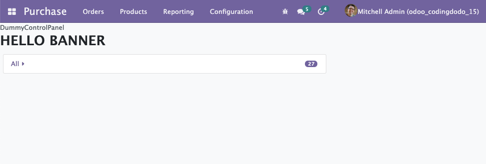
class DummyControlPanel extends owl.Component {}
DummyControlPanel.template = owl.tags.xml/* xml */ `
<div>DummyControlPanel</div>`;
class MyBanner extends owl.Component {}
MyBanner.template = owl.tags.xml/* xml */ `
<div class="banner-test"><h1>HELLO BANNER</h1></div>`;
class MyComponent extends owl.Component {
setup() {
let config = this.env.config;
let searchModel = this.env.searchModel;
// Replacing the ControlPanel
config.ControlPanel = DummyControlPanel;
// Adding a Banner Component, default is not defined
config.Banner = MyBanner;
config.bannerRoute = "/toy/banner/route";
// Handling display
searchModel.display = {
controlPanel: true,
banner: true,
};
useSubEnv({
searchModel: searchModel,
config: { ...config },
});
}
}
MyComponent.components = { Layout };Example result
That's it for the Layout Component, very helpful to create new OWL Views.
The new Model Class
Located in odoo/addons/web/static/src/views/helpers/model.js, the new Model class is used when creating new Views. You can see some actual implementation examples for the Graph and Pivot Views. You can also check out our own View we created to have an example.
This Model Class is a bit different than the old JavaScript MVC system.
/** @odoo-module **/
import { Model } from "@web/views/helpers/model";

export class MyAwesomeModel extends Model {

  setup(params, { orm }) {
    this.modelName = params.resModel;
    this.orm = orm;
  }

  async load(params) {
      // ...
  }
}
Reactivity is achieved via the notify function.
First, it inherits the EventBus Class (coming directly from the owl library) and this is how it will handle reactivity, by using the trigger function (inherited from EventBus) via the notify function:
export class Model extends EventBus {
    // ... rest of the class skipped
    notify() {
        this.trigger("update");
    }
    // ...
}The trigger will fire an update event that will be caught by the useModel hook (see below). This useModel hook has access to the Component it is composing and will call a "render" on that Component.
notify() from one of your Model function, it will re-render the Component that is using this Model.Basic example
import { Model } from "@web/views/helpers/model";

export class MyAwesomeModel extends Model {

  setup(params, { orm }) {
    this.model = params.resModel;
    this.columns = params.columns;
    this.orm = orm;
    this.keepLast = new KeepLast();
  }

  async load(params) {
    const fields = this.columns.map((col) => col.name);
    this.data = await this.keepLast.add(
      this.orm.searchRead(this.model, params.domain, fields)
    );
    this.notify();
  }
}
MyAwesomeModel.services = ["orm"];
The Model.services property
When you declare your Model, don't forget to add the services you want to use. Often, you will see that we add the "orm" service:
export class MyAwesomeModel extends Model {
    // "orm" is injected as a dependency
    setup(params, { orm }) {
        this.orm = orm;
    }
// Register "orm" as a service
MyAwesomeModel.services = ["orm"];
Notice that, in the setup you have to declare orm since you are going to use it. Now to understand when and where does the string "orm" convert to the full "ORM Service" we have to check the useModel hook.
In itself, the new Model class doesn't do much, but with the power of the useModel hook it creates reactivity, let's check that.
The useModel hook
The basic setup of a View instantiate a Model with the useModel hook, then passes it to the Renderer Component.
With this magic hook, the Component using it becomes aware of the change made on the Model and re-renders itself as an answer.
How it works
The hook is located in odoo/addons/web/static/src/views/helpers/model.js, the function is quite long so i will just extract some of the most interesting pieces.
The useService calls
The services array that you registered (see previous section) are instantiated here:
const services = {};
for (const key of ModelClass.services) {
    services[key] = useService(key);
}
services.orm = services.orm || useService("orm");BTW, notice that even if you don't declare "orm" it will be added by default.
Instantiating the Model
To instantiate the useModel it you have to give the Model instance and the params that will also be passed to instantiate the Model:
export function useModel(ModelClass, params, options = {}) {
    // ...
    const model = new ModelClass(component.env, params, services);
    //...
}
Reactivity: Listening to the notify from the Model to re-render
With the following lines, the Component using this hook will render itself again, when the update event is coming from the Bus:
useBus(model, "update", options.onUpdate || component.render);Remember that the new Model class notify function actually just fire an 'update' event.
Reactivity: Loading the Model with onWillStart and onWillUpdateProps
This hook uses other hooks itself to handle reactivity. It is very similar to what we did in our Tutorial Series about creating the RealWorld App. So take a look if you don't understand the following piece:
async function load(props) {
    model.orm = orm;
    const searchParams = getSearchParams(props);
    await model.load(searchParams);
    if (useSampleModel && !model.hasData()) {
        sampleORM =
            sampleORM || buildSampleORM(component.props.resModel, component.props.fields, user);
        model.orm = sampleORM;
        await model.load(searchParams);
    } else {
        useSampleModel = false;
    }
    model.useSampleModel = useSampleModel;
}
onWillStart(() => {
    return load(component.props);
});
onWillUpdateProps((nextProps) => {
    useSampleModel = false;
    return load(nextProps);
});Usage
/** @odoo-module **/
import { useModel } from "@web/views/helpers/model";
import MyCustomModel from "@my_module/my_custom_model";

class CustomView extends owl.Component {
  /**
   * Standard setup function of OWL Component, here we
   * instantiate the Model.
   **/
  setup() {
    this.model = useModel(MyCustomModel, {
      resModel: this.props.resModel,
      domain: this.props.domain,
    });
  }
The model will hold data, so you can pass it directly as a prop to a Renderer. This way, when the data changes, the Renderer will update itself.
Registries
Registries have been refactored, improved, and expanded in Odoo v15. They are a good extension point for your own code. Registries are classified by categories and you can get or add to them very easily.
Overview
import { registry } from "@web/core/registry";


// Example VIEWS Category to add a View
const viewRegistry = registry.category("views");
viewRegistry.add("owl_tree", OWLTreeView);

// Example MAIN COMPONENTS Category to add a Root Component
registry.category("main_components").add("DialogContainer", {
    Component: DialogContainer,
    props: { bus, dialogs },
});

// Example DEBUG Category sub category
registry.category("debug").category("form").add("...", MyClass)

// Example SERVICES Category from partner_autocomplete module
export const companyAutocompleteService = {
    // Dependency Injection system
    dependencies: ["orm", "company"],

    start(env, { orm, company }) {
        if (session.iap_company_enrich) {
            const currentCompanyId = company.currentCompany.id;
            orm.silent.call("res.company", "iap_enrich_auto", [currentCompanyId], {});
        }
    },
};

registry
    .category("services")
    .add("partner_autocomplete.companyAutocomplete", companyAutocompleteService);
The most interesting ones for regular development are:
viewscategory for you to add new OWL Viewsmain_componentsto add Components accessible at the root level, like Dialog, Chat windows, Notification containerservicescategory that will contain very useful, well, services, like ORM, RPC, session, storage, etc
The Service registry and useService hook
Architecture of a Service object
This is the basic architecture of a Service
/** @odoo-module **/
import { registry } from "@web/core/registry";
export const myCustomService = {
  dependencies: ["user"],
  async: ["isAdmin"],
  // 'user' dependency injected
  start(env, { user }) {
    // closure declaration
    // This same "count" will live and be incremented
    // from anywhere in the application where this
    // service is called
    let count = 0;
    return {
      isAdmin() {
        return user.hasGroup("base.group_system");
      },
      incrementCounter() {
        count++;
      },
      getCount() {
        return count;
      },
    };
  },
};
// Registering the service
registry.category("services").add("my.custom.service", myCustomService);
A service is an Object with 2 keys at a minimum:
dependencies: here you register other services that yours will depend upon.startfunction: the body of your service. Takesenvas a first parameter, then the injected dependencies that you declared.
You can see here the async key is also available. You can directly define your functions inside the start as async or you can define which one is asynchronous inside this async array.
Usage with useService hook
This hook is located in "odoo/addons/web/static/src/core/utils/hooks.js" and will return the adequate Service, with dependencies injected, coming directly from the SERVICES_METADATA. This SERVICES_METADATA is a big object containing all the registered services instantiated and ready to be used (all functions from the start function merged and exposed).
Be careful, calling this service directly like registry.category("services").get('my.custom.service') would not work. You have to use the useService hook for that:
const customService = useService("my.custom.service");
customService.incrementCounter();
console.log(customService.getCount());
We will now take a look at one example Service.
The Action Service
The action service is located in odoo/addons/web/static/src/webclient/actions/action_service.js and contains all the "actions-related" functions, the service category is aptly named "action".
There is a lot of functions in this file but the usable API return by the service is this one (these are the functions you have access to):
return {
    doAction,
    doActionButton,
    switchView,
    restore,
    loadState,
    async loadAction(actionRequest, context) {
        let action = await _loadAction(actionRequest, context);
        return _preprocessAction(action, context);
    },
    get currentController() {
        return _getCurrentController();
    },
    __legacy__isActionInStack(actionId) {
        return controllerStack.find((c) => c.action.jsId === actionId);
    },
};doAction, call an action given an action name or a params objectdoActionButton, call action of type "object"switchView, given the name of the view type and the params, switch to the controller of that viewrestore, given the JavaScript ID of a controller, restore the view to that Controller. If null is given, restore to the last controller on the stack.loadState: Performs adoActionor aswitchViewaccording to the current content of the URL
Example usage in your Views
If your view needs to do things like doAction or switchView you will need to give it access to this service, via the useService('action') declaration.
/** @odoo-module **/

import { useService } from "@web/core/utils/hooks";
const { Component } = owl;

export class MyViewComponent extends Component {
    setup() {
        this.actionService = useService("action");
    }
}
Example usage for doAction
Similar to the old doAction, if you want to open any action, for example from the project module:
this.actionService.doAction("project.project_update_all_action", {
    additionalContext: {
        default_project_id: this.projectId,
        active_id: this.projectId,
    },
});
Can also be called without the action name as the first argument:
this.actionService.doAction(
    {
        context,
        domain,
        name: title,
        res_model: resModel,
        target: "current",
        type: "ir.actions.act_window",
        views: actionViews,
    },
    {
        viewType: "list",
    }
);
Example usage doActionButton
Expected params for the function:
this.actionService.doActionButton({
    args: {},
    buttonContext: {},
    context: {},
    close: null,
    resModel: "",
    name: payload.action_data.name,
    resId: ID || null,
    resIds: [Ids],
    special: false,
    type: 'button',
    onClose: callBack,
    effect: null,
}),
Example usage for switchView
If you have the target res.model and want to open the record:
const resIds = this.model.data.map((record) => record.id);
this.actionService.switchView("form", { resId: record.id, resIds });
The ORM and the RPC services
The rpc Service
In odoo 15 the RPC service is still here, but it is now part of the new services registry.
import { useService } from "@web/core/utils/hooks";

// ...
const rpcService = useService("rpc");
let products = await rpcService({
  model: 'product.product',
  method: 'search_read',
  kwargs: {
    'domain': [],
    'fields': ['id', 'name'],
    'offset': 0,
    'limit': 10
  },
  //context: {},
});
Nothing changed here really, except the useService hook.
The orm Service.
Located in odoo/addons/web/static/src/core/orm_service.js, the ORM service is an abstraction layer on top of the rpc service that is specially made to make RPC calls targeted at Models. Its goal is to have an API very similar to what we have in the backend.
This is the API:
import { useService } from "@web/core/utils/hooks";

// ...
// Example
const ormService = useService("orm");

ormService.create(model, state, ctx);
ormService.read(model, ids, fields, ctx);
ormService.readGroup(model, domain, fields, groupby, options = {}, ctx = {});
ormService.search(model, domain, options = {}, ctx = {});
ormService.searchRead(model, domain, fields, options = {}, ctx = {});
ormService.write(model, ids, data, ctx);
ormService.unlink(model, ids, ctx);

ormService.webReadGroup(model, domain, fields, groupby, options = {}, ctx = {});
ormService.webSearchRead(model, domain, fields, options = {}, ctx = {});
These are all asynchronous calls, so in a real example you would use the await keyword, inside an async function.
Usage example
Inside a new Model class, where this.orm service was injected:
/** @odoo-module **/
import { Model } from "@web/views/helpers/model";

export default class CustomModel extends Model {
  setup(params, { orm }) {
    this.modelName = params.resModel;
    this.orm = orm;
  }
  async getSomeData(params) {
    this.orm.searchRead(this.model, params.domain, [], { limit: 10 })
    this.notify();
  }
}
CustomModel.services = ["orm"];
Finally, how to create an OWL View
As I implied at the beginning of our analysis, in Odoo 15 you can create a new View type without inheriting from the old MVC Classes.
The main View class will be an OWL Component and the Controller is not necessary anymore.
Basic View definition
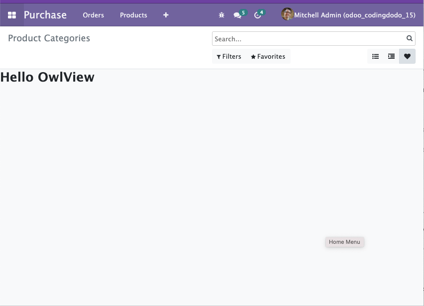
To create a simple View, that you can switch to from the UI is actually very simple. You can make a basic "Hello world" View with 6 lines of code:
/** @odoo-module **/
import { registry } from "@web/core/registry";
import { Layout } from "@web/views/layout";

// Empty component for now
class VeryBasicView extends owl.Component {}

VeryBasicView.type = "very_basic_view";
VeryBasicView.display_name = "VeryBasicView";
VeryBasicView.icon = "fa-heart";
VeryBasicView.multiRecord = true;
VeryBasicView.searchMenuTypes = ["filter", "favorite"];

// Registering the Layout Component is optional
// But in this example we use it in our template
VeryBasicView.components = { Layout };
VeryBasicView.template = owl.tags.xml/* xml */ `
<Layout viewType="'very_basic_view'">
    <div><h1>Hello OwlView</h1></div>
</Layout>`;

registry.category("views").add("very_basic_view", VeryBasicView);
Register the view in the ir_http.py file:
from odoo import fields, models


class View(models.Model):
    _inherit = "ir.ui.view"

    type = fields.Selection(
        selection_add=[("very_basic_view", "Very Basic View")]
    )
And add it to any model in an XML file. In this example, I added that view to the product categories:
<?xml version="1.0" encoding="utf-8"?>
<odoo>

    <record id="product_category_view_very_basic_view" model="ir.ui.view">
        <field name="name">Product Categories Very Basic View</field>
        <field name="model">product.category</field>
        <field name="arch" type="xml">
            <very_basic_view></very_basic_view>
        </field>
    </record>

    <record id='product.product_category_action_form' model='ir.actions.act_window'>
        <field name="name">Product Categories</field>
        <field name="res_model">product.category</field>
        <field name="view_mode">tree,very_basic_view,form</field>
    </record>

</odoo>
And you should see:
Now let's add a basic Model to our View
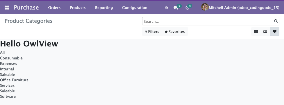
In the same file let's create a VeryBasicModel and call the useModel in the setup of our main View Component:
/** @odoo-module **/
import { registry } from "@web/core/registry";
import { Layout } from "@web/views/layout";
import { KeepLast } from "@web/core/utils/concurrency";
import { Model, useModel } from "@web/views/helpers/model";

class VeryBasicModel extends Model {
  static services = ["orm"];

  setup(params, { orm }) {
    this.model = params.resModel;
    this.orm = orm;
    this.keepLast = new KeepLast();
  }

  async load(params) {
    this.data = await this.keepLast.add(
      this.orm.searchRead(this.model, params.domain, [], { limit: 100 })
    );
    this.notify();
  }
}
VeryBasicModel.services = ["orm"];

class VeryBasicView extends owl.Component {
  setup() {
    this.model = useModel(VeryBasicModel, {
      resModel: this.props.resModel,
      domain: this.props.domain,
    });
  }
}

VeryBasicView.type = "very_basic_view";
VeryBasicView.display_name = "VeryBasicView";
VeryBasicView.icon = "fa-heart";
VeryBasicView.multiRecord = true;
VeryBasicView.searchMenuTypes = ["filter", "favorite"];
VeryBasicView.components = { Layout };
VeryBasicView.template = owl.tags.xml/* xml */ `
<Layout viewType="'very_basic_view'">
    <div><h1>Hello OwlView</h1></div>
    <div t-foreach="model.data" t-as="record" t-key="record.id">
        <t t-esc="record.name"/>
    </div>
</Layout>`;

registry.category("views").add("very_basic_view", VeryBasicView);
With that done, you already have a View fetching and displaying data:
You don't really need a Renderer for such a basic display but if would want one, it will just be a sub-Component of the main "VeryBasicView" Component. You can pass the this.model that is holding data, directly to the Renderer Component and this Renderer will then react to any change in the Model.
Taking it further
For a more advanced use case with Renderer, bigger Model, and event catching, refer to the next part of this tutorial where we migrate our Odoo 14 OWL View to Odoo 15.
Conclusion
This article is meant to live for a long time. I will update it regularly as I find more and more knowledge fitted to be kept in this "Reference" guide.
The goal is to have "improve" documentation this time around because as of now the Odoo official Documentation is still lacking.
Thank you for reading! ?
If you liked the content, consider becoming a member as it is the best way to support me. Please follow CodingDodo on Twitter for the latest news and article previews.
 ]]>
]]>
This is the third part of our ongoing tutorial series about the Odoo 14 JavaScript Framework. In the second part, we created our new type of View in OWL that displayed a hierarchical vision of parent/child type Models. The nodes are clickable and can open the child elements.
In this follow-up, we will add the drag and drop feature that will allow us to move the items and change their hierarchy.
There are some rules though:
- A parent item shouldn't be dragged and dropped into one of its own children.
- Moving an item should recalculate the count of the old parent and the new target parent should be refresh.
- An item cannot be dropped into itself.
To handle that we need to first take a look at the HTML Drag and Drop API
The HTML Drag And Drop API
In this section, I will briefly explain the HTML Drag and Drop API but if you would like a more in-depth view, take a look at this MDN Documentation.
The first step to make a DOM element draggable is adding the draggable attribute to the element and set it to true:
<div id="draggableDiv" draggable="true">This element can be dragged.</div>
The DragEvent interface
This element will then already be draggable in the browser. On top of that, it will fire multiple events. We will not cover all the events but only the ones we are interested in:
dragstartevent when the dragging begins. After a prolonged click on the draggable element, it "pops out" and can be dragged around.dragenteranddragleaveevents are events that happen on the element being dragged onto. You can know when the dragged element is entering or leaving a zone represented by another element, and make that zone react accordingly.dragoverevents trigger every few hundred milliseconds when an element is being dragged over. An element that is a valid drop target should handle that event.dropevent when the item is dropped (mouse released). If an element is a valid drop target it should handle that event.
Handling event means that we will have to ev.preventDefault() the events coming into our handler function. Fortunately for us, OWL provides us with shortcuts for that.
The DataTransfer interface
The DataTransfer is an object holding data during the drag and drop events, it can hold multiple items.
We will use this DataTransfer to pass around the tree item being drag and dropped. To do so, the interface gives u access to 2 functions:
DataTransfer.setData()Set the data for a given type. If data for the type does not exist, it is added at the end, such that the last item in the types list will be the new format. If data for the type already exists, the existing data is replaced in the same position.
event.dataTransfer.setData("text/plain", "hello world");DataTransfer.getData()Retrieves the data for a given type, or an empty string if data for that type does not exist or the data transfer contains no data.
let result = event.dataTransfer.getData("text/plain");
// result: "hello world"
Let's dive into our TreeItem Component now to make everything clearer.
Making our TreeItem draggable
Now that we know how everything works, we will update our TreeItem Component. The draggable element will be the whole <div> (without the children) and it will also be the drop zone.
Let's update static/src/components/tree_item/TreeItem.xml to reflect that:
<t t-name="owl_tutorial_views.TreeItem" owl="1">
    <div class="tree-item-wrapper">
        <div
            draggable="true"
            t-on-dragstart="onDragstart"
            t-on-drop.stop.prevent="onDrop"
            t-on-dragover.prevent="onDragover"
            t-on-dragenter.prevent="onDragenter"
            t-on-dragleave.prevent="onDragleave"
            t-attf-class="list-group-item list-group-item-action d-flex justify-content-between align-items-center owl-tree-item {{ state.isDraggedOn ? 'list-group-item-warning': '' }}"
        >
            <a href="#" t-on-click.stop.prevent="toggleChildren" t-if="props.item.child_id.length > 0">
                <t t-esc="props.item.display_name"/>
                <i t-attf-class="pl-2 fa {{ state.childrenVisible ? 'fa-caret-down': 'fa-caret-right'}}" ></i>
            </a>
            <span t-else="">
                <t t-esc="props.item.display_name"/>
            </span>
            <span
                t-if="props.countField !== '' and props.item.hasOwnProperty(props.countField)"
                class="badge badge-primary badge-pill"
                t-esc="props.item[props.countField]">
            </span>
        </div>
        <t t-if="props.item.child_id.length > 0">
            <div class="d-flex pl-4 py-1 flex-row treeview" t-if="props.item.children and props.item.children.length > 0 and state.childrenVisible">
                <div class="list-group">
                    <t t-foreach="props.item.children" t-as="child_item">
                        <TreeItem item="child_item"/>
                    </t>
                </div>
            </div>
        </t>
    </div>
</t>
We can directly use .prevent shortcuts to not have to write event.preventDefault() inside the handler function.
Notice that we also added a CSS class that triggers by checking the state of the TreeItem here {{ state.isDraggedOn ? 'list-group-item-warning': '' }}.
This will make the item become yellow-ish when dragged over. Let's now check each function we have to implement.
Handling the dragstart event
The dragstart represents the first step of the whole drag and drop operation. This is where we will set our TreeItem Object as the data to be transferred during the drag and drop.
We want to transfer the full object but the DataTransfer API setData only let us transfer strings so we will have to JSON.stringify our object first. So inside our src/components/tree_item/TreeItem.js:
onDragstart(event) {
	event.dataTransfer.setData("TreeItem", JSON.stringify(this.props.item));
}As you can see, we can transfer custom formats of data, ie "TreeItem" in our example. With that done, we will be able to get the item being moved at the end of the chain of operations.
Handling dragenter and dragleave to give visual feedback to the user.
These two events only trigger once and they will toggle the list-group-item-warning CSS class to give the user visual feedback on the component he is dragging over.
onDragenter() {
  Object.assign(this.state, { isDraggedOn: true });
}

onDragleave() {
  Object.assign(this.state, { isDraggedOn: false });
}
The code is self-explanatory on this one, let's move on to the main event.
]]>
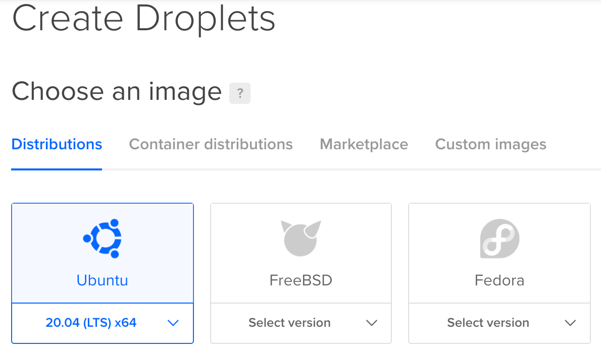
Odoo 15 is finally released and one of the best ways to try it is to quickly spin up a server on DigitalOcean with the 100€ free credits and destroy the droplet when you finished. But, following this tutorial you could also keep your server up and running and use it for production! In this tutorial, we will deploy a production-ready Odoo 15 instance on a Ubuntu 20.04 (LTS) x64 Droplet. I will not go over the DigitalOcean registration process as it was already covered in this tutorial about installing Odoo 14.
DigitalOcean offers you 100€ credit to use in 6 months since you can create machines and destroy them quickly it's a great place to experiment with Odoo installs or to choose it as your production server!
Ubuntu 20.4 Prerequisites
Now that we are connected to our new machine we will do the usual maintenance of updating and upgrading packages.
apt update
apt upgrade -y
If you created a DigitalOcean Droplet and run into a message saying that the sshd_config has been modified:
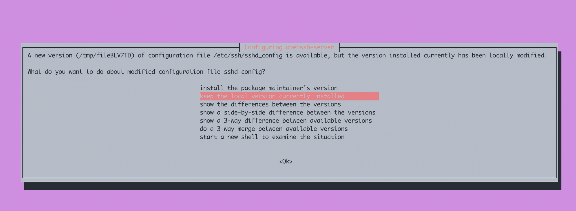
Select "keep the local version currently installed".
Common packages, dependencies, git, node, wget.
Let's run a big install of the commonly used tools on Linux and some dependencies needed later for our python installation.
apt install -y build-essential libssl-dev zlib1g-dev libbz2-dev \
libreadline-dev libsqlite3-dev wget curl llvm libncurses5-dev libncursesw5-dev \
xz-utils tk-dev libffi-dev liblzma-dev python-openssl git libpq-dev libsasl2-dev libldap2-dev ccze node-less bash-completion
Inside that list, you will notice commons Unix tools like bash-completion, ccze, curl, wget, git and, SSL requirements needed later.
Installing PostgreSQL 13
Version 13 of PostgreSQL is not directly available from Ubunto 20 so we have to add the package manually.
wget --quiet -O - https://www.postgresql.org/media/keys/ACCC4CF8.asc | apt-key add -Now that we have the key we add the repository
echo "deb http://apt.postgresql.org/pub/repos/apt/ `lsb_release -cs`-pgdg main" | tee /etc/apt/sources.list.d/pgdg.listNow we update packages and run the install of PostgreSQL 13
apt update
apt install -y postgresql-13 postgresql-client-13
Let's create a database user named odoo, this user will be the owner of the differents odoo databases we will create. To do that, we must connect as Postgres and run the interactive user creation prompt.
su - postgres
createuser --interactive -P odoo
With the --interactive flag, PostgreSQL will ask us for a password and the privileges that will be given to our odoo PostgreSQL user.
Enter password for new role:
Enter it again:
Shall the new role be a superuser? (y/n) n
Shall the new role be allowed to create databases? (y/n) y
Shall the new role be allowed to create more new roles? (y/n) n
Now we will create a new empty database that we will init later by launching odoo. This database will be named coding_dodo.
createdb -O odoo codingdodo_demo
exit
The -O flag represents the owner of the database, we choose odoo because it's the name of the PostgreSQL user we created just before.
wkhtmltopdf
wkhtmltopdf is used by Odoo to generate documents and is a necessary evil. We will pull the deb of version 0.12.6-2 from Github and install it
wget https://github.com/wkhtmltopdf/packaging/releases/download/0.12.6-1/wkhtmltox_0.12.6-1.bionic_amd64.deb
apt install ./wkhtmltox_0.12.6-1.bionic_amd64.deb -y
Creating the Unix odoo user
Let's create our odoo user that will have its own home folder, where we will store the odoo source.
useradd -m -U -r -s /bin/bash odoo-r indicate that it's a system account so useradd will not create a home directory for such a user. We want a folder so we use -m-U create a group and -s specify the shell that will be used.
Preparing the Python environment with Pyenv
We will use pyenv to manage multiple Python versions on our system. This is not necessary but if for some reason you would like to host a different Odoo version that requires a different Python version, by following these steps, it will not be a problem later.
Log in as the odoo user
pyenv will be installed as the odoo system user.
su - odooInstalling pyenv
curl https://pyenv.run | bashAdding pyenv python versions to the path is a necessary step for the whole system to work correctly:
echo -e 'if shopt -q login_shell; then' \
      '\n  export PYENV_ROOT="$HOME/.pyenv"' \
      '\n  export PATH="$PYENV_ROOT/bin:$PATH"' \
      '\n eval "$(pyenv init --path)"' \
      '\nfi' >> ~/.bashrc
echo -e 'if [ -z "$BASH_VERSION" ]; then'\
      '\n  export PYENV_ROOT="$HOME/.pyenv"'\
      '\n  export PATH="$PYENV_ROOT/bin:$PATH"'\
      '\n  eval "$(pyenv init --path)"'\
      '\nfi' >>~/.profile
Now log off and log in again as odoo user
exit
su - odoo
Installing python 3.9.2
pyenv install 3.9.2Depending on the CPU power you choose, it may take some time, but in the end, you should see:
Installed Python-3.9.2 to /home/odoo/.pyenv/versions/3.9.2Now type python --version as a sanity check for the python version, you should see this.
odoo@ubuntu-s-4vcpu-8gb-amd-blr1-01:~$ python --version
pyenv: python: command not found

The `python' command exists in these Python versions:
  3.9.2

Note: See 'pyenv help global' for tips on allowing both
      python2 and python3 to be found.
Python command is not available but the 3.9.2 version we just installed is present. If you can't see the newly installed python you should check the pyenv documentation here to make it available in your path via a different method than what we did earlier.
Creating the virtualenv
We can now create a virtualenv via the pyenv virtualenv command. We have to give the name of the python version 3.9.2 and the name we want to give to this new virtual environment
pyenv virtualenv 3.9.2 odoo-15-envVirtualenvs are a good way to keep your dependencies clean in their own space. It is generally good practice to not mess too much with the system python.
Installing Odoo from GitHub source
Creating a folder for our custom addons (Optional)
mkdir /home/odoo/odoo-15-custom-addonsThis is the folder you will use to store your custom addons. Be careful if you add the custom addon patch to the --addons-path command-line argument and there are no valid add-ons inside, it will not work.
To make it work we will clone our own module inside that folder
cd /home/odoo/odoo-15-custom-addons
git clone https://github.com/Coding-Dodo/web_widget_markdown.git
cd ~/
Pulling Odoo 15 and activating the virtualenv
We will pull Odoo version 15 with the -b flag for the branch and put it in a folder named odoo-15
git clone -b 15.0 --single-branch --depth 1 https://github.com/odoo/odoo.git odoo-15Since we created our virtualenv called odoo-15-env, we will "park" it in the odoo-15 folder we just created. With that done, every time we cd into this folder it will activate our virtualenv automatically.
cd odoo-15
pyenv local odoo-15-env
Do another sanity check by typing python --version you should now have that output:
odoo@ubuntu-s-4vcpu-8gb-amd-blr1-01:~/odoo-15$ python --version
Python 3.9.2
Installing python dependencies
pip install --upgrade pip
pip install setuptools wheel
pip install -r requirements.txt -e .
If you see any error please refer to the part "Common packages, dependencies..." and make sure you installed everything.
Launching Odoo for the first time to test and generate a config file
We will test launch Odoo with some command-line arguments that will be saved in our Odoo configuration file
./odoo-bin --database=codingdodo_demo --db_user=odoo --db_password=codingdodo -i base --without-demo=all --save -c /home/odoo/.odoorc_codingdodo_demo --stop-after-init
./odoo-bin --database=codingdodo_demo --db_user=odoo --db_password=codingdodo -i base --addons-path="/home/odoo/odoo-15/addons,/home/odoo/odoo-15-custom-addons" --without-demo=all --save -c /home/odoo/.odoorc_codingdodo_demo --stop-after-init
We directly typed the DB name, user, and password and initialized it with the i flag. --without-demo=all is used because we are installing a production-ready environment. If you want demo data, omit that flag.
With the -c flag we told Odoo where the config file will be /home/odoo/.odoorc_codingdodo_demo
The --save flag is used to save everything we just typed into the newly created config file.
Create the logs directory
We want our log files to be inside /var/log/odoo/ so we create that folder and give odoo user access to it.
exit
mkdir /var/log/odoo
touch /var/log/odoo/odoo-15.log
chown odoo: /var/log/odoo
chown -R odoo: /var/log/odoo/*
log back as odoo and edit the config file
su - odoo
vim /home/odoo/.odoorc_codingdodo_demo
Modify the config file to reflect that change
logfile = /var/log/odoo/odoo-15.logRunning Odoo as service
We would like to have Odoo available as a service so, log out of odoo user, and create a service file:
exit
vim /etc/systemd/system/odoo-15.service
You don't have to use vim to edit your file, but if you follow exactly the commands, to go into Insert mode press I, then copy that content via Ctrl + V (or Cmd + V)
[Unit]
Description=Odoo15
Requires=postgresql.service
After=network.target postgresql.service

[Service]
Type=simple
SyslogIdentifier=odoo-15
PermissionsStartOnly=true
User=odoo
Group=odoo
ExecStart=/home/odoo/.pyenv/versions/odoo-15-env/bin/python /home/odoo/odoo-15/odoo-bin -c /home/odoo/.odoorc_codingdodo_demo
StandardOutput=journal+console

[Install]
WantedBy=multi-user.target
If you are using vim press :wq to save and exit the file.
Now we Reload the service.
systemctl daemon-reload
systemctl enable --now odoo-15
Check status via systemctl status odoo-15 and you should see
systemctl status odoo-15
● odoo-15.service - Odoo15
     Loaded: loaded (/etc/systemd/system/odoo-15.service; enabled; vendor preset: enabled)
     Active: active (running) since Sat 2021-10-02 14:48:59 UTC; 9s ago
   Main PID: 58656 (python)
      Tasks: 4 (limit: 9513)
     Memory: 63.3M
     CGroup: /system.slice/odoo-15.service
             └─58656 /home/odoo/.pyenv/versions/odoo-15-env/bin/python /home/odoo/odoo-15/odoo-bin -c /home/odoo/.odoorc_codingdodo_demo

Oct 02 14:48:59 ubuntu-s-4vcpu-8gb-amd-blr1-01 systemd[1]: Started Odoo15.
Install Nginx and add SSL with Let's Encrypt
Installing Nginx
apt install nginx -yLet's Encrypt with Certbot
Certbot will be used to install our first certificate and to renew it every month
apt install certbot -yGenerate a new set of 2048 bit DH parameters by typing the following command:
sudo openssl dhparam -out /etc/ssl/certs/dhparam.pem 2048Let's Encrypt Nginx Snippet
Let's Encrypt needs to do its acme-challenge to validate our domain name and creating the certificate with Certbot. If we plan to install multiple instances / different domain names pointing to this server, it is a good habit to isolate the let's encrypt acme-challenge location to its custom snippet.
mkdir -p /var/lib/letsencrypt/.well-known
chgrp www-data /var/lib/letsencrypt
chmod g+s /var/lib/letsencrypt
We create a Let's Encrypt snippet
vim /etc/nginx/snippets/letsencrypt.confWith this content
location ^~ /.well-known/acme-challenge/ {
  allow all;
  root /var/lib/letsencrypt/;
  default_type "text/plain";
  try_files $uri =404;
}
SSL Conf Nginx Snippet
vim /etc/nginx/snippets/ssl.confCopy-paste that content
ssl_dhparam /etc/ssl/certs/dhparam.pem;

ssl_session_timeout 1d;
ssl_session_cache shared:SSL:10m;
ssl_session_tickets off;

ssl_protocols TLSv1.2 TLSv1.3;
ssl_ciphers ECDHE-ECDSA-AES128-GCM-SHA256:ECDHE-RSA-AES128-GCM-SHA256:ECDHE-ECDSA-AES256-GCM-SHA384:ECDHE-RSA-AES256-GCM-SHA384:ECDHE-ECDSA-CHACHA20-POLY1305:ECDHE-RSA-CHACHA20-POLY1305:DHE-RSA-AES128-GCM-SHA256:DHE-RSA-AES256-GCM-SHA384;
ssl_prefer_server_ciphers on;

ssl_stapling on;
ssl_stapling_verify on;
resolver 8.8.8.8 8.8.4.4 valid=300s;
resolver_timeout 30s;

add_header Strict-Transport-Security "max-age=31536000; includeSubDomains" always;
add_header X-Frame-Options SAMEORIGIN;
add_header X-Content-Type-Options nosniff;
Create A Record with your DNS Provider pointing to the Droplet IP
For the following parts, you must have a domain name that will point to your DigitalOcean droplet, or else the acme-challenge of Let's Encrypt will fail.
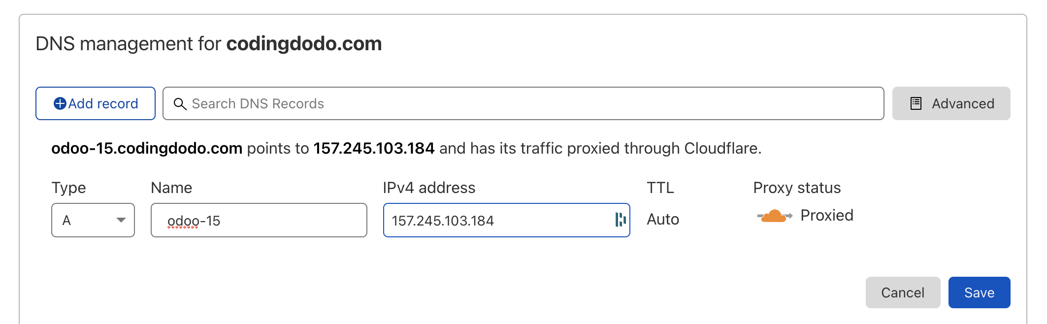
Here we created a subdomain of codingdodo.com with an A record pointing to our Droplet IP Value.
Our final address will be odoo-15.codingdodo.com
Installing the Let's Encrypt certificate
In case the Odoo service is still running.
service odoo-15 stopBasic Nginx Conf file to pass the Certbot acme-challenge
cd /etc/nginx/sites-available
vim odoo-15.codingdodo.com
We will first create a basic Nginx conf file to pass Certbot acme-challenge:
upstream odoo_15 {
 server 127.0.0.1:8069;
}

upstream odoochat_15 {
 server 127.0.0.1:8072;
}

server {
    listen      80;
    listen [::]:80;
    server_name odoo-15.codingdodo.com;
    include snippets/letsencrypt.conf;
}
Symlink your site declaration from site-available to site-enabled.
ln -s /etc/nginx/sites-available/odoo-15.codingdodo.com /etc/nginx/sites-enabled/odoo-15.codingdodo.comAlways test the config with nginx -t and if everything is okay we reload Nginx
service nginx reloadCertbot acme-challenge
It is now time to create our SSL certificate.
certbot certonly --agree-tos --email [email protected] --webroot -w /var/lib/letsencrypt/ -d odoo-15.codingdodo.comYou should see
 - Congratulations! Your certificate and chain have been saved at:
   /etc/letsencrypt/live/odoo-15.codingdodo.com/fullchain.pem
Managing Auto renew
Let's Encrypt already created a cron in the crontab but Nginx needs to reload to take into consideration the new certificate so we will edit this file
vim /etc/letsencrypt/cli.iniAnd add the line at the end.
deploy-hook = systemctl reload nginxTo test if our renew will work we can use the --dry-run flag to test it
certbot renew --dry-runFinal Nginx site conf for proxy mode multi workers
Now edit the odoo-15.codingdodo.com file again:
vim /etc/nginx/sites-available/odoo-15.codingdodo.comupstream odoo_15 {
server 127.0.0.1:8069;
}
upstream odoochat_15 {
server 127.0.0.1:8072;
}
server {
listen 80;
listen [::]:80;
server_name odoo-15.codingdodo.com;
include snippets/letsencrypt.conf;
location / {
return 301 https://odoo-15.codingdodo.com$request_uri;
}
}
server {
listen 443 ssl http2 default_server;
listen [::]:443;
server_name odoo-15.codingdodo.com ;
ssl_certificate /etc/letsencrypt/live/odoo-15.codingdodo.com/fullchain.pem;
ssl_certificate_key /etc/letsencrypt/live/odoo-15.codingdodo.com/privkey.pem;
ssl_trusted_certificate /etc/letsencrypt/live/odoo-15.codingdodo.com/chain.pem;
include snippets/ssl.conf;
include snippets/letsencrypt.conf;
proxy_buffers 16 64k;
proxy_buffer_size 128k;
proxy_set_header X-Forwarded-Host $host;
proxy_set_header X-Forwarded-For $proxy_add_x_forwarded_for;
proxy_set_header X-Forwarded-Proto $scheme;
proxy_set_header X-Real-IP $remote_addr;
proxy_set_header X-Odoo-dbfilter "codingdodo_demo";
proxy_next_upstream error timeout invalid_header http_500 http_502 http_503 http_504;
location / {
proxy_pass http://odoo_15;
}
location /longpolling {
proxy_pass http://odoochat_15;
}
location ~* /web/static/ {
proxy_cache_valid 200 60m;
proxy_buffering on;
expires 864000;
proxy_pass http://odoo_15;
}
location ~* /website/image/ir.attachment/ {
proxy_cache_valid 200 60m;
proxy_buffering on;
expires 864000;
proxy_pass http://odoo_15;
}
gzip_types text/css text/less text/plain text/xml application/xml application/json application/javascript;
gzip on;
}
Use nginx -t to test the new config, you should see:
root@ubuntu-s-4vcpu-8gb-amd-blr1-01:/etc/nginx/sites-available# nginx -t
nginx: the configuration file /etc/nginx/nginx.conf syntax is ok
nginx: configuration file /etc/nginx/nginx.conf test is successful
Now you can reload Nginx.
service nginx reloadUpdating the Odoo config file
vim /home/odoo/.odoorc_codingdodo_demoNow that we have our reverse proxy we need to modify/add these lines
proxy_mode = True
workers = 4
max_cron_threads = 1
limit_memory_hard = 2684354560
limit_memory_soft = 2147483648
limit_request = 8192
limit_time_cpu = 600
limit_time_real = 1200
The number of workers depends on the RAM and CPU you choose during the creation of your droplet. Refer to this official documentation to calculate the appropriate number of workers.
- Server with 2 CPU, 4 Thread
- 30 concurrent users
- 30 users / 6 = 5 <- theorical number of worker needed
- (2 * 2) + 1 = 5 <- theorical maximal number of worker
- We’ll use 4 workers + 1 for cron.
- RAM = 9 * ((0.8*150) + (0.2*1024)) ~= 3Go RAM for Odoo
Restart Odoo and see logs
service odoo-15 restartGo to https://odoo-15.codingdodo.com and in the meantime on the server check the logs
tail -f /var/log/odoo/odoo-15.log | cczeIn your browser access your domain name, you should see the login screen :
Setting the Firewall
Let's add some security!
ufw app listIf you followed this guide it should show you :
Available applications:
  Nginx Full
  Nginx HTTP
  Nginx HTTPS
  OpenSSH
First, we secure ssh connection
ufw allow OpenSSHNow if you have installed Nginx with an SSL certificate
ufw allow 'Nginx Full'
ufw enable
The last line will ask you to confirm, enter y
Command may disrupt existing ssh connections. Proceed with operation (y|n)? y
Firewall is active and enabled on system startup
Create a sudo user for day to day actions
adduser codingdodoAnswer the prompt questions:
Changing the user information for codingdodo
Enter the new value, or press ENTER for the default
	Full Name []: CodingDodo
	Room Number []:
	Work Phone []:
	Home Phone []:
	Other []:
Is the information correct? [Y/n] Y
Now we update the rights for that user.
usermod -aG sudo codingdodorsync --archive --chown=codingdodo:codingdodo ~/.ssh /home/codingdodoWith DigitalOcean we already uploaded our ssh-key to the authorized_keys of the root so we are using Rsync to copy the folder with a new owner.
Updating Odoo 15 sources from git
In this configuration you have full control over the source code used on your Odoo production environment, it's then your duty to also update it. To do so, you will have to stop Odoo service, for maximum stability during updates. So warn your customer that the maintenance will be ongoing and access to the application will be interrupted. After stopping we will pull the GitHub repo, update all modules and restart the instance.
After SSH-ing into your machine, stop odoo service
service odoo-15 stopThen we su into the odoo user to pull the sources and do the update.
su - odoo
cd /home/odoo/odoo-15
git pull
When the pull is done let's update all modules
./odoo-bin --database=codingdodo_demo -c /home/odoo/.odoorc_codingdodo_demo --update=all --stop-after-initThis will take some time depending on the number of modules you installed. When it is done, exit and restart odoo:
exit
service odoo-15 restart
Wrapping up
This is the final Odoo config file
[options]
addons_path = /home/odoo/odoo-15/addons,/home/odoo/odoo-15-custom-addons
admin_passwd = $pbkdf2-sha512$25000$TwkBoDRGqBUi5LyXMiaE8A$SUyyCVfU1jk0YqiuTbHqVNmT31jw33fyh6tLMkA6t6lLSKpbnutYuQ.dVwQ2wIgWs2hf1OQmhNcHR9ofqGtSFg
csv_internal_sep = ,
data_dir = /home/odoo/.local/share/Odoo
db_host = False
db_maxconn = 64
db_name = codingdodo_demo
db_password = codingdodo
db_port = False
db_sslmode = prefer
db_template = template0
db_user = odoo
dbfilter =
demo = {}
email_from = False
geoip_database = /usr/share/GeoIP/GeoLite2-City.mmdb
http_enable = True
http_interface =
http_port = 8069
import_partial =
limit_memory_hard = 2684354560
limit_memory_soft = 2147483648
limit_request = 8192
limit_time_cpu = 60
limit_time_real = 120
limit_time_real_cron = -1
list_db = False
log_db = False
log_db_level = warning
log_handler = :INFO
log_level = info
logfile = /var/log/odoo/odoo-15.log
longpolling_port = 8072
max_cron_threads = 2
osv_memory_age_limit = False
osv_memory_count_limit = False
pg_path =
pidfile =
proxy_mode = True
reportgz = False
screencasts =
screenshots = /tmp/odoo_tests
server_wide_modules = base,web
smtp_password = False
smtp_port = 25
smtp_server = localhost
smtp_ssl = False
smtp_user = False
syslog = False
test_enable = False
test_file =
test_tags = None
transient_age_limit = 1.0
translate_modules = ['all']
unaccent = False
upgrade_path =
without_demo = all
workers = 2
Wrapping up.
That's it for our Odoo 15 install on DigitalOcean. The cool thing with this platform is that you are only billed for as long as the droplet is up. So if you just want to create a quick proof of concept and spin up a good server this is a good way to do it. If this article was helpful to you please consider becoming a member for future updates ? and keep in touch by following me on Twitter.
- For the Odoo 14 Version (Install and deploy Odoo 14 from source on DigitalOcean)
- OWL in Odoo 14 - How to extend and patch existing OWL Components.
]]>
In this second part about Odoo 14 JavaScript basics, we will now review how to create a new View from scratch with OWL. It's very important that you understood clearly the concepts seen in part 1 of this tutorial because we will not explain each MVC Components that we will create here.
What are we building?
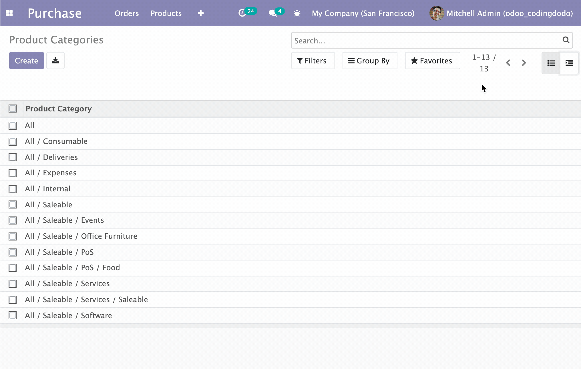
We will create a new type of view that will display parent/child models types in a hierarchical, interactive manner. I have to be honest I'm not a big fan of the way Odoo displays the Product Categories, I would prefer to see them in a hierarchical tree so this is exactly what we are building.
The source code for this part of the tutorial is available here and you can clone directly that branch:
git clone -b basic-rendering-component https://github.com/Coding-Dodo/owl_tutorial_views.gitOr, better you can follow along with this tutorial, create and modify files one by one as we go.
Overview of the Module architecture
This is the file architecture of our new module.
├── LICENSE
├── README.md
├── README.rst
├── __init__.py
├── __manifest__.py
├── models
│   ├── __init__.py
│   └── ir_ui_view.py
├── static
│   ├── description
│   │   └── icon.png
│   └── src
│       ├── components
│       │   └── tree_item
│       │       ├── TreeItem.js
│       │       ├── TreeItem.xml
│       │       └── tree_item.scss
│       ├── owl_tree_view
│       │   ├── owl_tree_controller.js
│       │   ├── owl_tree_model.js
│       │   ├── owl_tree_renderer.js
│       │   ├── owl_tree_view.js
│       │   └── owl_tree_view.scss
│       └── xml
│           └── owl_tree_view.xml
└── views
    └── assets.xml
From that typical Odoo structure, we can note that:
- All our JS logic lives in the /static/src folder
- OWL Components live inside the
componentsfolder and each component has its own folder to host the JS File (Actual OWL Component), the XML template, and the styling in the SCSS file. - The actual Odoo View is inside the
owl_tree_viewfolder and is split into 4 files for the 4 parts: the Model, the Renderer, the Controller, and the View.
Registering a new view type in the ir.ui.view Model.
First, let's take the python out of the way, we will register a new View type on the ir.ui.view Model. So let's create a file in the models folder called ir_ui_view.py with this content:
from odoo import fields, models


class View(models.Model):
    _inherit = "ir.ui.view"

    type = fields.Selection(selection_add=[("owl_tree", "OWL Tree Vizualisation")])
We expand the Selection Field called type with a new tuple of values. Our type of view will be called "owl_tree", feel free to choose anything you'd like, but try to stay descriptive and simple. Don't forget to add and update your __init__.py files inside the models' folder and the root folder.
Adding the assets to the assets_backend view
Even if the JavaScript files are not created yet, let's call them inside the assets_backend view that we will be extending.
Create a assets.xml file inside the views folder of the module with that content:
<?xml version="1.0" encoding="utf-8"?>
<odoo>
    <template id="assets_backend" name="assets_backend" inherit_id="web.assets_backend">
        <xpath expr="." position="inside">
            <script type="text/javascript" src="/owl_tutorial_views/static/src/components/tree_item/TreeItem.js"></script>

            <script type="text/javascript" src="/owl_tutorial_views/static/src/owl_tree_view/owl_tree_view.js"></script>
            <script type="text/javascript" src="/owl_tutorial_views/static/src/owl_tree_view/owl_tree_model.js"></script>
            <script type="text/javascript" src="/owl_tutorial_views/static/src/owl_tree_view/owl_tree_controller.js"></script>
            <script type="text/javascript" src="/owl_tutorial_views/static/src/owl_tree_view/owl_tree_renderer.js"></script>
        </xpath>
        <xpath expr="link[last()]" position="after">
            <link rel="stylesheet" type="text/scss" href="/owl_tutorial_views/static/src/components/tree_item/tree_item.scss"/>
            <link rel="stylesheet" type="text/scss" href="/owl_tutorial_views/static/src/owl_tree_view/owl_tree_view.scss"/>
        </xpath>
    </template>
</odoo>
We added the JavaScript file with the XPath expression "." (root) and the SCSS files are added via the XPath expression link[last()] meaning that we will search for other <link rel="stylesheet" src="..."/> declaration and place ours after the last one.
For the XML Qweb templates for the OWL Components and the OWL Renderer, we need to add them inside the __manifest__.py of our module:
{
    "name": "Coding Dodo - OWL Tutorial Views",
    "summary": "Tutorial about Creating an OWL View from scratch.",
    "author": "Coding Dodo",
    "website": "https://codingdodo.com",
    "category": "Tools",
    "version": "14.0.1",
    "depends": ["base", "web", "mail", "product"],
    "qweb": [
        "static/src/components/tree_item/TreeItem.xml",
        "static/src/xml/owl_tree_view.xml",
    ],
    "data": [
        "views/assets.xml",
        "views/product_views.xml",
    ],
}
You can see that we inherited the product module and also added product_views.xml. This is not necessary, it will only help us see our module in action:
<?xml version="1.0" encoding="utf-8"?>
<odoo>

    <record id="product_category_view_owl_tree_view" model="ir.ui.view">
        <field name="name">Product Categories</field>
        <field name="model">product.category</field>
        <field name="arch" type="xml">
            <owl_tree></owl_tree>
        </field>
    </record>

    <record id='product.product_category_action_form' model='ir.actions.act_window'>
        <field name="name">Product Categories</field>
        <field name="res_model">product.category</field>
        <field name="view_mode">tree,owl_tree,form</field>
    </record>

</odoo>This is a typical example of how you will be able to call our new View type on any model. Notice that the <owl_tree></owl_tree> tag corresponds to the newly added type on ir.ui.view Model. You have to:
- Update the
ir.actions.act_windowto include your newly created "view mode" inside the tag<field name="view_mode">. - Create the actual
ir.ui.viewcalling your View in its XML arch.
Creating the View, Model, Controller and, Renderer.
Begin by creating a folder that will hold the 4 elements of our view and an XML folder to hold the QWeb Templates, inside the root folder src:
├── owl_tree_view
│   ├── owl_tree_controller.js
│   ├── owl_tree_model.js
│   ├── owl_tree_renderer.js
│   ├── owl_tree_view.js
│   └── owl_tree_view.scss
└── xml
└── owl_tree_view.xmlThe Controller
Inside the file owl_tree_controller.js we will create our OWLTreeController that extends AbastractController that we saw in part 1 of the Tutorial:
odoo.define("owl_tutorial_views.OWLTreeController", function (require) {
  "use strict";

  var AbstractController = require("web.AbstractController");

  var OWLTreeController = AbstractController.extend({
    custom_events: _.extend({}, AbstractController.prototype.custom_events, {}),

    /**
     * @override
     * @param parent
     * @param model
     * @param renderer
     * @param {Object} params
     */
    init: function (parent, model, renderer, params) {
      this._super.apply(this, arguments);
    }
  });

  return OWLTreeController;
});
For now, this Controller does nothing really, init just calls the parent function and no custom_events are created for now, but we will get to it later.
The Model
Inside the file owl_tree_model.js, we will create our OWLTreeModel, which will make the call to the server.
The model inherits the AbstractModel Class and will implement the basic essential functions to make our view works:
- The
__loadfunction (called the first time) will fetch data from the server. - The
__reloadfunction called by the Controller when any change in the state of the UI occurs. This will also fetch data from the server. - The
__getfunction to give data back to the Controller and be passed to our OWL Renderer.
odoo.define("owl_tutorial_views.OWLTreeModel", function (require) {
  "use strict";

  var AbstractModel = require("web.AbstractModel");

  const OWLTreeModel = AbstractModel.extend({

    __get: function () {
      return this.data;
    },

    __load: function (params) {
      this.modelName = params.modelName;
      this.domain = [["parent_id", "=", false]];
      // this.domain = params.domain;
      // It is the better to get domains from params
      // but we will evolve our module later.
      this.data = {};
      return this._fetchData();
    },

    __reload: function (handle, params) {
      if ("domain" in params) {
        this.domain = params.domain;
      }
      return this._fetchData();
    },

    _fetchData: function () {
      var self = this;
      return this._rpc({
        model: this.modelName,
        method: "search_read",
        kwargs: {
          domain: this.domain,
        },
      }).then(function (result) {
        self.data.items = result;
      });
    },
  });

  return OWLTreeModel;
});
Since we want to make RPC calls in the load and the reload function we decided to extract that logic to a fetchData function that will do the actual rpc call.
The params argument of the load and reload functions contains a lot of info, notably the domain that we could use. But we have to be careful because without enough logic it could break our code. We will keep it simple right now, the view needs to show the Root category and then show the child under so the domain is set explicitly to [["parent_id", "=", false]] for now.
Notice that we store the result of that server request to data.items. This is important because later you will see that the OWL Renderer gets access to multiple data via props that get merged into a big JS Object. So it will make our life easier later to directly store the result of the RPC call into the item key of the data.
The OWL Renderer
Now we will create our first OWL Component, the Renderer of our view inside the file owl_tree_renderer.js. It will not extend the usual Component but the AbstractRendererOwl Component instead.
odoo.define("owl_tutorial_views.OWLTreeRenderer", function (require) {
  "use strict";

  const AbstractRendererOwl = require("web.AbstractRendererOwl");
  const patchMixin = require("web.patchMixin");
  const QWeb = require("web.QWeb");
  const session = require("web.session");

  const { useState } = owl.hooks;

  class OWLTreeRenderer extends AbstractRendererOwl {
    constructor(parent, props) {
      super(...arguments);
      this.qweb = new QWeb(this.env.isDebug(), { _s: session.origin });
      this.state = useState({
        localItems: props.items || [],
      });
    }

    willUpdateProps(nextProps) {
      Object.assign(this.state, {
        localItems: nextProps.items,
      });
    }
  }

  const components = {
    TreeItem: require("owl_tutorial_views/static/src/components/tree_item/TreeItem.js"),
  };
  Object.assign(OWLTreeRenderer, {
    components,
    defaultProps: {
      items: [],
    },
    props: {
      arch: {
        type: Object,
        optional: true,
      },
      items: {
        type: Array,
      },
      isEmbedded: {
        type: Boolean,
        optional: true,
      },
      noContentHelp: {
        type: String,
        optional: true,
      },
    },
    template: "owl_tutorial_views.OWLTreeRenderer",
  });

  return patchMixin(OWLTreeRenderer);
});
This Renderer will be instantiated with props that will contain the items fetched from the server by the Model. The other props passed and present are examples of what can be passed.
In our Component, we declare a local state via the useState hook that contains a "local version" of the items. This is not necessary in that situation but this is an example to show you that your Renderer can have a local state copied from the props and then independent!
Inside the willUpdateProps function, we update the localItems with the new value of items fetched from the server. The willUpdateProps function will be called by the Controller every time the UI change or new data has been loaded from the server.
willUpdateProps is the key piece of reactivity that will make our OWL View react to different elements of the UI like the Control Panel, the reload button, etc...
The QWeb Template for the renderer
Inside /src/xml we create the OWL Template for the renderer, the file will be called owl_tree_view.xml:
<?xml version="1.0" encoding="UTF-8"?>
<templates xml:space="preserve">

    <div t-name="owl_tutorial_views.OWLTreeRenderer" class="o_owl_tree_view" owl="1">
        <div class="d-flex p-2 flex-row owl-tree-root">
            <div class="list-group">
                <t t-foreach="props.items" t-as="item">
                    <TreeItem item="item"/>
                </t>
            </div>
        </div>
    </div>

</templates>
This is a basic template with a foreach loop on the items, here you can see that we use a custom TreeItem OWL Component that we will create later.
The View
Finally, we will create the View that extends the AbstractView. It will be responsible for instantiating and connecting the Model, Renderer, and Controller.
Create the file owl_tree_view.js with that content:
odoo.define("owl_tutorial_views.OWLTreeView", function (require) {
  "use strict";

  // Pulling the MVC parts
  const OWLTreeController = require("owl_tutorial_views.OWLTreeController");
  const OWLTreeModel = require("owl_tutorial_views.OWLTreeModel");
  const OWLTreeRenderer = require("owl_tutorial_views.OWLTreeRenderer");
  const AbstractView = require("web.AbstractView");
  const core = require("web.core");
  // Our Renderer is an OWL Component so this is needed
  const RendererWrapper = require("web.RendererWrapper");
  const view_registry = require("web.view_registry");

  const _lt = core._lt;

  const OWLTreeView = AbstractView.extend({
    accesskey: "m",
    display_name: _lt("OWLTreeView"),
    icon: "fa-indent",
    config: _.extend({}, AbstractView.prototype.config, {
      Controller: OWLTreeController,
      Model: OWLTreeModel,
      Renderer: OWLTreeRenderer,
    }),
    viewType: "owl_tree",
    searchMenuTypes: ["filter", "favorite"],

    /**
     * @override
     */
    init: function () {
      this._super.apply(this, arguments);
    },

    getRenderer(parent, state) {
      state = Object.assign(state || {}, this.rendererParams);
      return new RendererWrapper(parent, this.config.Renderer, state);
    },
  });

  // Make the view of type "owl_tree" actually available and valid
  // if seen in an XML or an action.
  view_registry.add("owl_tree", OWLTreeView);

  return OWLTreeView;
});
As you can see, this is a very classic definition of a View in JavaScript Odoo. The special part is inside the getRenderer function where we will return our OWL Component wrapped with the RendererWrapper
getRenderer(parent, state) {
    state = Object.assign(state || {}, this.rendererParams);
    // this state will arrive as "props" inside the OWL Component
    return new RendererWrapper(parent, this.config.Renderer, state);
},
Notice also that, again we use the same view_type name that is owl_tree that we choose at the beginning and add it to the view registry.
Adding some CSS
In the folder of our view, create an scss file called owl_tree_view.scss with this content:
.owl-tree-root {
  width: 1200px;
  height: 1200px;
}
This will help us visualize correctly our view.
That's it for the basic structure of our view, we have all the MVC components created and will now have to handle the TreeItem component that will represent an Item (or a Category in our example on product categories).
The TreeItem OWL Component
Let's handle the TreeItem component that will represent a node in our hierarchical tree view. An item will have child_id (standard field for parent/child models) and have a children property also, containing the children in Object form.
We will create a components folder and inside that, there will be the different files for our TreeItem Component:
.
├── components
│   └── tree_item
│       ├── TreeItem.js
│       ├── TreeItem.xml
│       └── tree_item.scss
The Template
We will begin with the Template, which will indicate how we would like the information to be displayed before coding the JavaScript component. It is sometimes beneficial to code the desired end result first so our JavaScript implementation will then follow that wishful thinking.
<?xml version="1.0" encoding="UTF-8"?>
<templates xml:space="preserve">
    <t t-name="owl_tutorial_views.TreeItem" owl="1">
        <div class="tree-item-wrapper">
            <div class="list-group-item list-group-item-action d-flex justify-content-between align-items-center owl-tree-item">
                <span t-esc="props.item.display_name"/>
                <span class="badge badge-primary badge-pill" t-esc="props.item.product_count">4</span>
            </div>
            <t t-if="props.item.child_id.length > 0">
                <div class="d-flex pl-4 py-1 flex-row treeview" t-if="props.item.children and props.item.children.length > 0">
                    <div class="list-group">
                        <t t-foreach="props.item.children" t-as="child_item">
                            <TreeItem item="child_item"/>
                        </t>
                    </div>
                </div>
            </t>
        </div>
    </t>
</templates>
As you can see, this is a recursive component. If the TreeItem has child_id array set and with items, it will loop over the children and call itself:
<t t-foreach="props.item.children" t-as="child_item">
	<TreeItem item="child_item"/>
</t>
The rest of the Component template is not that interesting, it is standard bootstrap 4 classes and markup.
The TreeItem.js Component
odoo.define(
  "owl_tutorial_views/static/src/components/tree_item/TreeItem.js",
  function (require) {
    "use strict";
    const { Component } = owl;
    const patchMixin = require("web.patchMixin");

    const { useState } = owl.hooks;

    class TreeItem extends Component {
      /**
       * @override
       */
      constructor(...args) {
        super(...args);
        this.state = useState({});
      }
    }

    Object.assign(TreeItem, {
      components: { TreeItem },
      props: {
        item: {},
      },
      template: "owl_tutorial_views.TreeItem",
    });

    return patchMixin(TreeItem);
  }
);
Here also you can see that the Component is recursive because its own components are made of itself.
We declared a state here but it is not used... yet! The rest of the Component is very classic OWL Component definition in Odoo.
If you are coming from the tutorial about using OWL as a standalone modern JavaScript library you may notice some differences, like not defining static properties on the Component. This is due to the fact that from Odoo we don't have access to Babel that will transpile our ES6/ESNext JavaScript syntax to standard output. So we use Object.assign to assign the usual static properties of the component like components, template or props.
Adding the SCSS Styles
We have to create another SCSS file for that component: tree_item.scss that will contain this class style rules:
.tree-item-wrapper {
  min-width: 50em;
}
What's Next
Now we should have a working module already. If you followed this tutorial, you can go into Purchase / Configuration / Products / Products Categories to see our view in action:
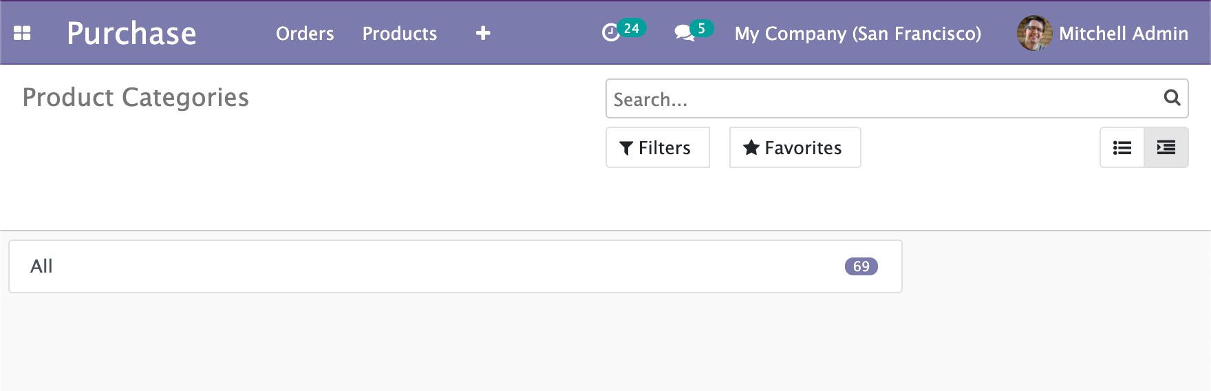
But the problem is that only the Root category is shown and nothing else. If we take a look at what is given as a prop to our TreeItem we see that:
{
    "id": 1,
    "name": "All",
    "complete_name": "All",
    "parent_id": false,
    "parent_path": "1/",
    "child_id": [
        9,
        12,
        3,
        4,
        2
    ],
    "product_count": 69,
    "display_name": "All",
    // Other odoo fields
}
There is a child_id property containing the IDs of the child items but it is just an array of integers for now.
What we will do is create another property called children that will be an array of Objects like the parent that we will fetch from the Server. The goal is to fill this same global items object that will contain all the nested children.
Clicking on a TreeItem to fetch and display the Children
Introduction
We have to evolve our TreeItem component, and these are the main guidelines:
- The TreeItem component should have a boolean
childrenVisiblein its state that will be used in the template to check if the TreeItem's children are visible or not. - The TreeItem component should be clickable if it has children, to open it.
- The TreeItem component should trigger an event to indicate that we need to fetch data from the server: getting children as full objects.
- The TreeItem should display a little arrow/caret if it is expanded or collapsed.
Updating the TreeItem template
We will change the way the name of the TreeItem is displayed, if the Item has children it will be a link with a bound action, or else it will be a regular span. Change the <span t-esc="props.item.display_name"/> for that:
<a href="#" t-on-click.stop.prevent="toggleChildren" t-if="props.item.child_id.length > 0">
    <t t-esc="props.item.display_name"/>
    <i t-attf-class="pl-2 fa {{ state.childrenVisible ? 'fa-caret-down': 'fa-caret-right'}}" ></i>
</a>
<span t-else="">
    <t t-esc="props.item.display_name"/>
</span>
As you can see we also do the caret-down/caret-right logic with the childrenVisible boolean that we will soon add to the TreeItem Component.
We also declared the function toggleChildren as a handler for the click action with t-on-click.stop.prevent="toggleChildren". The .stop and .prevent are OWL little useful shortcuts directives so we don't have to write in our function the usual event.preventDefault or stopPropagation.
We also update the wrapper around the for each loop for the children to only show if the boolean childrenVisible is at true:
<t t-if="props.item.child_id.length > 0">
    <div class="d-flex pl-4 py-1 flex-row treeview" t-if="props.item.children and props.item.children.length > 0 and state.childrenVisible">
        <div class="list-group">
            <t t-foreach="props.item.children" t-as="child_item">
                <TreeItem item="child_item"/>
            </t>
        </div>
    </div>
</t>
For now, props.item.children is always empty because it doesn't exist in the standard response coming from the server. We have to add it ourselves to the result when the intention to fetchData is resolved.
Adding "toggleChildren" function to the TreeItem Component.
Now we update our Component to have "childrenVisible" in its state and, we add the "toggleChildren" function:
odoo.define(
  "owl_tutorial_views/static/src/components/tree_item/TreeItem.js",
  function (require) {
    "use strict";
    const { Component } = owl;
    const patchMixin = require("web.patchMixin");

    const { useState } = owl.hooks;

    class TreeItem extends Component {
      /**
       * @override
       */
      constructor(...args) {
        super(...args);
        this.state = useState({
          childrenVisible: false,
        });
      }

      toggleChildren() {
        if (
          this.props.item.child_id.length > 0 &&
          this.props.item.children == undefined
        ) {
          this.trigger("tree_item_clicked", { data: this.props.item });
        }
        Object.assign(this.state, {
          childrenVisible: !this.state.childrenVisible,
        });
      }
    }

    Object.assign(TreeItem, {
      components: { TreeItem },
      props: {
        item: {},
      },
      template: "owl_tutorial_views.TreeItem",
    });

    return patchMixin(TreeItem);
  }
);
The toggleChildren function first checks if the children are already filled. If not, it will trigger an event named "tree_item_clicked". Then it toggles the state "childrenVisible".
Catching the custom event in the Controller
Inside our owl_tree_controller.js:
odoo.define("owl_tutorial_views.OWLTreeController", function (require) {
  "use strict";

  var AbstractController = require("web.AbstractController");

  var OWLTreeController = AbstractController.extend({
    // We register the custom_events here
    custom_events: _.extend({}, AbstractController.prototype.custom_events, {
      // The TreeItem event we triggered
      tree_item_clicked: "_onTreeItemClicked",
    }),

    /**
     * @override
     * @param parent
     * @param model
     * @param renderer
     * @param {Object} params
     */
    init: function (parent, model, renderer, params) {
      this._super.apply(this, arguments);
    },

    /**
     * When an item is clicked the controller call the Model to fetch
     * the item's children and display them in the tree via the call
     * to the update() function.
     *
     * @param {Object} ev
     * @param {Object} ev.data contains the payload
     */
    _onTreeItemClicked: async function (ev) {
      ev.stopPropagation();
      await this.model.expandChildrenOf(
        ev.data.data.id,
        ev.data.data.parent_path
      );
      this.update({}, { reload: false });
    },
  });

  return OWLTreeController;
});
We registered custom events with exactly the same name as the event we fired from the OWL TreeItem Component, and bind it to a function.
_onTreeItemClicked is an async function but it will wait for the model RPC call via the await keyword before it triggers its rendering update with the update call.
This Model function expandChildrenOf doesn't exist yet on our Model so we will create it.
Fetching children from the Model and placing it in the tree.
Our expandChildrenOf function will take 2 parameters:
- The actual ID of the item we want to expand (example category ID)
- The
parent_pathof the item. Parent Path is a string representation of the nesting position of the item.
For example, let's say you have a category of id 321, that has a parent of id 23. And, category 23 has a parent of id 2.
Then the parent_path of the item will be "2/23/321/".
The parent_path will be our saving grace to actually navigate the tree and find the node we want relatively quickly, or at least without going through every branche recursively to find one item.
Add these new functions to owl_tree_model.js
  const OWLTreeModel = AbstractModel.extend({
    /**
     * Make a RPC call to get the child of the target itm then navigates
     * the nodes to the target the item and assign its "children" property
     * to the result of the RPC call.
     *
     * @param {integer} parentId Category we will "open/expand"
     * @param {string} path The parent_path represents the parents ids like "1/3/32/123/"
     */
    expandChildrenOf: async function (parentId, path) {
      var self = this;
      await this._rpc({
        model: this.modelName,
        method: "search_read",
        kwargs: {
          domain: [["parent_id", "=", parentId]],
        },
      }).then(function (children) {
        var target_node = self.__target_parent_node_with_path(
          path.split("/").filter((i) => i),
          self.data.items
        );
        target_node.children = children;
      });
    },

    /**
     * Search for the Node corresponding to the given path.
     * Paths are present in the property `parent_path` of any nested item they are
     * in the form "1/3/32/123/" we have to split the string to manipulate an Array.
     * Each item in the Array will correspond to an item ID in the tree, each one
     * level deeper than the last.
     *
     * @private
     * @param {Array} path for example ["1", "3", "32", "123"]
     * @param {Array} items the items to search in
     * @param {integer} n The current index of deep inside the tree
     * @returns {Object|undefined} the tree Node corresponding to the path
     **/
    __target_parent_node_with_path: function (path, items, n = 0) {
      for (const item of items) {
        if (item.id == parseInt(path[n])) {
          if (n < path.length - 1) {
            return this.__target_parent_node_with_path(
              path,
              item.children,
              n + 1
            );
          } else {
            return item;
          }
        }
      }
      return undefined;
    },
The function to expand children is very straightforward, it will fetch items from the model with the domain containing parent_id as the current item. Then the tricky part is to "open/expand" the node inside self.data.items.
The function __target_parent_node_with_path will actually explore the self.data.items until it finds the item we are currently opening. When it finds that node it will return it.
This returned item is a direct reference to the item inside the global data.items of the Model.
So when we fill the children with target_node.children = children we are actually updating the global this.data.items of the Model class. Meaning that when the Controller updates, it will also pass the new opened items to the OWL Renderer as props.
With that done, we connected every piece necessary to handle the click on the Item, try your module and check if it is working:
Making the "count badge pill field" dynamic
You may have noticed that in our first iteration of this view the TreeItem Component Template was actually displaying the count badge like that:
<span class="badge badge-primary badge-pill" t-esc="props.item.product_count">4</span>We are working with categories as an example but this implementation is problematic because we are using a field named product_count that doesn't exist on other Models.
We would like our View to be usable on any model that has parent/child relationships, but we don't want to force the presence of any other field than the basic Odoo ones.
Getting XML attrs from templates into the Renderer.
Let's update our product_views.xml file to actually write the end result we would like to work with:
    <record id="product_category_view_owl_tree_view" model="ir.ui.view">
        <field name="name">Product Categories</field>
        <field name="model">product.category</field>
        <field name="arch" type="xml">
            <owl_tree count_field="product_count"></owl_tree>
        </field>
</record>You actually have access to the attributes passed inside the XML like that from the Renderer. To do so we will edit our owl_tree_renderer.js:
  class OWLTreeRenderer extends AbstractRendererOwl {
    constructor(parent, props) {
      super(...arguments);
      this.qweb = new QWeb(this.env.isDebug(), { _s: session.origin });
      this.state = useState({
        localItems: props.items || [],
        countField: "",
      });
      if (this.props.arch.attrs.count_field) {
        Object.assign(this.state, {
          countField: this.props.arch.attrs.count_field,
        });
      }
    }
The props contain the XML arch data already transformed into a JavaScript object and filled with the attrs key.
The attrs are the attributes that we would add inside our XML Markup, so here we check if a count_field is defined, and if so, we assign it to the state.
We also update the owl_tree_view.xml file to pass the newly created countField.
<div t-name="owl_tutorial_views.OWLTreeRenderer" class="o_owl_tree_view" owl="1">
    <div class="d-flex p-2 flex-row owl-tree-root">
        <div class="list-group">
            <t t-foreach="props.items" t-as="item">
                <TreeItem item="item" countField="state.countField"/>
            </t>
        </div>
    </div>
</div>
Using the count_field in the TreeItem Components
Let's go back into our TreeItem.js and declare a new prop:
Object.assign(TreeItem, {
  components: { TreeItem },
  props: {
    item: {},
    countField: "", // Comming from the view arch
  },
  template: "owl_tutorial_views.TreeItem",
});
And now we replace the usage inside the QWeb template TreeItem.xml to use the actual dynamic field from the attrs.
<span
    t-if="props.countField !== '' and props.item.hasOwnProperty(props.countField)"
    class="badge badge-primary badge-pill"
    t-esc="props.item[props.countField]">
</span>
We first check if countField is filled with something else than an empty string. Then, we check if it also is present as a property on our item Object to avoid errors with the hasOwnProperty object method.
If everything is okay, we can access the property dynamically via the []operator on a JS Object.
owl.__info__.
For this tutorial, the code is working on any OWL version >= 1.2.4. 1.2.3 Is known to not work so please consider updating your Odoo or changing the owl.js file.Conclusion
We now have a functional OWL View that we created from scratch. The problem is that this view doesn't really do anything and is purely presentation for now. We have to add some interactivity to that View!
But that's enough for that part of the tutorial. The source code for this chapter is available here and you can clone directly that branch to continue exactly where we stopped here with git:
git clone -b basic-rendering-component https://github.com/Coding-Dodo/owl_tutorial_views.gitAs I showed you in the introductory screenshot there will be drag and drop to handle the parent_id change of items in a pleasant manner. You can already try to do it by yourself, and if you are very curious the code is actually already here on the main branch.
In the next part we will:
- Integrate the drag and drop functionality with the help of the standard HTML Drag and Drop API. We will see how to listen to these events in OWL Component and handle data fetching.
- You may have noticed some weird behavior when you reload the View, like the tree node staying opened. We will implement a
resetStatefunction to handle these cases. - Finally, we may expand the functionalities of our View to let the user do more editing.
The next part will be subscriber-only, so consider joining us!
]]>
In this series, we will go over the basics of the Odoo JavaScript Framework with the end goal to create a view from scratch in OWL.
As of Odoo 14 (and still a big part of Odoo 15), the core JavaScript MVC system in Odoo has not been yet rewritten in OWL. So it is necessary for us to understand better each part so our development flow will be better later and we will be able to understand the different bugs and roadblocks that may arise.
We will look at the MVC Architecture of Odoo soon but first, we have to take a look at the two pillars of JavaScript classes that every piece is built upon the core 'web.Class' and the core 'web.Widget'.
The core web.Class of Odoo
The web.Class defined in odoo/addons/web/static/src/js/core/class.js is a very old piece of code (ES6 Classes were not here yet) in the Odoo JavaScript Framework that makes the whole system of inheritance possible. The web.Class is at the basis of most other classes in the Odoo JavaScript Framework, except for the OWL Components that are pure ES6 Classes.
It was inspired by this 2008 article by John Resig where he presents his solution to inheritance in JavaScript via a function prototype system.
I wanted to go about extracting the soul of these techniques [Prototype and base2] into a simple, re-usable, form that could be easily understood and didn’t have any dependencies. Additionally I wanted the result to be simple and highly usable
- John Resig
The John Resig version was a single inheritance system that Odoo improved to add support for mixins:
function OdooClass(){}

// defining the extend function
OdooClass.extend = function() {
    var _super = this.prototype;
    // Support mixins arguments
    var args = _.toArray(arguments);
    args.unshift({});
    var prop = _.extend.apply(_,args);
    // ...
    // rest of the definition
}
This makes it possible for Odoo to do things like:
var Class = require('web.Class');
var mixins = require('web.mixins');
var ServicesMixin = require('web.ServicesMixin');


var MyCustomClass = core.Class.extend(mixins.PropertiesMixin, ServicesMixin, {
    myProperty: 'test'
    // ...
}
Odoo also, unfortunately, added the new function include that modifies the prototype of the original "class". To simplify it, include is a dangerous function that will modify "in place" the behavior of a method way up into its parents, it was not in the original design but was a necessary evil in the Odoo "modular" ecosystem.
.extend() and .include on every Odoo JavaScript Widgets and so on.
The web.Widget Odoo Class.
The Widget Class extends the core web.Class and is tightly coupled with its DOM representation and JQuery.
var Widget = core.Class.extend(mixins.PropertiesMixin, ServicesMixin, {
    // Backbone-ish API
    tagName: 'div',
    id: null,
    className: null,
    attributes: {},
    events: {},
    // Rest of the class' properties and functions
}
By extending the core web.Class this Widget class can have 2 mixins, the PropertiesMixin and the ServicesMixin.
The web.Widget extends the PropertiesMixin
Let's take a quick look at these mixins, first, the PropertiesMixin is supposed to... handle properties ? but it also extends the EventDispatcherMixin ! This is what actually gives the web.Widget class the possibility to trigger events, etc...
And if you want to see something quite funny, inside the PropertiesMixin there is this beautiful piece of code with comments (I did not edit anything, that comment is still in source code of Odoo 14).
// seriously, why are you doing this? it is obviously a stupid design.
// the properties mixin should not be concerned with handling fields details.
// this also has the side effect of introducing a dependency on utils.  Todo:
// remove this, or move it elsewhere.  Also, learn OO programming.
if (key === 'value' && self.field && self.field.type === 'float' && tmp && val){
    var digits = self.field.digits;
    if (_.isArray(digits)) {
        if (utils.float_is_zero(tmp - val, digits[1])) {
            return;
        }
}I enjoy good old dev banter in the code, anyway the more interesting fact is the underlying extend to the EventDispatcherMixin giving, in the end, the ability to the web.Widget to have the trigger_up function and the various on, of, once events binding on the prototype.
The EventDispatcherMixin itself extends the ParentedMixin ! This mixin gives access to function like getParent and, getChildren, and, also handle the destroying of children when a parent is destroyed.
The web.Widget extends the ServicesMixin
This mixin gives the Widget abilities to loadViews, do_action, get_session, and make RPC calls via the _rpc function.
The funny part about, for example, the do_action (same with the get_session, loadViews, etc, except the _rpc) is what it does:
do_action: function (action, options) {
    var self = this;
    return new Promise(function (resolve, reject) {
        self.trigger_up('do_action', {
            action: action,
            options: options,
            on_success: resolve,
            on_fail: reject,
        });
    });
},
We can see that the do_action is just a shortcut to actually bubble up the event via a trigger_up...
But this mixin doesn't extend the EventDispatcherMixin ? and still depends on the fact that a trigger_up function should be present! So in reality you cannot use all the functions of this ServicesMixin without also pulling the EventsDispatcherMixin into your class.
Anyway, I will stop here because you get the idea, this is not the best architectural work done out there.
Let's recap this mixins mess, so what can the web.Widget do ?
To make a summary of the inheritance tree, the web.Widget has access to:
- The ParentedMixin for
getChildren,getParent, etc - The EventDispatcherMixin to handle events and
trigger_up - The PropertiesMixin to
getandset - The ServicesMixin to make RPC calls, call actions, load views, etc.
The actual content of the web.Widget class
Besides what it extends, the web.Widget main purpose is to render itself with QWeb, do its life cycle management (destroy when parents are destroyed or destroying children when it is destroyed), and inserting itself into the DOM.
The web.Widget has Backbone inspired properties visible in the class like tagName, id, className, attributes, events, and template that we saw earlier but also other properties that will get filled by the modular nature of Odoo.
The xmlDependencies, cssLibs, jsLibs and assetLibs that are lists of files, paths, xml_id to fetch before the Widget can be rendered (It will not load anything that hasn't already been loaded).
The web.Widget class also has 2 hidden properties that get filled during its lifecycle:
elis DOM Element set when calling thesetElementfunction, called for example when the Widget is attached to the DOM via theattachTofunction.$elis the JQuery version of that element
this.$el or this.el at the wrong time of the Widget lifecycle you will probably see undefined when debugging! These 2 properties are only present after a call to the function renderElement or an attachTo.
Rendering itself with QWeb
The widget renders itself with its renderElement function:
renderElement: function () {
    var $el;
    if (this.template) {
        $el = $(core.qweb.render(this.template, {widget: this}).trim());
    } else {
        $el = this._makeDescriptive();
    }
    this._replaceElement($el);
},
Lifecycle
The Life cycle goes init -> willStart ->[rendering]-> start -> destroy. In the init, the parent and children are set, the willStart will do asynchronous work to load XML Views or Libs, rendering will happen by a call via other parts of the Framework, start will be different for each implementation and destroy will remove the $el from the DOM and clean up the children.
Inserting itself into the DOM
To insert the widget to the DOM, the Widget gives us access to public functions like appendTo, attachTo, insertAfter, insertBefore, and prependTo that all takes a jQuery element as an argument and do the work corresponding to their name.
Conclusion
That's it for the core classes of the Framework, the web.Widget is one of the most important pieces of the Framework, I would advise you to take time to dive into the source code, read again our explanation and take a look at the updated Odoo documentation about the web.Widget class.
The Odoo JavaScript MVC overview
Now we will begin to talk about the JavaScript MVC architecture. I know that some of you may feel uncomfortable about having an MVC here, as maybe you would think that the WebClient in JavaScript is already the View where Python has the real M and C. But you should think about the WebClient as a separate single-page application that also needs its own MVC architecture.
The way Odoo implements MVC (Model View Controller) in its JavaScript client is heavily inspired by Backbone.js, but still different enough that it deserves its own Tutorial.
The MVC base Classes
We begin our analysis of the MVC Architecture in Odoo WebClient by going into the source code inside /odoo/addons/web/static/src/core/mvc.js.
This file defines the main 4 components of the Odoo vision of MVC; The Model, the Renderer, the Controller, and the Factory (Also known as the "View").
This is a quick overview of the mvc.js file for us to know what kind of classes these 4 elements are.
var Class = require('web.Class');
var mixins = require('web.mixins');
var ServicesMixin = require('web.ServicesMixin');
var Widget = require('web.Widget');

var Model = Class.extend(mixins.EventDispatcherMixin, ServicesMixin, {
	//...
})
var Renderer = Widget.extend({
    //...
})
var Controller = Widget.extend({
    //...
})
var Factory = Class.extend({
    config: {
        Model: Model,
        Renderer: Renderer,
        Controller: Controller,
    },
    //...
})
The Model controls the state, it will call the server via RPC to fetch data, update it, and create it. The Model doesn't extend the Widget class but the base core.web.Class, has no view representation and is only responsible for the state of the data.
The Renderer is extending the Widget Class and its sole responsibility is to display something to the end-user via rendering things to the DOM. It doesn't have direct access to the Model, it renders itself by order of the Controller, and should be able to capture events, like click, to dispatch them to the Controller.
The Controller is the coordinator between the Renderer and the Model. The Controller also receives events from other elements like the search bar or the pagination and should be able to update itself (and trigger an update to the Renderer also). The Controller owns the Model and the Renderer.
The Factory (or View) inits all the other Components with the correct parameters that it gets from the route URL. The Factory's main job is to instantiate the Controller with the Model and the Renderer passed as params. As soon as the Controller is started the Factory has no use anymore.
The Abstract classes of the MVC Architecture
The implementation we just saw inside this mvc.js file of the 4 components is very minimal. The whole file clocks at 250 lines so it will not be very productive to analyze them.
The actual basis of MVC in Odoo is separated into 4 files that extend these 4 mvc components. They can be found inside addons/web/static/src/js/views root folder:
- AbstractModel (abstractmodel.js)
- AbstractRenderer (abstractrenderer.js)
- AbstractController (abstractcontroller.js)
- AbstractView (abstractview.js)
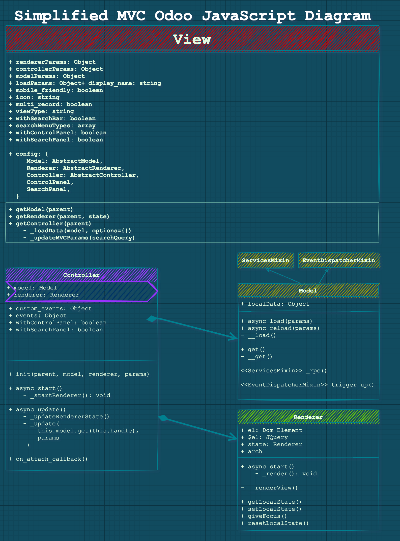
To really understand what each of the MVC components do we will look at these files one by one. I will call them Model instead of AbstractModel, Renderer instead of AbstractRenderer, etc... so it will be easier to follow. Because knowing how they works will be sufficient enough for us in the objective of creating OWL Views.
The Model
The Model holds the state of the application and will directly talk to the server by making RPC calls to fetch data and process the result.
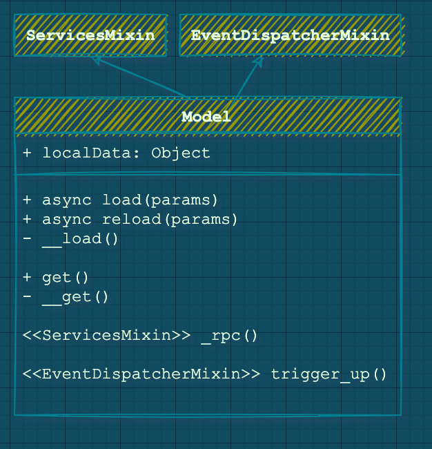
Basic functions of the Model Class load, reload and, get.
A Model has no UI implementation yet but, should answer to actions changed, initialization, etc. With 3 mains functions that you should be aware of:
The async load function.
This method is called at the initialization of the view and will be called only once. The actual function is not very interesting, it is an override to handle the case of empty records and the need to load «sample data».
We will not focus on "sample data" in this tutorial, but you have to know that some logic pieces inside these files are entirely dedicated to handling sample data.
async load(params) {
    this.loadParams = params;
    const handle = await this.__load(...arguments);
    await this._callSampleModel('__load', handle, ...arguments);
    return handle;
},
The params arg will contain:
- Info related to the fields and their types
- For example in the BasicModel: The type of the view, «list» for TreeViews, and «record» for FormViews
- For example in the BasicModel: The recordID, if on a single record view
The async reload function.
async reload(_, params) {
    const handle = await this.__reload(...arguments);
    if (this._isInSampleMode) {
        if (!this._haveParamsChanged(params)) {
            await this._callSampleModel('__reload', handle, ...arguments);
        } else {
            this.leaveSampleMode();
        }
    }
    return handle;
},
Very similar to the load function, the reload function is called when something in the UI changed and the data need to be refreshed. Typically, this function is called when you are in FormView mode and click on the arrows to go to the next/previous records or when you refresh.
Example with the BasicModel (used in Form/List Views)
BasicModel extends AbstractModel and is a real implementation of the abstract class, to make what we said earlier a bit more clear we will take a look at this example.
In «real» implementation like the BasicModel, the reload and loadfunction both end up calling another underlying function called __load(with 2 underscores) that does the actual data fetching and filling up info on the Class.
The underlying __load in BasicModel implementation
The actual heavy lifting is done in the __load function that will handle all the logic. For example, in the BasicModel (which extends the AbstractModel), the load is overridden to handle the cases of a «list» view type or a «record» view type.
It will create a local dataPoint object containing all the info via the _makeDataPoint function (this adds the data and other meta info like the name of the model, the offset, the "orderBy", etc.).
From this __load function, another _load (with 1 underscore this time !) will make the actual RPC Calls to the server.
At the exit of the function, the promise eventually resolves to an ID.
The get function for the data that will be rendered.
This get function will be called by the Controller and the result will be passed to the Renderer. This function will format data similarly to the dataPoint seen previously. Actually, the get function often calls an underlying __get function (like in the BasicModel) that is used across the Model inside the «makeDataPoint» function.
In the AbstractModel this function just return an empty Object but in the BasicModel this is what is returned to the Controller:
var record = {
    context: _.extend({}, element.context),
    count: element.count,
    data: data, // Contains the actual data and field values
    domain: element.domain.slice(0),
    evalModifiers: element.evalModifiers,
    fields: element.fields,
    fieldsInfo: element.fieldsInfo,
    getContext: element.getContext,
    getDomain: element.getDomain,
    getFieldNames: element.getFieldNames,
    id: element.id,
    isDirty: element.isDirty,
    limit: element.limit,
    model: element.model,
    offset: element.offset,
    ref: element.ref,
    res_ids: element.res_ids.slice(0),
    specialData: _.extend({}, element.specialData),
    type: 'record',
    viewType: element.viewType,
};
Notice the type property, with the BasicModel it will change between record for FormViews and list for ListViews (trees). This is the main condition checked in the BasicModel to handle the queries and type of results expected (list of ids or actual record).
The Renderer
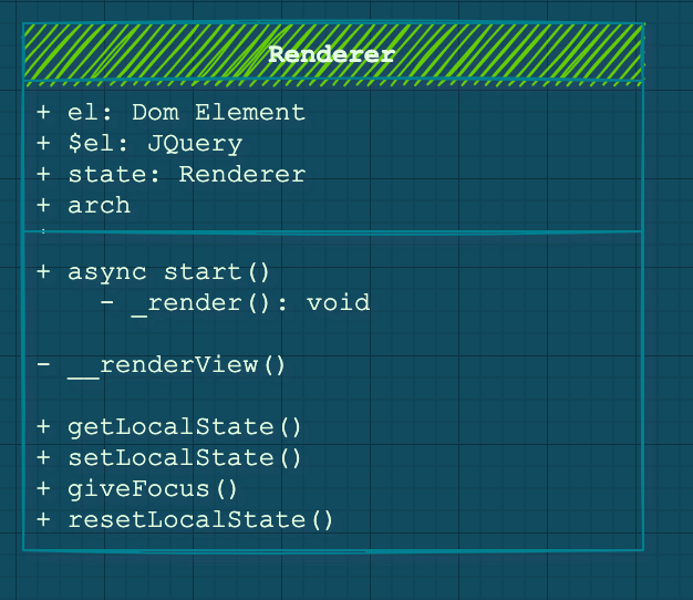
The Renderer is the equivalent of BackBone «Views» but was named differently, it is responsible for displaying the user interface, and react to user changes. In Odoo 14 you can have a « legacy » MVC Renderer that extends the AbstractRender, or you can create an OWL Renderer. The two are very different and don’t really have the same Interface or functionalities.
Legacy Renderer overview
We will not go too deep on the Legacy AbstractRenderer because our focus is on OWL for this lesson but we will have a quick overview.
The Legacy Renderer has the main function: _render that itself calls the underlying _renderView containing the logic of creating the UI.
This _render function is called in the async start method when the Renderer is attached and started by the Controller. It is also called each time the Controller requires a change of the state of the UI (like a pagination action, a refresh, next page, etc.) inside the async updateStatefunction.
When the Controller wants to update, the Renderer will set and give back his state with getLocalState and setLocalState. Before being detached the Renderer also has to reset its state via the resetLocalStatefunction to cleanup memory usage.
The OWL Renderer
The OwlRendererWrapper helps the Component answer to the standard interactions the Controller has with Renderer as we saw before with the Legacy version. For that matter the RendererWrapper exposes accessible functions that return nothing, just to not throw an error.
class RendererWrapper extends ComponentWrapper {
    getLocalState() { }
    setLocalState() { }
    giveFocus() { }
    resetLocalState() { }
}
These functions do nothing, they are here for the legacy code not to break. You need to override them yourself in the case of OWL Renderer. For example, the PivotRenderer actually overrides the resetLocalState to actually reset the OWL state of the Component:
_resetState() {
    // This check is used to avoid the destruction of the dropdown.
    // The click on the header bubbles to window in order to hide
    // all the other dropdowns (in this component or other components).
    // So we need isHeaderClicked to cancel this behaviour.
    if (this.isHeaderClicked) {
        this.isHeaderClicked = false;
        return;
    }
    this.state.activeNodeHeader = {
        groupId: false,
        isXAxis: false,
        click: false
    };
}
It may be necessary to keep these functions in mind when your OWL Renderer begins to have more functionalities.
The Controller
The Controller generally manages the communication between the Renderer and the Model. But it is also responsible for answering events from the ControlPanel or the SearchPanel.
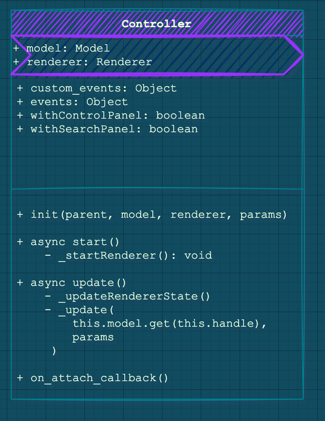
At initialization, The Controller will store the Model and Renderer as properties to themselves. And, in its start method, it will attach the renderer to the $el property, corresponding to the root JQuery node.
The start function is interesting because it will insert the Renderer into the DOM. In case you have an OWL Renderer there is a special condition that handles that in the AbstractController base Class.
_startRenderer: function () {
    if (this.renderer instanceof owl.Component) {
        return this.renderer.mount(this.$('.o_content')[0]);
    }
    return this.renderer.appendTo(this.$('.o_content'));
},
Now we will go over the two main responsibilities of the Controller.
Communication between the Renderer and the Model
The Renderer (UI) will fire some Events to the Controller and in response, the former will execute some actions.
With the help of the ActionsMixin the Controller can register some custom_events that the Controller will listen to and bind function as handler/
custom_events: _.extend({}, ActionMixin.custom_events, {
    navigation_move: '_onNavigationMove',
    open_record: '_onOpenRecord',
    switch_view: '_onSwitchView',
}),
The Controller will also answer to main UI buttons events, like changing a Page, and will call its update function to triggering call to the Model function:
/**
 * This is the main entry point for the controller.  Changes from the search
 * view arrive in this method, and internal changes can sometimes also call
 * this method.  It is basically the way everything notifies the controller
 * that something has changed.
 *
 * The update method is responsible for fetching necessary data, then
 * updating the renderer and wait for the rendering to complete.
 *
 * @param {Object} params will be given to the model and to the renderer
 * @param {Object} [options={}]
 * @param {boolean} [options.reload=true] if true, the model will reload data
 * @returns {Promise}
 */
async update(params, options = {}) {
    const shouldReload = 'reload' in options ? options.reload : true;
    if (shouldReload) {
        this.handle = await this.dp.add(this.model.reload(this.handle, params));
    }
    const localState = this.renderer.getLocalState();
    const state = this.model.get(this.handle, { withSampleData: true });
    const promises = [
        this._updateRendererState(state, params).then(() => {
            this.renderer.setLocalState(localState);
        }),
        this._update(this.model.get(this.handle), params)
    ];
    await this.dp.add(Promise.all(promises));
    this.updateButtons();
    this.el.classList.toggle('o_view_sample_data', this.model.isInSampleMode());
},
Access to the Control Panel and Search Panel
The Controller should also be configured to know if it will interact with a ControlPanel and a SearchBar via the withControlPanel, and withSearchPanel properties.
Note that the SearchPanel and the ControlPonel are now OWL Components in v14 now and are instantiated inside the start function of the Controller by wrapping them around with the ComponentWrapper:
if (this.withControlPanel) {
    this._updateControlPanelProps(this.initialState);
    this._controlPanelWrapper = new ComponentWrapper(this, this.ControlPanel, this.controlPanelProps);
    this._controlPanelWrapper.env.bus.on('focus-view', this, () => this._giveFocus());
    promises.push(this._controlPanelWrapper.mount(this.el, { position: 'first-child' }));
}
if (this.withSearchPanel) {
    this._searchPanelWrapper = new ComponentWrapper(this, this.SearchPanel, this.searchPanelProps);
    const content = this.el.querySelector(':scope .o_content');
    content.classList.add('o_controller_with_searchpanel');
    promises.push(this._searchPanelWrapper.mount(content, { position: 'first-child' }));
}
The update function of a Controller also has to update the SearchPanel or the ControlPanel if they are part of it via the _updateSearchPanel and _updateControlPanelProps respectively.
OWL specifics inside the Controller
Some functions in the AbstractController are specific to the case that interests us here. We will make an OWL Renderer Component and the API is not quite the same when the Renderer has to answer, for example when the Controller is attached or detached to the DOM. Example with the attach:
on_attach_callback: function () {
    ActionMixin.on_attach_callback.call(this);
    this.searchModel.on('search', this, this._onSearch);
    this.searchModel.trigger('focus-control-panel');
    if (this.withControlPanel) {
        this.searchModel.on('get-controller-query-params', this, this._onGetOwnedQueryParams);
    }
    if (!(this.renderer instanceof owl.Component)) {
        this.renderer.on_attach_callback();
    }
},
One other part that is specific to OWL Renderers is when the State has to be updated, this function is called by the update function that we saw just before.
_updateRendererState(state, params = {}) {
    if (this.renderer instanceof owl.Component) {
        return this.renderer.update(state);
    }
    return this.renderer.updateState(state, params);
},
Keep that in mind, it will help you debug later when you see weird behavior with your OWL Renderer Component!
The View
The View in Odoo JavaScript is not really the "V"iew from MVC. It is inherited from the "Factory" MVC Class seen earlier. I think the term "Factory" is a better fit for it because its main role is to instantiate each of the 3 elements we saw before.
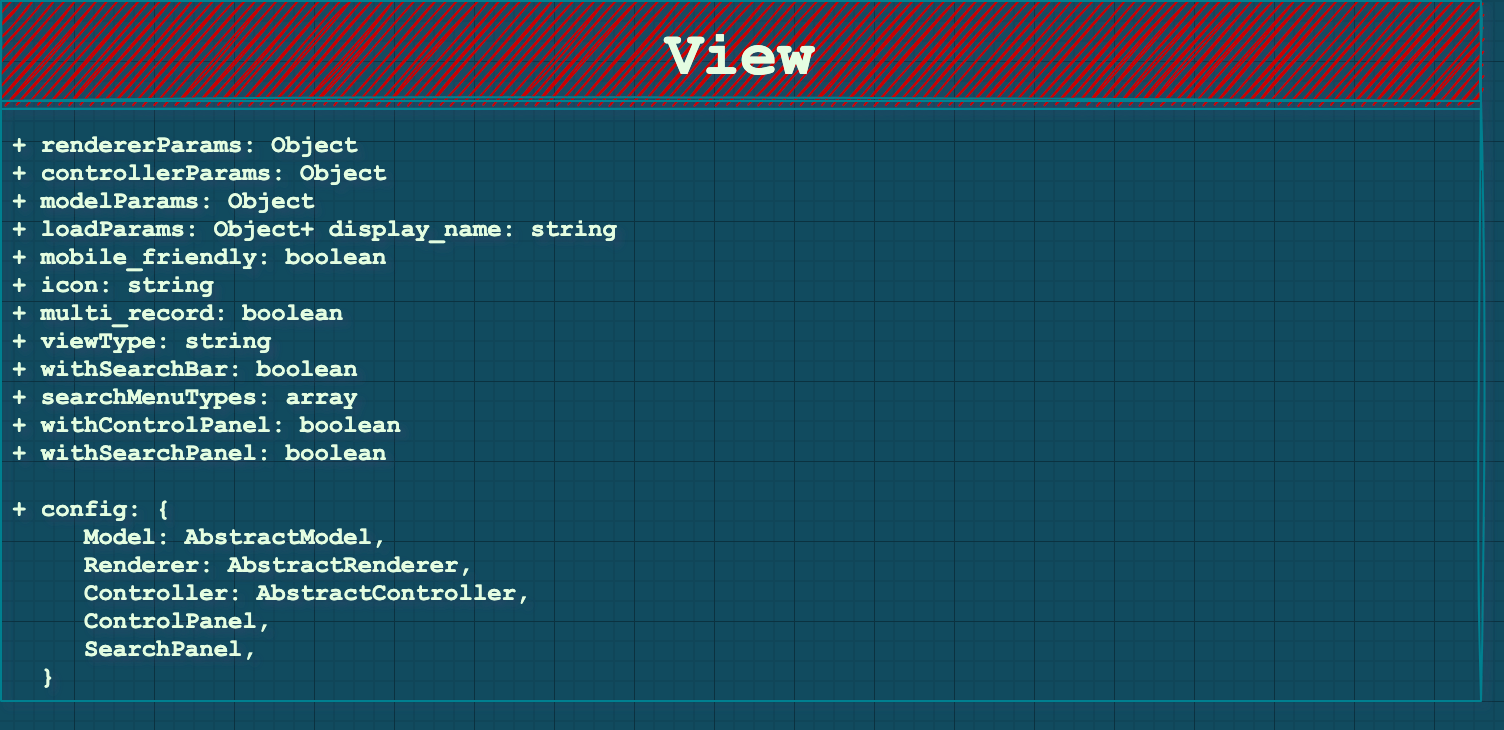
A View initialization takes 2 parameters:
init: function (viewInfo, params) {
    //...
}
The main goal of initialization is to fill config objects that will be passed to sub-components to create them:
this.rendererParams = {};
this.controllerParams = {};
this.modelParams = {};
this.loadParams = {};
The first three have obvious targets, respectively for the Renderer, the Controller and, the Model.
The loadParams will be used to load the initial data with _loadData and it will contain info if the View is being "opened" with a default group-by, the context, the limit, or the default domain.Let's see how these config objects are filled via analyzing the two parameters of the init function, "viewInfo" and "params". The goal for us is to understand how is our real JS View is created and started from the XML we usually write in our day-to-day Odoo developer life.
Analyzing the viewInfo parameter
The viewInfo first contains the arch which is a string representation of the XML arch of the defined view (in your XML file). This arch will be parsed in the init function and returned as JS Object. The viewInfo also contains the fields present in the Original XML and their different attributes.
// Inside the init function, parsing of the viewInfo to extract
// Arch and fields
if (typeof viewInfo.arch === 'string') {
    this.fieldsView = this._processFieldsView(viewInfo);
} else {
    this.fieldsView = viewInfo;
}
// Storing arch and fields as properties of the view
this.arch = this.fieldsView.arch;
this.fields = this.fieldsView.viewFields;
The arch data passed to the Render and the Controller
The local arch will then be passed to the Renderer, for the actual rendering of the UI via a rendererParams config object:
this.rendererParams = {
    arch: this.arch,
    isEmbedded: isEmbedded,
    noContentHelp: htmlHelp.innerText.trim() ? help : "",
};
The arch also contains info about the edit/create/delete/duplicate possible actions that will be passed to the Controller.
The fields data passed to the Model
The this.fields will be passed, similarly to the Renderer, via a config object to the Model:
this.modelParams = {
    fields: this.fields,
    modelName: params.modelName,
    useSampleModel,
};
The Model, in charge of communicating with the server, will be able to fetch the record(s) with the right field.
What's in the params of the View init function?
The params is a big object containing all the necessary info for a good instantiation of our View, especially the Model and Controller part. The Renderer doesn't need anything from the params.
Firstly, it holds the modelName, this will be passed to the modelParams and the loadParams we saw in the intro.
The params also contains the action we are coming from. This action will be parsed and from that, an object will be created:
_extractParamsFromAction: function (action) {
    action = action || {};
    var context = action.context || {};
    var inline = action.target === 'inline';
    const params = {
        actionId: action.id || false,
        actionViews: action.views || [],
        activateDefaultFavorite: !context.active_id && !context.active_ids,
        context: action.context || {},
        controlPanelFieldsView: action.controlPanelFieldsView,
        currentId: action.res_id ? action.res_id : undefined,  // load returns 0
        displayName: action.display_name || action.name,
        domain: action.domain || [],
        limit: action.limit,
        modelName: action.res_model,
        noContentHelp: action.help,
        searchMenuTypes: inline ? [] : this.searchMenuTypes,
        withBreadcrumbs: 'no_breadcrumbs' in context ? !context.no_breadcrumbs : true,
        withControlPanel: this.withControlPanel,
        withSearchBar: inline ? false : this.withSearchBar,
        withSearchPanel: this.withSearchPanel,
    };
    if ('useSampleModel' in action) {
        params.useSampleModel = action.useSampleModel;
    }
    return params;
},
We can notably see that the context is here, the domain, limit and, modelName.
The params actionView, controllerId, displayName and modelName will be passed to the Controller via its config object.
The params count, context, domain, modelName, ids will be passed to the config object loadParams to load initial data.
The params modelName will also be passed to the Model via its config object, for natural reasons.
Recap of the View initialization
A quick overview of what we just detailed:
The View instantiation uses the params (coming from the action) and the arch (coming from the XML) to put critical data into config objects necessary for the creation of the Model, Renderer, and the Controller.
-
The
paramshaving the modelName, context, etc..., holds necessary info for the Model, Controller and the initial loading of the data. -
The
archcontains conditions for edit/create/delete/duplicate passed to the Controller. It also contains the fields for the Model and, the arch XML will be passed to the Renderer also.
What does the View do after init?
getController function and be done. The Controller will take charge of the rest.
The window action manager will create a new View then call the getController function to "attach" it to the current action.
var view = new viewDescr.Widget(viewDescr.fieldsView, viewOptions);
var def = new Promise(function (resolve, reject) {
    rejection = reject;
    view.getController(self).then(function (widget) {
        if (def.rejected) {
            // the promise has been rejected meanwhile, meaning that
            // the action has been removed, so simply destroy the widget
            widget.destroy();
        } else {
            controller.widget = widget;
            resolve(controller);
        }
    }).guardedCatch(reject);
});
The View Object also has a getModel and a getRenderer functions, but they are used only inside the final getController.
The very abstract definition of this function is this one:
getController: function (parent) {
    var self = this;
    var model = this.getModel(parent);
    return Promise.all([this._loadData(model), ajax.loadLibs(this)]).then(function (result) {
        const { state, handle } = result[0];
        var renderer = self.getRenderer(parent, state);
        var Controller = self.Controller || self.config.Controller;
        const initialState = model.get(handle);
        var controllerParams = _.extend({
            initialState,
            handle,
        }, self.controllerParams);
        var controller = new Controller(parent, model, renderer, controllerParams);
        model.setParent(controller);
        renderer.setParent(controller);
        return controller;
    });
},
As we said earlier the main objective of the View is to Instantiate the Controller with the Model and Renderer as sub-widgets. After that, the View has no further utility and can be forgotten. The Controller will handle the rest of the updates coming from the UI until an action change occurs and a new View has to be created.
Making the View use an OWL Renderer
In the case you are creating an OWL Renderer you will need to wrap it around the RendererWrapper we saw earlier (existing especially for OWL Renderer) and return it inside the controller.
To do so we will override the getRenderer function like this example, inside our custom View definition:
const CustomOWLDisplayView = AbstractView.extend({
  accesskey: "m",
  display_name: _lt("CustomOWLDisplay"),
  icon: "fa-truck",
  config: _.extend({}, AbstractView.prototype.config, {
    Controller: CustomOWLDisplayController,
    Model: CustomOWLDisplayModel,
    Renderer: CustomOWLDisplayRenderer,
  }),
  viewType: "blog_publication",
  searchMenuTypes: ["filter", "favorite"],

  /**
   * @override
   */
  init: function () {
    this._super.apply(this, arguments);
  },
  /**
   *
   * @override
   */
  getRenderer(parent, state) {
    state = Object.assign(
      {},
      { data: state, rendererParams: this.rendererParams }
    );
    return new RendererWrapper(null, this.config.Renderer, state);
  },
});
Conclusion
That was quite long! This is an example "life-cycle" of JavaScript MVC in Odoo:
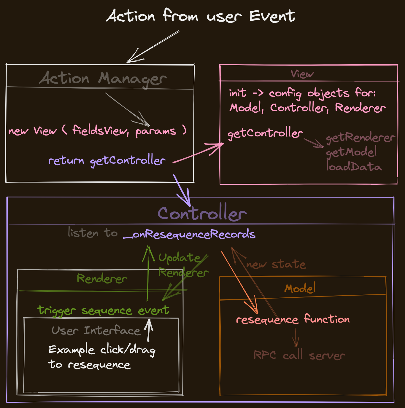
Feel free to experiment now with creating new views or wait until the next par where we will create an OWL view from scratch extending all the Abstract MVC Components.
If you found this article helpful, or not, I would love to hear your feedback either way so feel free to follow me on Twitter and consider subscribing to CodingDodo!
]]>
In this article, we will see how to extend, monkey-patch and, modify existing OWL Components in Odoo 14. There is a lot of confusion about that, and the existing way of overriding Odoo Widget doesn't work in that case.
We will focus on OWL Components inside Odoo 14, the process will probably be different in Odoo 15 since the WebClient has been entirely rewritten in OWL.
This article assumes you have a good understanding of OWL already, if this is not the case check out this article series where we create the Realworld App with OWL and go other most of the functionalities of the Framework.
All OWL-related content is available here.
Introduction to OWL Components
OWL Components are quite different from the usual Odoo JS Classes with the custom inheritance system you were familiar with.
First and foremost they are ES6 Classes, and if you are not familiar with ES6 classes, you can visit this Google presentation article. I would also refer you to the amazing book You Don't Know JS: ES6 and Beyond.
ES6 Classes are basically syntactical sugar over the existing prototype-based inheritance in JavaScript. At the most basic level, an ES6 Class is a constructor that conforms to prototype-based inheritance. ES6 classes still have Object.prototype!
To go deeper on this subject I would recommend this article about the difference between these ES6 classes and prototypes. This is a very confusing subject, but this quote from the article is very relevant:
The most important difference between class- and prototype-based inheritance is that a class defines a type which can be instantiated at runtime, whereas a prototype is itself an object instance.
Anyway, to work with Odoo 14 existing OWL Components, you still have to know some general concepts. We will keep it to a bare minimum, so let's begin with what an ES6 Class look like!
class Component {
  constructor(name) {
    this.name = name;
  }

  render() {
    console.log(`${this.name} renders itself.`);
  }

  // Getter/setter methods are supported in classes,
  // similar to their ES5 equivalents
  get uniqueId() {
    return `${this.name}-test`;
  }
}
You can inherit classes with the keyword extends and super to call parent function.
class MyBetterComponent extends Component {
  constructor(name) {
    super(name); // call the super class constructor and pass in the name parameter
  }

  render() {
    console.log(`${this.name} with id ${this.uniqueId} render itslef better.`);
  }
}

let comp = new MyBetterComponent('MyBetterComponent');
comp.render(); // MyBetterComponent with id MyBetterComponent-test renders itself better.
This is the standard ES6 super keyword, don't confuse it with the Odoo _super function built inside the Framework.
Most of the patching, extending, overriding of OWL Components in Odoo will make use of this basic knowledge, so let's dive in. Everything will become clearer with examples.
Odoo OWL utils patch, and patchMixin functions.
Extending Odoo OWL components is done via a patch function that comes in 2 flavors. Either the Component itself exposes a patch function because it is wrapped around the patchMixin. Or you have to use the patch function directly (in the web.utils package) to apply a patch to an OWL Component.
With the patchMixin, the Component exposes a "patch" function.
Inside odoo/addons/web/static/src/js/core/patch_mixin.js we have this patchMixinfunction:
function patchMixin(OriginalClass) {
    let unpatchList = [];
    class PatchableClass extends OriginalClass {}

    PatchableClass.patch = function (name, patch) {
        if (unpatchList.find(x => x.name === name)) {
            throw new Error(`Class ${OriginalClass.name} already has a patch ${name}`);
        }
        if (!Object.prototype.hasOwnProperty.call(this, 'patch')) {
            throw new Error(`Class ${this.name} is not patchable`);
        }
        const SubClass = patch(Object.getPrototypeOf(this));
        unpatchList.push({
            name: name,
            elem: this,
            prototype: this.prototype,
            origProto: Object.getPrototypeOf(this),
            origPrototype: Object.getPrototypeOf(this.prototype),
            patch: patch,
        });
        Object.setPrototypeOf(this, SubClass);
        Object.setPrototypeOf(this.prototype, SubClass.prototype);
    };

    PatchableClass.unpatch = function (name) {
        if (!unpatchList.find(x => x.name === name)) {
            throw new Error(`Class ${OriginalClass.name} does not have any patch ${name}`);
        }
        const toUnpatch = unpatchList.reverse();
        unpatchList = [];
        for (let unpatch of toUnpatch) {
            Object.setPrototypeOf(unpatch.elem, unpatch.origProto);
            Object.setPrototypeOf(unpatch.prototype, unpatch.origPrototype);
        }
        for (let u of toUnpatch.reverse()) {
            if (u.name !== name) {
                PatchableClass.patch(u.name, u.patch);
            }
        }
    };
    return PatchableClass;
}A Component using this patchMixin is returned wrapped around the function, for example inside odoo/addons/mail/static/src/components/messaging_menu/messaging_menu.js the MessagingMenu is returned like that:
// ...
const patchMixin = require('web.patchMixin');

const { Component } = owl;

class MessagingMenu extends Component {
// ...
// content of the file
// ...
}
return patchMixin(MessagingMenu);
Be careful, there are actually not that many Components that are returned with the patchMixin, you should always check first if that is the case. We will call these kinds of components "Patchable Components".
Import "web.utils", patch function for a "non-patchable" Component as a last resort.
When the Component doesn't use the patchMixin you will not be able to extend the ES6 class properly but with the patch function you will be able to override the regular functions of the Component.
The web.utils patchfunction is kind of limited, and will work on the "regular functions" of the component. Constructor, getters, setters won't be inherited with technique as we will see in examples later.This is the patch function content:
/**
 * Patch a class and return a function that remove the patch
 * when called.
 *
 * This function is the last resort solution for monkey-patching an
 * ES6 Class, for people that do not control the code defining the Class
 * to patch (e.g. partners), and when that Class isn't patchable already
 * (i.e. when it doesn't have a 'patch' function, defined by the 'web.patchMixin').
 *
 * @param {Class} C Class to patch
 * @param {string} patchName
 * @param {Object} patch
 * @returns {Function}
 */
patch: function (C, patchName, patch) {
    let metadata = patchMap.get(C.prototype);
    if (!metadata) {
        metadata = {
            origMethods: {},
            patches: {},
            current: []
        };
        patchMap.set(C.prototype, metadata);
    }
    const proto = C.prototype;
    if (metadata.patches[patchName]) {
        throw new Error(`Patch [${patchName}] already exists`);
    }
    metadata.patches[patchName] = patch;
    applyPatch(proto, patch);
    metadata.current.push(patchName);

    function applyPatch(proto, patch) {
        Object.keys(patch).forEach(function (methodName) {
            const method = patch[methodName];
            if (typeof method === "function") {
                const original = proto[methodName];
                if (!(methodName in metadata.origMethods)) {
                    metadata.origMethods[methodName] = original;
                }
                proto[methodName] = function (...args) {
                    const previousSuper = this._super;
                    this._super = original;
                    const res = method.call(this, ...args);
                    this._super = previousSuper;
                    return res;
                };
            }
        });
    }

    return utils.unpatch.bind(null, C, patchName);
},
As you may already see, the content of this function is problematic, it directly touches the prototype of the Object and do some checks on the typeof == "function" that can be misleading...
A Component returned from its module wrapped around thepatchMixinhas apatchfunction that you can use, if not your last resort is theweb.utilsgeneralpatchfunction.
In conclusion, this is what we have to work with. Now we will go through real world examples on how to apply this knowledge and see some specific cases.
Patchable Component (returned with "patchMixin"): Extend, monkey-patch, override.
Basic syntax
The basic syntax of extending a patchable component is:
PatchableComponent.patch("name_of_the_patch", (T) => {
    class NewlyPatchedComponent extends T {
        //... go wild
    }
    return NewlyPatchedComponent
})
With this patch, you really play with ES6 classes syntax. Your extended Component is also an ES6 class so you can touch the constructor, getters, setters, properties, and other functions.
Example: the ControlPanel Component.
In this example, we will extend the ControlPanel Component. This component is returned with the patchMixin function, original file:
// at the end of file...
ControlPanel.template = 'web.ControlPanel';

return patchMixin(ControlPanel);
Describing the functionality.
The goal of our module is to be very obnoxious, we will be to display a message, under the ControlPanel (everywhere) that will call an API and show a random inspiring quote from some famous people.
Please don't use this code in a real project, everybody will hate you secretly.
To make our fetch request to our quotes API we will use the willUpdateProps hook so every time the user navigates on his WebClient it will fetch a new quote!
If you are not familiar with OWL hooks and particularlywillUpdateProps, there is series about OWL from scratch here.
And the part talking about willUpdateProps is available here.
Implementing the code
First, let's extend the OWL XML template to add our div that will contain the quote.
<?xml version="1.0" encoding="UTF-8" ?>
<templates>
    <t t-inherit="web.ControlPanel" t-inherit-mode="extension" owl="1">
        <xpath expr="//div[hasclass('o_control_panel')]" position="inside">
            <div t-esc="state.customText" class="o_control_panel_random_quote"></div>
        </xpath>
    </t>
</templates>Inheriting an OWL XML Template is very similar to extending standard QWeb templates except that you should not forget to add owl="1". We will put our div inside the control panel and show the customText inside the state of our Component.
We will make it prettier by adding some custom SCSS for it, inside /src/scss/control_panel.scss.
.o_control_panel {
  .o_control_panel_random_quote {
    color: $text-muted;
    font-style: italic;
    align-items: center;
    justify-content: center;
    font-weight: bolder;
  }
}
Now for the JavaScript module itself /src/js/control_panel.js
odoo.define("owl_tutorial.ControlPanel", function (require) {
  "use strict";
  const ControlPanel = require("web.ControlPanel");
  const { useState } = owl.hooks;

  // ConstrolPanel has a patch function thanks to the patchMixin
  // This is the usual syntax, first argument is the name of our patch.
  ControlPanel.patch("owl_tutorial.ControlPanelCodingDodo", (T) => {
    class ControlPanelPatched extends T {
      constructor() {
        super(...arguments);
        this.state = useState({
          customText: "",
        });
        console.log(this.state);
      }

      async willUpdateProps(nextProps) {
        // Don't forget to call the super
        await super.willUpdateProps(nextProps);

        let self = this;
        fetch("https://type.fit/api/quotes")
          .then(function (response) {
            return response.json();
          })
          .then(function (data) {
            let quote = data[Math.floor(Math.random() * data.length)];
            // Update the state of the Component
            Object.assign(self.state, {
              customText: `${quote.text} - ${quote.author}`,
            });
          });
      }
    }
    return ControlPanelPatched;
  });
});
As you can see, having the Component returned with patchMixin makes it very easy to extend it directly, patch its function and add features!
Now let's take a loot at non-patchable Components.
Non-Patchable Component: Override a regular function with "web.utils" patch.
As of Odoo 14, most of the Components aren't returned with patchMixin and if we want to override the content of some Component functions we will use the web.utils patch function.
Example: the FileUpload Component.
Inside the mail addon the component FileUpload is responsible of handling the input files and the function that interests us is this one:
/**
 * @param {FileList|Array} files
 * @returns {Promise}
 */
async uploadFiles(files) {
    await this._unlinkExistingAttachments(files);
    this._createTemporaryAttachments(files);
    await this._performUpload(files);
    this._fileInputRef.el.value = '';
}
This Component isn't return wrapped with the patchMixin so we will have to use the "web.utils" function patch.
Describing the functionality
In this example we will change the behavior of the file upload inside the chatter send message box:
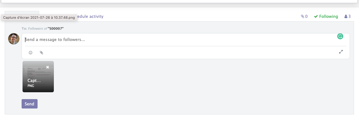
We will try to extend the behavior of the FileUpload so it doesn't even try to compute any file with a size over 10MB.
Implementing the code.
This is the content of our JavaScript module file.
odoo.define(
  "owl_tutorial/static/src/components/file_uploader/file_uploader.js",
  function (require) {
    "use strict";

    const components = {
      FileUploader: require("mail/static/src/components/file_uploader/file_uploader.js"),
    };

    const { patch } = require("web.utils");

    patch(
      components.FileUploader,
      "owl_tutorial/static/src/components/file_uploader/file_uploader.js",
      {
        // You can add your own functions to the Component.
        getMaxSize() {
          return 10000000;
        },

        /**
         * @override
         */
        async uploadFiles(files) {
          for (const file of files) {
            if (file.size > this.getMaxSize()) {
              // Files over 10MB are now rejected
              this.env.services["notification"].notify({
                type: "danger",
                message: owl.utils.escape(
                  `Max file size allowed is 10 MB, This file ${file.name} is too big!`
                ),
              });
              return false;
            }
          }
          return this._super(files);
        },
      }
    );
    console.log(components.FileUploader.prototype);
  }
);
With that done we now have a limit of 10MB on the size of the file uploaded, and a little notification warning us. We return _super if no file reached the limit.
Non-patchable Component: Override the "getter" of an OWL Component.
Some time ago I saw a question on the Odoo forums asking to override the get avatar getter of the Message component.
I noticed a lot of confusion around that and unfortunately, as we saw in the introduction, there is also an architectural problem with the way the patch function is coded in Odoo core.
Describing the problem
This is the original get avatar getter function:
/**
 * @returns {string}
 */
get avatar() {
    if (
        this.message.author &&
        this.message.author === this.env.messaging.partnerRoot
    ) {
        return '/mail/static/src/img/odoobot.png';
    } else if (this.message.author) {
        // TODO FIXME for public user this might not be accessible. task-2223236
        // we should probably use the correspondig attachment id + access token
        // or create a dedicated route to get message image, checking the access right of the message
        return this.message.author.avatarUrl;
    } else if (this.message.message_type === 'email') {
        return '/mail/static/src/img/email_icon.png';
    }
    return '/mail/static/src/img/smiley/avatar.jpg';
}
This syntax with a space between get and avatar is what we call a getter function.
To see the problem we have to look inside the content of the web.utils patch function and especially the applyPatch function. We can see this condition
if (typeof method === "function") {
    //...
}
But doing typeof on avatar will give us string in that case and not function type! So the patch will never get applied, we will have to find another way to hard override this getter function.
We could try to patch the components.Message.prototype instead of the Message class itself but that would also throw an error because the patch function stores a WeakMap on top of the file:
const patchMap = new WeakMap();To search and add patched prototype, the lookup is done via a WeakMap this way:
patch: function (C, patchName, patch) {
    let metadata = patchMap.get(C.prototype);
    if (!metadata) {
        metadata = {
            origMethods: {},
            patches: {},
            current: [],
        };
        patchMap.set(C.prototype, metadata);
    }
So the C.prototype will throw an error if the C given is already SomeClass.prototype.
Solution 1 - Redefining prototype property.
To quickly solve this problem we will apply standard JavaScript knowledge with Object.defineProperty on the prototype and change the "avatar" property.
odoo.define(
  "owl_tutorial/static/src/components/message/message.js",
  function (require) {
    "use strict";

    const components = {
      Message: require("mail/static/src/components/message/message.js"),
    };

    Object.defineProperty(components.Message.prototype, "avatar", {
      get: function () {
        if (
          this.message.author &&
          this.message.author === this.env.messaging.partnerRoot
        ) {
          // Here we replace the Robot with the better CodingDodo Avatar
          return "https://avatars.githubusercontent.com/u/81346769?s=400&u=614004f5f4dace9b3cf743ee6aa3069bff6659a2&v=4";
        } else if (this.message.author) {
          return this.message.author.avatarUrl;
        } else if (this.message.message_type === "email") {
          return "/mail/static/src/img/email_icon.png";
        }
        return "/mail/static/src/img/smiley/avatar.jpg";
      },
    });
  }
);
Note that this is pure JavaScript override and no "Odoo magic" will save you here, the super is not called for you and you have to be really careful when doing that. Any other override after yours on the same getter will override yours!
Using directly Object.defineProperty works but you are closing the door to future easy extensions from other modules. It is important to keep that in mind as Odoo is a module-driven Framework.Solution 2 - Putting the defineProperty inside the Component setup function (overridable).
It would be better if the standard getter would call a regular function called _get_avatar that could be overrideable by other modules.
With the patch we also cannot override the constructor so we will use a function available on each OWL Component called setup.
setup is called at the end of the constructor of an OWL Component and can be overridden, patched, etc
const { patch } = require("web.utils");

patch(
  components.Message,
  "owl_tutorial/static/src/components/message/message.js",
  {
    /**
     * setup is run just after the component is constructed. This is the standard
     * location where the component can setup its hooks.
     */
    setup() {
      Object.defineProperty(this, "avatar", {
        get: function () {
          return this._get_avatar();
        },
      });
    },
    /**
     * Get the avatar of the user. This function can be overriden
     *
     * @returns {string}
     */
    _get_avatar() {
      if (
        this.message.author &&
        this.message.author === this.env.messaging.partnerRoot
      ) {
        // Here we replace the Robot with the better CodingDodo Avatar
        return "https://avatars.githubusercontent.com/u/81346769?s=400&u=614004f5f4dace9b3cf743ee6aa3069bff6659a2&v=4";
      } else if (this.message.author) {
        return this.message.author.avatarUrl;
      } else if (this.message.message_type === "email") {
        return "/mail/static/src/img/email_icon.png";
      }
      return "/mail/static/src/img/smiley/avatar.jpg";
    },
  }
);
In that way, the function can now be overridden again by another patch in the future.
// Can be overriden again now
patch(
  components.Message,
  "another_module/static/src/components/message/message_another_patch.js",
  {
    _get_avatar() {
      let originAvatar = this._super(...arguments);
      console.log("originAvatar", originAvatar);
      if (originAvatar === "/mail/static/src/img/odoobot.png") {
        return "https://avatars.githubusercontent.com/u/81346769?s=400&u=614004f5f4dace9b3cf743ee6aa3069bff6659a2&v=4";
      }
      return originAvatar;
    },
  }
);
Getter and setters are a cool feature of Classes but leave little space for extendability, it is sometimes better to make a getter as a shortcut to an actual classic function that can be extended later.
Solution 3 - Force apply the "patchMixin" on the Component and replace it in the Components tree.
The last solution is to create another Component equal to the old Component returned with patchMixin, then replace them where they are used in parent Components.
const { QWeb } = owl;
const patchMixin = require("web.patchMixin");

// Create patchable component from original Message
const PatchableMessage = patchMixin(components.Message);
// Get parent Component
const MessageList = require("mail/static/src/components/message_list/message_list.js");

PatchableMessage.patch(
  "owl_tutorial/static/src/components/message/message.js",
  (T) => {
    class MessagePatched extends T {
      /**
       * @override property
       */
      get avatar() {
        if (
          this.message.author &&
          this.message.author === this.env.messaging.partnerRoot
        ) {
          // Here we replace the Robot with the better CodingDodo Avatar
          return "https://avatars.githubusercontent.com/u/81346769?s=400&u=614004f5f4dace9b3cf743ee6aa3069bff6659a2&v=4";
        } else if (this.message.author) {
          return this.message.author.avatarUrl;
        } else if (this.message.message_type === "email") {
          return "/mail/static/src/img/email_icon.png";
        }
        return "/mail/static/src/img/smiley/avatar.jpg";
      }
    }
    return MessagePatched;
  }
);
MessageList.components.Message = PatchableMessage;
We had to import the parent MessageList component to redefine its own components and put our own PatchableMessage.
Be careful with that solution. If the originalMessageComponent was patched in any other module (it is the case in thesnailmessagemodule) then all the previous patches will be lost.
If you are certain you want to use that way of overriding, the good thing is that now, every other module can extend our PatchableMessage and override easily our function.
Solution 4 - Creating a patchInstanceMethods copied from the Odoo 15 version of the patch method.
Odoo 15 already has a solution for this common problem of wanting to patch the instance method., directly implemented in the patch function. As long as it is not backported into Odoo 14, we can create a utils file and add that function.
So let's create a utils.js file and add this:
odoo.define(
  "owl_tutorial_extend_override_components.utils",
  function (require) {
    "use strict";
    class AlreadyDefinedPatchError extends Error {
      constructor() {
        super(...arguments);
        this.name = "AlreadyDefinedPatchError";
      }
    }
    const classPatchMap = new WeakMap();
    const instancePatchMap = new WeakMap();
    var utils = {
      /**
       * Inspired by web.utils:patch utility function
       *
       * @param {Class} Class
       * @param {string} patchName
       * @param {Object} patch
       * @returns {function} unpatch function
       */
      patchClassMethods: function (Class, patchName, patch) {
        let metadata = classPatchMap.get(Class);
        if (!metadata) {
          metadata = {
            origMethods: {},
            patches: {},
            current: [],
          };
          classPatchMap.set(Class, metadata);
        }
        if (metadata.patches[patchName]) {
          throw new Error(`Patch [${patchName}] already exists`);
        }
        metadata.patches[patchName] = patch;
        applyPatch(Class, patch);
        metadata.current.push(patchName);

        function applyPatch(Class, patch) {
          Object.keys(patch).forEach(function (methodName) {
            const method = patch[methodName];
            if (typeof method === "function") {
              const original = Class[methodName];
              if (!(methodName in metadata.origMethods)) {
                metadata.origMethods[methodName] = original;
              }
              Class[methodName] = function (...args) {
                const previousSuper = this._super;
                this._super = original;
                const res = method.call(this, ...args);
                this._super = previousSuper;
                return res;
              };
            }
          });
        }

        return () => unpatchClassMethods.bind(Class, patchName);
      },

      /**
       * Patch an object and return a function that remove the patch
       * when called.
       *
       * @param {Object} obj Object to patch
       * @param {string} patchName
       * @param {Object} patch
       */
      patchInstanceMethods: function (obj, patchName, patch) {
        if (!instancePatchMap.has(obj)) {
          instancePatchMap.set(obj, {
            original: {},
            patches: [],
          });
        }
        const objDesc = instancePatchMap.get(obj);
        if (objDesc.patches.some((p) => p.name === patchName)) {
          throw new AlreadyDefinedPatchError(
            `Patch ${patchName} is already defined`
          );
        }
        objDesc.patches.push({
          name: patchName,
          patch,
        });

        for (const k in patch) {
          let prevDesc = null;
          let proto = obj;
          do {
            prevDesc = Object.getOwnPropertyDescriptor(proto, k);
            proto = Object.getPrototypeOf(proto);
          } while (!prevDesc && proto);

          const newDesc = Object.getOwnPropertyDescriptor(patch, k);
          if (!objDesc.original.hasOwnProperty(k)) {
            objDesc.original[k] = Object.getOwnPropertyDescriptor(obj, k);
          }
          if (prevDesc) {
            const patchedFnName = `${k} (patch ${patchName})`;

            if (prevDesc.value && typeof newDesc.value === "function") {
              makeIntermediateFunction(
                "value",
                prevDesc,
                newDesc,
                patchedFnName
              );
            }
            if (prevDesc.get || prevDesc.set) {
              // get and set are defined together. If they are both defined
              // in the previous descriptor but only one in the new descriptor
              // then the other will be undefined so we need to apply the
              // previous descriptor in the new one.
              newDesc.get = newDesc.get || prevDesc.get;
              newDesc.set = newDesc.set || prevDesc.set;
              if (prevDesc.get && typeof newDesc.get === "function") {
                makeIntermediateFunction(
                  "get",
                  prevDesc,
                  newDesc,
                  patchedFnName
                );
              }
              if (prevDesc.set && typeof newDesc.set === "function") {
                makeIntermediateFunction(
                  "set",
                  prevDesc,
                  newDesc,
                  patchedFnName
                );
              }
            }
          }

          Object.defineProperty(obj, k, newDesc);
        }

        function makeIntermediateFunction(
          key,
          prevDesc,
          newDesc,
          patchedFnName
        ) {
          const _superFn = prevDesc[key];
          const patchFn = newDesc[key];
          newDesc[key] = {
            [patchedFnName](...args) {
              const prevSuper = this._super;
              this._super = _superFn.bind(this);
              const result = patchFn.call(this, ...args);
              this._super = prevSuper;
              return result;
            },
          }[patchedFnName];
        }
      },

      /**
       * Inspired by web.utils:unpatch utility function
       *
       * @param {Class} Class
       * @param {string} patchName
       */
      unpatchClassMethods: function (Class, patchName) {
        let metadata = classPatchMap.get(Class);
        if (!metadata) {
          return;
        }
        classPatchMap.delete(Class);

        // reset to original
        for (let k in metadata.origMethods) {
          Class[k] = metadata.origMethods[k];
        }

        // apply other patches
        for (let name of metadata.current) {
          if (name !== patchName) {
            patchClassMethods(Class, name, metadata.patches[name]);
          }
        }
      },

      /**
       * @param {Class} Class
       * @param {string} patchName
       */
      unpatchInstanceMethods: function (Class, patchName) {
        return webUtilsUnpatch(Class.prototype, patchName);
      },
    };
    return utils;
  }
);
We can now use the patchInstanceMethods function on any Component:
const {
  patchInstanceMethods,
} = require("owl_tutorial_extend_override_components.utils");
patchInstanceMethods(components.Message.prototype, "messageFirstPatch", {
  /**
   * Get the avatar of the user. This function can be overriden
   *
   * @returns {string}
   */
  get avatar() {
    if (
      this.message.author &&
      this.message.author === this.env.messaging.partnerRoot
    ) {
      // Here we replace the Robot with the better CodingDodo Avatar
      return "https://avatars.githubusercontent.com/u/81346769?s=400&u=614004f5f4dace9b3cf743ee6aa3069bff6659a2&v=4";
    } else if (this.message.author) {
      return this.message.author.avatarUrl;
    } else if (this.message.message_type === "email") {
      return "/mail/static/src/img/email_icon.png";
    }
    return "/mail/static/src/img/smiley/avatar.jpg";
  },
});

patchInstanceMethods(components.Message.prototype, "messageSecondPatch", {
  /**
   * Override of override
   *
   * @returns {string}
   */
  get avatar() {
    let originAvatar = this._super(...arguments);
    return originAvatar + "?overridenPatch=Yes";
  },
});Conclusion
In this article, we reviewed the two main available methods of patching, overriding, and extending Odoo 14 OWL Components. The patchfunction available when the Component is returned with the patchMixin and the global patch function from "web.utils" when we want to override basic functions of a Component.
I hope this guide was helpful to you on your journey customizing OWL Components in Odoo 14. In another article, we will so how to create Odoo 14 OWL Components from scratch and take a look at all the adapters available to us to mix OWL Components with good old Odoo Widgets.
The repository for this tutorial is available here:
 Coding-Dodo
Please consider subscribing to be alerted when new content is released here on Coding Dodo.
You can also follow me on Twitter and interact with me for requests about the content you would like to see here!
]]>
This is the fourth and final part of our tutorial series about creating the RealWorld App (Demo link) and our current implementation in OWL is available here:
 Coding-Dodo
To continue directly where we left off last time, you can clone this branch:
git clone -b feature/displaying-articles https://github.com/Coding-Dodo/owl-realworld-app.gitOr continue with your own project, in this part, we will refactor some redundant code.
- We will use hooks to make pieces of code reusable via composition into different components.
- Inside these hooks, we will use built-in OWL hooks like
useEnv,useComponent,useGetters, andonWillStart.
Completing missing features from part 3.
In the last chapter we left with some homework to do, the code is already inside the repository you pulled but wasn't explained in the last part.
The ArticleMeta Component
The ArticleMeta Component will contain metadata about an article, the author, likes, and follow button if present. These features are present in the Article listing and on the single Article page so we decide to extract that logic into its own Component.
ArticleMeta Component props
- This component will take an
articleprops - And also a boolean
articlesListModeto know if we are on the listing of articles or on the single article because the display will be slightly different in both cases. Notably, the Like button is different and the follow button is not available on the listing.
ArticleMeta State and actions
This Component will handle the three actions buttons:
- Following the author of the article with state
updatingFollowing - Favoriting the article with state
updatingFavorited - Deleting the article if the user is the author with state
deletingArticle
Emitting events when the article is favorited or the author followed.
The article is passed as a props so it shouldn't update itself to be favorited so we will fire events when these actions are performed so the parent Component can update its own state.
  async updateFavorited(slug, favorited) {
    if (!this.getters.userLoggedIn()) {
      this.env.router.navigate({ to: "LOG_IN" });
      return;
    }
    let response = {};
    Object.assign(this.state, { updatingFavorited: true });
    if (favorited === true) {
      response = await this.conduitApi.favoriteArticle(slug);
    } else {
      response = await this.conduitApi.unfavoriteArticle(slug);
    }
    Object.assign(this.state, { updatingFavorited: false });
    this.trigger("update-favorited", {
      article: response.article,
    });
  }

  async updateFollowing(username, following) {
    if (!this.getters.userLoggedIn()) {
      this.env.router.navigate({ to: "LOG_IN" });
      return;
    }
    let response = {};
    Object.assign(this.state, { updatingFollowing: true });
    if (following === true) {
      response = await conduitApi.followUser(username);
    } else {
      response = await conduitApi.unfollowUser(username);
    }
    Object.assign(this.state, { updatingFollowing: false });
    this.trigger("update-following", {
      profile: response.profile,
    });
  }
Full Component code
With that knowledge, we will create the component inside ./src/components/ArticleMeta.js :
import { Component, tags, hooks, router, useState } from "@odoo/owl";
const { useGetters } = hooks;
const { Link } = router;
import { useApi } from "../hooks/useApi";

const ARTICLE_META_PAGE_TEMPLATE = tags.xml/* xml */ `
<div class="article-meta">
    <a href=""><img t-att-src="props.article.author.image" /></a>
    <div class="info">
        <a href="#" class="author" t-esc="props.article.author.username"></a>
        <span class="date" t-esc="getArticleDate(props.article.createdAt)"></span>
    </div>
    <!-- Articles List mode with only heart button -->
    <t t-if="props.articlesListMode">
        <button t-attf-class="btn btn-sm pull-xs-right {{ props.article.favorited ? 'btn-primary': 'btn-outline-primary' }}" t-att-disabled="state.updatingFavorited" t-on-click="updateFavorited(props.article.slug, !props.article.favorited)">
            <i class="ion-heart"></i> <t t-esc="props.article.favoritesCount"/>
        </button>
    </t>
    <!-- Article Page mode with following/favorite/edit/delete conditional buttons -->
    <t t-else="">
        <span t-if="userIsAuthor()">
            <Link class="btn btn-outline-secondary btn-sm" to="'EDITOR'">
                <i class="ion-edit"></i> Edit Article
            </Link>
            <button t-attf-class="btn btn-outline-danger btn-sm" t-on-click="deleteArticle(props.article.slug)">
                <i class="ion-trash-a"></i> Delete Article
            </button>
        </span>
        <span t-else="">
            <button
                t-attf-class="btn btn-sm {{ props.article.author.following ? 'btn-secondary' : 'btn-outline-secondary' }}"
                t-on-click="updateFavorited(props.article.author.username, !props.article.author.following)"
                t-att-disabled="state.updatingFollowing"
            >
                <i class="ion-plus-round"></i> <t t-esc="props.article.author.following ? 'Unfollow' : 'Follow'"/> <t t-esc="props.article.author.username"/>
            </button>
            <button
                t-attf-class="btn btn-sm {{ props.article.favorited ? 'btn-primary': 'btn-outline-primary' }}"
                t-att-disabled="state.updatingFavorited"
                t-on-click="updateFavorited(props.article.slug, !props.article.favorited)"
            >
                <i class="ion-heart"></i> <t t-esc="props.article.favorited ? 'Unfavorite': 'Favorite'"/> Post
                <span class="counter">(<t t-esc="props.article.favoritesCount"/>)</span>
            </button>
        </span>
    </t>
</div>
`;
export class ArticleMeta extends Component {
  static template = ARTICLE_META_PAGE_TEMPLATE;
  static components = { Link };
  conduitApi = useApi();
  getters = useGetters();
  state = useState({
    updatingFollowing: false,
    updatingFavorited: false,
    deletingArticle: false,
  });
  static props = {
    article: { type: Object },
    articlesListMode: { type: Boolean, optional: true },
  };

  getArticleDate(date) {
    let articleDate = new Date(date);
    return articleDate.toLocaleDateString("en-US", {
      year: "numeric",
      month: "long",
      day: "numeric",
    });
  }

  async updateFavorited(slug, favorited) {
    if (!this.getters.userLoggedIn()) {
      this.env.router.navigate({ to: "LOG_IN" });
      return;
    }
    let response = {};
    Object.assign(this.state, { updatingFavorited: true });
    if (favorited === true) {
      response = await this.conduitApi.favoriteArticle(slug);
    } else {
      response = await this.conduitApi.unfavoriteArticle(slug);
    }
    Object.assign(this.state, { updatingFavorited: false });
    this.trigger("update-favorited", {
      article: response.article,
    });
  }

  async updateFollowing(username, following) {
    if (!this.getters.userLoggedIn()) {
      this.env.router.navigate({ to: "LOG_IN" });
      return;
    }
    let response = {};
    Object.assign(this.state, { updatingFollowing: true });
    if (following === true) {
      response = await conduitApi.followUser(username);
    } else {
      response = await conduitApi.unfollowUser(username);
    }
    Object.assign(this.state, { updatingFollowing: false });
    this.trigger("update-following", {
      profile: response.profile,
    });
  }
  async deleteArticle(slug) {
    this.conduitApi.deleteArticle(slug);
    this.env.router.navigate({
      to: "PROFILE",
      params: { username: this.getters.getUser().username },
    });
  }

  userIsAuthor() {
    return (
      this.getters.userLoggedIn() &&
      this.getters.getUser().username == this.props.article.author.username
    );
  }
}
Now that we have extracted that logic to this ArticleMeta Component we will modify the ArticlePage.js and Article.js accordingly.
These components will have to listen to the custom events and update their state with the event.detail.
// ....
const ARTICLE_PAGE_TEMPLATE = tags.xml/* xml */ `
<div class="article-page">
  <div class="banner">
    <div class="container">
      <h1 t-esc="state.article.title"></h1>
      <ArticleMeta
        article="state.article"
        t-on-update-following="updateFollowing"
        t-on-update-favorited="updateFavorited"
        updatingFollowing="state.updatingFollowing"
        updatingFavorited="state.updatingFavorited"
        deletingArticle="state.deletingArticle"
      />
    </div>
  </div>
  <div class="container page">
    <div class="row article-content">
      <div class="col-md-12">
        <div t-raw="renderMarkdown(state.article.body)"/>
      </div>
    </div>
    <hr />
    <div class="article-actions">
      <ArticleMeta
        article="state.article"
        t-on-update-following="updateFollowing"
        t-on-update-favorited="updateFavorited"
        updatingFollowing="state.updatingFollowing"
        updatingFavorited="state.updatingFavorited"
        deletingArticle="state.deletingArticle"
      />
    </div>
    <CommentsSection articleSlug="state.article.slug"/>
  </div>
</div>
`;
// ....
export class ArticlePage extends Component {
  static template = ARTICLE_PAGE_TEMPLATE;
  static components = { ArticleMeta, CommentsSection };
  getters = useGetters();
  conduitApi = useApi();
  state = useState({
    article: {
      slug: "",
      title: "",
      description: "",
      body: "",
      tagList: [],
      createdAt: "",
      updatedAt: "",
      favorited: false,
      favoritesCount: 0,
      author: {
        username: "",
        bio: "",
        image: "",
        following: false,
      },
    },
    updatingFollowing: false,
    updatingFavorited: false,
    deletingArticle: false,
  });
  async fetchArticle(slug) {
    let response = await this.conduitApi.getArticle(slug);
    if (response && response.article) {
      Object.assign(this.state, response);
    }
  }
  async willStart() {
    let slug = this.env.router.currentParams.slug;
    await this.fetchArticle(slug);
  }

  renderMarkdown(content) {
    return marked(content);
  }

  onUpdateFollowing(ev) {
    Object.assign(this.article.author, ev.detail.profile);
  }

  onUpdateFavorited(ev) {
    Object.assign(this.article, ev.detail.article);
  }
} The same pattern applies to the Article Component.
import { Component, tags, router } from "@odoo/owl";
import { ArticleMeta } from "./ArticleMeta";
const Link = router.Link;

const ARTICLE_TEMPLATE = tags.xml/*xml*/ `
<div class="article-preview">
    <ArticleMeta
        article="props.article"
        articlesListMode="true"
      />
    <Link to="'ARTICLE'" params="{slug: props.article.slug}" class="preview-link">
        <h1><t t-esc="props.article.title"/></h1>
        <p><t t-esc="props.article.description"/></p>
        <span>Read more...</span>
    </Link>
</div>
`;
export class Article extends Component {
  static template = ARTICLE_TEMPLATE;
  static components = { Link, ArticleMeta };
  static props = {
    article: { type: Object },
  };
}Notice that we don't listen to the event here, we will listen to the event on the parent Component ArticlesList that contains the state:
const ARTICLESLIST_TEMPLATE = tags.xml/*xml*/ `
<section>
    <t t-foreach="state.articles" t-as="article" t-key="article.slug">
        <ArticlePreview article="article" t-on-update-favorited="onUpdateFavorited(article)"/>
    </t>
    <span class="loading-articles" t-if="state.loading">
        Loading Articles...
    </span>
    <Pagination
        t-if="! state.loading"
        itemsPerPage="props.queryOptions.limit"
        totalCount="state.articlesCount"
        currentOffset="props.queryOptions.offset"
    />
</se
export class ArticlesList extends Component {
  static template = ARTICLESLIST_TEMPLATE;
  // ...
  onUpdateFavorited(article, ev) {
    Object.assign(article, ev.detail.article);
  }
}Since events bubble up the Component chain we can listen to them much higher in the Component tree order.
Making the Editor Page Dynamic (Edit existing article) with route parameters.
Inside the application, the Editor page is used to create a new article but also to edit an existing one. So depending on if a slug is present inside the route we should redirect to a blank new article or load an existing article with its data inside each of the fields.
We can already imagine that the logic to get a single article via a slug will be similar to what we did with the regular Article Page Component. It will involve making an API request inside the willStart function to get the article and load it into the state. Later, we will see how to avoid code duplication with that piece of functionality, but for now, let's begin with the routing.
Editing the routes.
Inside ./src/main.js we will modify the routes
export const ROUTES = [
  { name: "HOME", path: "/", component: Home },
  { name: "LOG_IN", path: "/login", component: LogIn },
  { name: "REGISTER", path: "/register", component: Register },
  {
    name: "SETTINGS",
    path: "/settings",
    component: Settings,
    beforeRouteEnter: authRoute,
  },
  {
    name: "EDITOR",
    path: "/editor",
    component: Editor,
    beforeRouteEnter: authRoute,
  },
  {
    name: "EDITOR_ARTICLE",
    path: "/editor/{{slug}}",
    component: Editor,
    beforeRouteEnter: authRoute,
  },
  // ... rest of the routes
We created a new route that uses the same component <Editor/>, but with a slug parameter as the specs tell us to do.
Similar to the ArticlePage (also loaded via a slug), we will have to fetch the Article in the willStart and assign it to the state of the Component. To avoid duplication we will use the OWL hooks system.
Refactoring the loading of one article with the onWillStart hook.
When you have to load the same kind of data, in multiple different Components, you can use hooks to avoid code duplication. The willStart function of a Component can be also written as a hook with onWillStart. All the logic written inside these two functions are "merged" with each other, they are not mutually exclusive, meaning that you can use a willStart on a Component and also injecting onWillStart hooks and all of them will trigger.
Inside the ArticlePage component we will refactor this part of the code:
async fetchArticle(slug) {
    let response = await this.conduitApi.getArticle(slug);
    if (
      response &&
      response.article &&
      response.article.author.username == this.getters.getUser().username
    ) {
      Object.assign(this.state, response);
    }
  }
  async willStart() {
    if (this.env.router.currentParams && this.env.router.currentParams.slug) {
      let slug = this.env.router.currentParams.slug;
      await this.fetchArticle(slug);
    }
  }
Refactoring into a hook consists of writing a JavaScript closure. Closures are an integral part of what makes JavaScript awesome and are a great way to achieve Composition like in other Object Oriented Programmation languages.
I will not explain JavaScript closure in-depth here, because I would never do a better job than what already exists in the amazing You don't Know JS book. I invite you to read everything but:
- Get started part about closures is here
- Deep dive into Closure inside this second chapter "Scope and Closure"
Closures are useful because they let you associate data (the lexical environment) with a function that operates on that data. In our case, the article in the state will be associated with the closure (saved inside the Closure) and also the functions responsible for fetching the data.
We will create a loader that will do the same thing and return the article. Inside our hooks folder, we create a new file called useArticleLoader.js.
import { useState, hooks } from "@odoo/owl";
const { onWillStart, useEnv } = hooks;
import { useApi } from "../hooks/useApi";

export function useArticleLoader() {
  const conduitApi = useApi();
  const article = useState({
    slug: "",
    title: "",
    description: "",
    body: "",
    tagList: [],
    createdAt: "",
    updatedAt: "",
    favorited: false,
    favoritesCount: 0,
    author: {
      username: "",
      bio: "",
      image: "",
      following: false,
    },
  });
  const env = useEnv();
  async function fetchArticle(slug) {
    let response = await conduitApi.getArticle(slug);
    if (response && response.article) {
      Object.assign(article, response.article);
    }
  }
  onWillStart(async () => {
    let slug = env.router.currentParams.slug;
    await fetchArticle(slug);
  });
  return article;
}
From within our useArticleLoader we can use different OWL hooks like useEnv to get access to the current env (and the router) or useState to assign state data and also our own useApi to call API. The logic stays mostly the same as what it was inside the original Component.
onWillStart is an asynchronous hook and will be run just before the component is first rendered, exactly like willStart. Inside this function, we have access to the env and we decide to directly expect that the slug is inside the route current parameters. This is not optimal behavior because we make our hook dependant on the fact that the Article is loaded via slug (and this is always the case in our application). It would be better to separate concerns and having another function get the slug to leave our hook doing is only purpose: fetching an article. But this will do for now as we don't want to overengineer too much.
Note: onWillUpdateProps is not used in our example but you have to know that the hook exists. It is also an asynchronous hook that will trigger the associated function every time the props of the Component are updated, exactly like willUpdateProps.
Using our newly created useArticleLoader hook
We will now refactor the ArticlePage Component to make use of this new hook, open the ArticlePage.js Component:
import { useArticleLoader } from "../hooks/useArticleLoader";
// other Imports
// ...
const ARTICLE_PAGE_TEMPLATE = tags.xml/* xml */ `
<div class="article-page">
  <div class="banner">
    <div class="container">
      <h1 t-esc="article.title"></h1>
      <ArticleMeta
        article="article"
        t-on-update-following="updateFollowing"
        t-on-update-favorited="updateFavorited"
        t-on-delete-article="deleteArticle"
        updatingFollowing="state.updatingFollowing"
        updatingFavorited="state.updatingFavorited"
        deletingArticle="state.deletingArticle"
      />
    </div>
  </div>
  <div class="container page">
    <div class="row article-content">
      <div class="col-md-12">
        <div t-raw="renderMarkdown(article.body)"/>
      </div>
    </div>
    <hr />

    <div class="article-actions">
      <ArticleMeta
        article="article"
        t-on-update-following="updateFollowing"
        t-on-update-favorited="updateFavorited"
        t-on-delete-article="deleteArticle"
        updatingFollowing="state.updatingFollowing"
        updatingFavorited="state.updatingFavorited"
        deletingArticle="state.deletingArticle"
      />
    </div>

    <CommentsSection articleSlug="article.slug"/>
  </div>
</div>
`;
export class ArticlePage extends Component {
  static template = ARTICLE_PAGE_TEMPLATE;
  static components = { ArticleMeta, CommentsSection };
  getters = useGetters();
  conduitApi = useApi();
  state = useState({
    updatingFollowing: false,
    updatingFavorited: false,
    deletingArticle: false,
  });
  article = useArticleLoader();

  renderMarkdown(content) {
    return marked(content);
  }
// ...
}As you can see, we kinda have 2 states but in reality both of them useState so state and article share the reactivity (both of them being a ProxyObject). Modifying one or the other will trigger the "state changed" hook observed!
Make sure that everywhere state.article was used it is now replaced with article.
Improving the Editor with the new hook
import { Component, tags, useState, hooks } from "@odoo/owl";
const { useGetters } = hooks;
import { useApi } from "../hooks/useApi";
import { useArticleLoader } from "../hooks/useArticleLoader";
const { xml } = tags;

const EDITOR_TEMPLATE = xml/* xml */ `
<div class="editor-page">
  <div class="container page">
    <div class="row">

      <div class="col-md-10 offset-md-1 col-xs-12">
        <ul class="error-messages">
            <li t-foreach="state.errors" t-as="errorKey">
                <t t-esc="errorKey"/> <t t-esc="state.errors[errorKey]"/>
            </li>
        </ul>
        <form>
          <fieldset>
            <fieldset class="form-group">
                <input type="text" class="form-control form-control-lg" placeholder="Article Title" t-model="article.title" t-att-disabled="state.publishingArticle"/>
            </fieldset>
            <fieldset class="form-group">
                <input type="text" class="form-control" placeholder="What's this article about?" t-model="article.description" t-att-disabled="state.publishingArticle"/>
            </fieldset>
            <fieldset class="form-group">
                <textarea class="form-control" rows="8" placeholder="Write your article (in markdown)" t-model="article.body" t-att-disabled="state.publishingArticle"></textarea>
            </fieldset>
            <fieldset class="form-group">
                <input type="text" class="form-control" placeholder="Enter tags" t-att-disabled="state.publishingArticle"/><div class="tag-list"></div>
            </fieldset>
            <button class="btn btn-lg pull-xs-right btn-primary" type="button" t-att-disabled="state.publishingArticle" t-on-click.prevent="publishArticle">
                Publish Article
            </button>
          </fieldset>
        </form>
      </div>

    </div>
  </div>
</div>
`;
export class Editor extends Component {
  static template = EDITOR_TEMPLATE;
  getters = useGetters();
  state = useState({
    publishingArticle: false,
    errors: {},
  });
  article = useArticleLoader();
  conduitApi = useApi();

  async publishArticle() {
    let response = {};
    Object.assign(this.state, { publishingArticle: true });
    if (this.article.slug) {
      response = await this.conduitApi.updateArticle(
        this.article.slug,
        this.article
      );
    } else {
      response = await this.conduitApi.createArticle(this.article);
    }
    Object.assign(this.state, { publishingArticle: false });
    if (response.article) {
      this.env.router.navigate({
        to: "PROFILE",
        params: { username: this.getters.getUser().username },
      });
    } else {
      Object.assign(this.state.errors, response.errors);
    }
  }
}
Modifying the publishArticle function.
Since the Editor Component will now create and update an article we use a conditional to check if the slug is present in our article state and act consequently.
We also improved the Editor page with error handling coming from the API the same way we did in the first part of this series with the LogIn and Register Component.
Refactoring the ArticleMeta Component with reusable pieces of action logic as hooks.
]]>
We are now in the third part of our tutorial series about creating the RealWorld App (Demo link) and our current implementation in OWL is available here:
Coding-DodoTo continue directly where we left off last time, you can clone this branch:
git clone -b feature/authentication-registration https://github.com/Coding-Dodo/owl-realworld-app.gitOr continue with your own project, in this part, we will manage the Articles display, in the list and the single article page:
- Reactive component tightly coupled with data with the use of
willUpdateandwillUpdateProps. - Dynamic routing in the form of
/#/article/:slug.
The Article Component
We will begin by creating the first version of the Article Component because it is a pre-requisite of the ArticleList Component that we will build later. This Component will mainly be a "presentation" component, responsible for formatting some data and presenting it, the only real logic it will contain will be the "Like" button. But we will handle that later, for now, we will handle only the presentation layer.
We need to take a quick look at the Conduit API Specs to know how an article looks like when returned from API:
{
slug: "how-to-train-your-dragon",
title: "How to train your dragon",
description: "Ever wonder how?",
body: "It takes a Jacobian",
tagList: ["dragons", "training"],
createdAt: "2016-02-18T03:22:56.637Z",
updatedAt: "2016-02-18T03:48:35.824Z",
favorited: false,
favoritesCount: 0,
author: {
    username: "jake",
    bio: "I work at statefarm",
    image: "https://i.stack.imgur.com/xHWG8.jpg",
    following: false,
},
}
With that knowledge, we will create our ./src/components/Article.js to behave as if it was getting an article object as a prop and displaying its data.
import { Component, tags, router, hooks } from "@odoo/owl";
const { useGetters } = hooks;
const Link = router.Link;

const ARTICLE_TEMPLATE = tags.xml/*xml*/ `
<div class="article-preview">
    <div class="article-meta">
        <Link to="'PROFILE'"><img t-att-src="props.article.author.image" /></Link>
        <div class="info">
            <a href="" class="author"><t t-esc="props.article.author.username"/></a>
            <span class="date"><t t-esc="getArticleDate()"/></span>
        </div>
        <button class="btn btn-outline-primary btn-sm pull-xs-right">
            <em class="ion-heart"></em> <t t-esc="props.article.favoritesCount"/>
        </button>
    </div>
    <a href="" class="preview-link">
        <h1><t t-esc="props.article.title"/></h1>
        <p><t t-esc="props.article.description"/></p>
        <span>Read more...</span>
    </a>
</div>
`;
export class Article extends Component {
  static template = ARTICLE_TEMPLATE;
  static components = { Link };
  getters = useGetters();
  static props = {
    article: { type: Object },
  };
  getArticleDate() {
    let articleDate = new Date(this.props.article.createdAt);
    return articleDate.toLocaleDateString("en-US", {
      year: "numeric",
      month: "long",
      day: "numeric",
    });
  }
}
We added a function getArticleDate() that format the Date received from the API to the format expected by the others examples of RealWorld App. In this function, we use the native JavaScript Date object and transform it to the format needed by the specs of the FrontEnd.
With that done, let's tackle the creation of the ArticlesList.
The ArticlesList Component
New functions in our useApi custom hook
First, we will add 2 new API calls inside ./src/hooks/useApi.js to fetch articles.
  async getArticles(queryOptions) {
    let response = {};
    await this.service
      .get("/articles", { params: queryOptions })
      .then((res) => {
        if (res.data && res.data) {
          response = res.data;
        }
      })
      .catch((error) => {
        if (error && error.response) {
          response = error.response.data;
        }
      });
    return response;
  }
  async getArticlesFeed(queryOptions) {
    let response = {};
    await this.service
      .get("/articles/feed", { params: queryOptions })
      .then((res) => {
        if (res.data && res.data) {
          response = res.data;
        }
      })
      .catch((error) => {
        if (error && error.response) {
          response = error.response.data;
        }
      });
    return response;
  }
The getArticle function will take queryParameters as described by the API specs:
Query Parameters:
- Filter by tag:
?tag=AngularJS - Filter by author:
?author=jake - Favorited by user:
?favorited=jake - Limit number of articles (default is 20):
?limit=10 - Offset/skip number of articles (default is 0):
?offset=0
Imagining our Component via analysis of the API
The ArticlesList Component will be the container of the <Article> components, and will also be responsible for fetching and holding the data (list of articles).
The props
The ArticlesList will take different options as props that should reflect the API options to the articles endpoint to keep the logic simple. Reading the props of a current ArticlesList component should reflect the exact parameters request sent to the API.
- tag (string) prop to render an ArticleList filtered by tag
- author (string) prop to render an ArticleList filtered by author
- favorited (string) prop to render ArticleList filtered by "favorited by user=[USERNAME]"
- limit (number) prop to render ArticleList limit number of articles (default 20)
- offset (number) of the data being read from the API. The Component will then responsible for its pagination by keeping the same initials filters and updating its own props.
- feed (boolean) prop to render ArticleList via the /articles/feed endpoint. Only logged-in users, show articles list created by authors that user follow.
For example, the parent component Homepage will be responsible for the props passed to the ArticlesList Component.
The local state
Inside its local state, the ArticlesList component will hold:
- articles (Array) the list of article objects.
- articlesCount (Number) the total number of articles.
- loading (Boolean) state
- currentOffset (Number) that will be a copy of the passed props but saved to be passed itself to sub-component "Pagination".
Child Components
This Component will probably have 2 child Component:
- Multiple Article Components, each responsible for rendering a single article
- A Pagination Component to navigate through the records set.
Creating the ArticlesList Component, props validation and willStart hook.
Now that we know our props we can create our ./src/components/ArticlesList.js file
import { Component, tags, useState } from "@odoo/owl";
import { Article } from "./Article";

const ARTICLESLIST_TEMPLATE = tags.xml/*xml*/ `
<section>
    <span>Article count: <t t-esc="state.articlesCount"/></span>
    <span class="loading-articles" t-if="state.loading">
        Loading Articles...
    </span>
    <t t-foreach="state.articles" t-as="article">
        <Article article="article"/>
    </t>
    <span class="loading-articles" t-if="state.loading">
        Loading Articles...
    </span>
</section>
`;
export class ArticlesList extends Component {
  static template = ARTICLESLIST_TEMPLATE;
  static components = { Article };
  static props = {
    options: {
      type: Object,
      optional: true,
      tag: { type: String, optional: true },
      author: { type: String, optional: true },
      favorited: { type: String, optional: true },
      limit: { type: Number, optional: true },
      feed: { type: Boolean, optional: true },
      offset: { type: Number, optional: true },
    },
  };
}
Props validation
  static props = {
    options: {
      type: Object,
      optional: true,
      tag: { type: String, optional: true },
      author: { type: String, optional: true },
      favorited: { type: String, optional: true },
      limit: { type: Number, optional: true },
      feed: { type: Boolean, optional: true },
      offset: { type: Number, optional: true },
    },
  };
Leveraging props validation helps us and other developers of the team, to keep everything clean, and safer to use as our application grows in size.
props are required by default. You will not see any error in production mode but if you are in dev mode you will get an error if you omit any of the props that are not optional: ture.
Also if you are in dev mode and you pass the wrong kind of type for props it will trigger an error.
Handling state with willUpdateProps, willStart
The <ArticlesList> component is tightly coupled with the need to fetch articles from theAPI. Data needs to be present the first time the Component is rendering itself and each time the props are updated.
//imports ...
//template...
export class ArticlesList extends Component {
  static template = ARTICLESLIST_TEMPLATE;
  static components = { Article, Pagination };
  conduitApi = useApi();
  state = useState({
    articles: [],
    articlesCount: 0,
    loading: false,
  });
  static props = {
    queryOptions: {
      type: Object,
      optional: true,
      tag: { type: String, optional: true },
      author: { type: String, optional: true },
      favorited: { type: String, optional: true },
      limit: { type: Number, optional: true },
      feed: { type: Boolean, optional: true },
      offset: { type: Number, optional: true },
    },
  };
  conduitApi = useApi();

  async fetchArticles(queryOptions) {
    let response = {};
    Object.assign(this.state, { loading: true });
    if (queryOptions.feed == true) {
      response = await this.conduitApi.getArticlesFeed(queryOptions);
    } else {
      response = await this.conduitApi.getArticles(queryOptions);
    }
    Object.assign(this.state, response);
    Object.assign(this.state, { loading: false });
  }

  async willStart() {
    this.fetchArticles(this.props.queryOptions);
  }

  async willUpdateProps(nextProps) {
    if (deepEqual(nextProps.queryOptions, this.props.queryOptions)) {
      return;
    }
    this.fetchArticles(nextProps.queryOptions);
  }
First, we define our fetchArticles async function that will do the API call. This function will then be used in the next 2 functions:
willStart
This async function is the perfect spot to fetch data from an API, willStart will be called called just before the first rendering.
willUpdateProps(newProps)
This async function will be called after the props have changed. Here we will also call the API to fetch the articles again with new query parameters.
It will trigger if any change is made to the state of the Component passing the props so we will make a comparison of the old queryOptions with the new queryOptions. Since these are different objects we should do a deep comparison on the keys of the object. That's why we call deepEqual. On top of the file import the function:
import { deepEqual } from "../utils/utils.js";We will create a utils.js file inside ./utils/ folder with that content
function isObject(object) {
  return object != null && typeof object === "object";
}

export function deepEqual(object1, object2) {
  const keys1 = Object.keys(object1);
  const keys2 = Object.keys(object2);

  if (keys1.length !== keys2.length) {
    return false;
  }

  for (const key of keys1) {
    const val1 = object1[key];
    const val2 = object2[key];
    const areObjects = isObject(val1) && isObject(val2);
    if (
      (areObjects && !deepEqual(val1, val2)) ||
      (!areObjects && val1 !== val2)
    ) {
      return false;
    }
  }

  return true;
}
Refactoring the Home Component and adding the ArticlesList
The Home Component can show different Article List via a Tabs system, specifically the Feed list, the Global list and, the filter by Tags list.
That means that the Home Component should hold in its state the current navigation mode it is on. Then create the config object to pass to <ArticlesList> Component.
First, we will refactor the useState() directive and put it inside the constructor of the component. This will help us to have the initial state of the component:
- If the user is logged in the current navigation mode by default is FEED
- If the user is not logged in the current navigation mode by default is GLOBAL
export class Home extends Component {
  static template = HOME_TEMPLATE;
  static components = { ArticlesList };
  getters = useGetters();

  constructor(...args) {
    super(...args);
    let initialNavMode = "GLOBAL";
    let initialArticlesOptions = { limit: 10, offset: 0 };
    if (this.getters.userLoggedIn()) {
      initialNavMode = "FEED";
      initialArticlesOptions = { feed: true, limit: 10, offset: 0 };
    }
    this.state = useState({
      text: "A place to share your knowledge.",
      navigationMode: initialNavMode,
      articlesOptions: initialArticlesOptions,
    });
  }
Inside the XML Template we also do some modifications:
- Pass our
state.articlesOptionsto theArticlesListComponent as props
<ArticlesList queryOptions="state.articlesOptions"/>Creating the Tabs system Feed/Global Feed/Tags inside our Home Component
Inside the Home component, we create a function to handle the change of navigation mode.
  changeNavigationMode(navigationMode, tag) {
    if (navigationMode == "FEED" && !this.getters.userLoggedIn()) {
      return;
    }
    let articlesOptions = {};
    switch (navigationMode) {
      case "FEED":
        articlesOptions = { feed: true, limit: 10, offset: 0 };
        break;
      case "TAGS":
        articlesOptions = { tag: tag, limit: 10, offset: 0 };
        break;
      default:
        articlesOptions = { limit: 10, offset: 0 };
    }
    Object.assign(this.state, {
      navigationMode: navigationMode,
      articlesOptions: articlesOptions,
    });
}Calling that function will update the state of the Home Component to change the navigationMode and the articlesOptions (that is passed via props to the <ArticlesList/>).
Then we update the Template of the Home Component to make use of these new functions and states.
<div class="col-md-9">
    <div class="feed-toggle">
        <ul class="nav nav-pills outline-active">
            <li class="nav-item">
                <a  t-attf-class="nav-link {{ getters.userLoggedIn() ? '' : 'disabled' }} {{ state.navigationMode == 'FEED' ? 'active' : '' }}"
                    t-on-click.prevent="changeNavigationMode('FEED')"
                    href="/">
                    Your Feed
                </a>
            </li>
            <li class="nav-item">
                <a  t-attf-class="nav-link {{ state.navigationMode == 'GLOBAL' ? 'active' : '' }}"
                    t-on-click.prevent="changeNavigationMode('GLOBAL')"
                    href="/">
                    Global Feed
                </a>
            </li>
            <li class="nav-item" t-if="state.navigationMode == 'TAGS' and state.articlesOptions.tag">
                <a  t-attf-class="nav-link {{ state.navigationMode == 'TAGS' ? 'active' : '' }}"
                    href="#">
                    <i class="ion-pound"></i> <t t-esc="state.articlesOptions.tag"/>
                </a>
            </li>
        </ul>
    </div>
    <ArticlesList queryOptions="state.articlesOptions"/>
</div>
Now we have the Home component that will change its state navigation mode and the query parameters to the ArticlesList. From the articles list, we used the hook onWillUpdateProps to listen to the change of props and fetch again the articles from the API with these new params.
We don't have any Pagination yet be we can now test that our Home is working correctly and displaying articles.
Pagination: Emitting events from Child to Parent component
]]>
This is the second part of our tutorial series about creating the RealWorld App with OWL (Odoo Web Library). In this part, we will implement the authentication layer with OWL Store, Actions, and getters. The OWL Store will help us and handle the global state of the application when the user is logged in or not, and what menu and actions should be available.
The app adheres to the spec of the RealWorld example apps repository on GitHub, and our current implementation in OWL is available here:
Coding-DodoBut, to continue directly where we left off last time, you should clone this branch:
git clone -b feature/basic-pages-structure-routing https://github.com/Coding-Dodo/owl-realworld-app.gitOr continue with your own project,
The problem of keeping the coherent state of an Application.
As our application grows and grows, we will have more and more components that need to communicate and share data between themselves.
For example, in our RealWorld App:
- The Navbar has to know if the user is logged in to show or hide the Login/Register/Settings links. It also shows the current Username if the user is connected.
- The Homepage has to know if the user is logged in to make the personalized "Feed" of the article available or not.
- Each article inside a list has to display the "Like" (heart button) if the user is logged in.
Passing props from Parent to Child works in a lot of cases but it can make the application complicated very fast and may sometimes not be possible at all.
         App
        /   \
 RouterComp  Navbar
      / \
Homepage Settings
    /
ArticlesList
   /
Article
In this example, handling the "user is logged in" info inside the App and passing it as props down the children's chain will be tedious. Article Component also has to know the user state and on the contrary, ArticlesList maybe doesn't need to know!
So it would force us to pass the user logged-in info as props to ArticlesList (that doesn't need it) to pass it again to Article (that needs it).
TLDR; Some data may need to be stored in a global state of the app and accessible from any components.
Creating and Using the OWL Store
OWL Store presentation
OWL gives us the possibility to use a centralized store, a class that owns data that will represent the state of the application.
This store is updated via actions, and OWL Components can connect to the store via a special hook to read that data.
The Components can also subscribe to the actions and dispatch them so they update the store. Without actions the store cannot be updated directly (assigning new values from within a Component), it is the job of the actions.
Store instantiation takes an Object as the argument:
const config = {
  state, // Initial State of the App
  actions, // Actions are functions that update the state
  getters, // Needed to transform raw data from state
  env, // The current env
};
const store = new Store(config);
Creating and connecting the store to our (root) App Component.
Let's instantiate a Store in our main.js that we will attach to our App. Our store will only have one Object called user.
We will have to actions functions for now:
- login action that will store the resulting user (from an API POST call done elsewhere) inside the store.
- logout cleanup our store and
We will define our User Object in the store to be similar to the User return by the API of "RealWorld app":
"user": {
    "email": "[email protected]",
    "token": "jwt.token.here",
    "username": "jake",
    "bio": "I work at statefarm",
    "image": null
}
We could directly make API calls inside our Store actions but it is important to not bind our Store logic to the underlying API. So our login and logout store actions will only store a user in the global state of the application and will not be responsible to authenticate against an external API.
We will also create a getter for the state called userLoggedIn that will return a boolean by checking if the user Object is present and filled with data. According to the specs seen earlier if the user object has the "token" property then we will say that it is correct and logged in. The other getter is getUser that will just return the current store user.
const actions = {
  logout({ state }) {
    state.user = {};
  },
  login({ state }, user) {
    state.user = user;
  },
};
const initialState = {
  user: {},
};
const getters = {
  userLoggedIn({ state }) {
    if (state.user && state.user.token) {
      return true;
    }
    return false;
  },
  getUser({ state }) {
    return state.user;
  },
};Finally, the initial state of the Application is an empty user Object.
Then, still inside ./src/main.js, we will create a function that will take all of these, create the Store and attach it to the env of the App.
// on top of the file main.js update the imports
// to import the Store
import { utils, router, mount, QWeb, Store } from "@odoo/owl";
// ...
// ...
async function makeEnvironment(store) {
  const env = { qweb: new QWeb(), store: store };
  env.router = new router.Router(env, ROUTES, { mode: "hash" });
  await env.router.start();
  return env;
}

function makeStore() {
  const store = new Store({ initialState, actions, getters });
  return store;
}

async function setup() {
  let store = makeStore();
  App.env = await makeEnvironment(store);
  mount(App, { target: document.body });
}
Notice that we also changed the makeEnvironment function to take the store as a parameter and put it inside the env of our App.
Now that our Store is set up we will use its state and actions inside our components.
Making the Navbar links dynamic with the Store state changes
Now that we have our Store and our getters functions we will update our Navbar Component to make use of that, and render its links conditionally.
// Adding hooks import from owl library
import { Component, tags, router, hooks } from "@odoo/owl";
// importing the useGetters hook
const { useGetters } = hooks;
const Link = router.Link;
import { NavbarLink } from "./NavbarLink";
const NAVBAR_TEMPLATE = tags.xml/*xml*/ `
<nav class="navbar navbar-light">
<div class="container">
<Link to="'HOME'" class="navbar-brand">conduit</Link>
<ul class="nav navbar-nav pull-xs-right">
<li class="nav-item">
<NavbarLink to="'HOME'" class="nav-link">Home</NavbarLink>
</li>
<li class="nav-item">
<NavbarLink to="'EDITOR'" class="nav-link nav-link-editor" t-if="getters.userLoggedIn()">
<i class="ion-compose"></i> New Post
</NavbarLink>
</li>
<li class="nav-item">
<NavbarLink to="'SETTINGS'" class="nav-link" t-if="getters.userLoggedIn()">
<i class="ion-gear-a"></i> Settings
</NavbarLink>
</li>
<li class="nav-item">
<NavbarLink to="'LOG_IN'" class="nav-link" t-if="!getters.userLoggedIn()">
Sign in
</NavbarLink>
</li>
<li class="nav-item">
<NavbarLink to="'REGISTER'" class="nav-link" t-if="!getters.userLoggedIn()">
Sign up
</NavbarLink>
</li>
<li class="nav-item" t-if="getters.userLoggedIn()">
<NavbarLink to="'PROFILE'" class="nav-link">
<t t-esc="getters.getUser().username"/>
</NavbarLink>
</li>
</ul>
</div>
</nav>
`;
export class Navbar extends Component {
static template = NAVBAR_TEMPLATE;
static components = { Link, NavbarLink };
// registering the getters
getters = useGetters();
}
Since we registered the getters = useGetters we can use the getters functions directly inside our template in conditionals and other expressions
<li class="nav-item" t-if="getters.userLoggedIn()">
<NavbarLink to="'PROFILE'" class="nav-link">
<t t-esc="getters.getUser().username"/>
</NavbarLink>
</li>For this example, the last link shows the username and navigate to the profile page if the user is logged in. So we surround the link with a conditional and then use the getUser() getter to have access to the Store user and display its username.
Dispatching Store action to Login and Logout.
Loggin in from the LogIn page
From the "LogIn page", we will call the Store action we created earlier login. For now, we will not implement Form logic yet and just dispatch the login action when the user clicks on the "login" button to test if our application state management works.
// import hooks from owl
import { Component, tags, router, hooks } from "@odoo/owl";
// import useDispatch hook to access actions
const { useDispatch } = hooks;
const Link = router.Link;
const { xml } = tags;
const LOG_IN_TEMPLATE = xml/* xml */ `
<div class="auth-page">
<div class="container page">
<div class="row">
<div class="col-md-6 offset-md-3 col-xs-12">
<h1 class="text-xs-center">Sign in</h1>
<p class="text-xs-center">
<Link to="'REGISTER'">Need an account?</Link>
</p>
<ul class="error-messages">
<li>Invalid credentials</li>
</ul>
<form>
<fieldset class="form-group">
<input class="form-control form-control-lg" type="text" placeholder="Email"/>
</fieldset>
<fieldset class="form-group">
<input class="form-control form-control-lg" type="password" placeholder="Password"/>
</fieldset>
<button class="btn btn-lg btn-primary pull-xs-right" t-on-click="login">
Sign In
</button>
</form>
</div>
</div>
</div>
</div>
`;
export class LogIn extends Component {
static components = { Link };
static template = LOG_IN_TEMPLATE;
dispatch = useDispatch();
login(ev) {
ev.preventDefault();
this.dispatch("login", {
email: "[email protected]",
token: "jwt.token.here",
username: "CodingDodo",
bio: "I am a Coding Dodo",
image: null,
});
this.env.router.navigate({ to: "HOME" });
}
}
After importing the correct dependencies and hook we declare that our LogIn Component should have a property dispatch = useDispatch.
On the login button, we bind the click event to an internal function of the component called login:
<button class="btn btn-lg btn-primary pull-xs-right" t-on-click="login">
Sign In
</button>This function is implemented inside the component and just dispatch the Store actions login with a dummy user object for now:
login(ev) {
ev.preventDefault();
this.dispatch("login", {
email: "[email protected]",
token: "jwt.token.here",
username: "CodingDodo",
bio: "I am a Coding Dodo",
image: null,
});
// redirect to the homepage:
this.env.router.navigate({ to: "HOME" });
}We have access to ev that represents the event of clicking and we use preventDefault so it doesn't trigger the original browser page refresh. After we have dispatched the action we redirect to the home page programmatically via the router function navigate accessible through the this.env.router (accessible in all Components env).
Logging out from the Settings page
From the Settings page, there is a button to Log out, and we will do the same as on the Login page: dispatch a Store action with the click of the button:
import { Component, tags, hooks } from "@odoo/owl";
const { useDispatch } = hooks;
const { xml } = tags;
const SETTINGS_TEMPLATE = xml/* xml */ `
<div class="settings-page">
<div class="container page">
<div class="row">
<div class="col-md-6 offset-md-3 col-xs-12">
<h1 class="text-xs-center">Your Settings</h1>
<form>
<fieldset>
<fieldset class="form-group">
<input class="form-control" type="text" placeholder="URL of profile picture"/>
</fieldset>
<fieldset class="form-group">
<input class="form-control form-control-lg" type="text" placeholder="Your Name"/>
</fieldset>
<fieldset class="form-group">
<textarea class="form-control form-control-lg" rows="8" placeholder="Short bio about you"></textarea>
</fieldset>
<fieldset class="form-group">
<input class="form-control form-control-lg" type="text" placeholder="Email"/>
</fieldset>
<fieldset class="form-group">
<input class="form-control form-control-lg" type="password" placeholder="Password"/>
</fieldset>
<button class="btn btn-lg btn-primary pull-xs-right">
Update Settings
</button>
</fieldset>
</form>
<hr/>
<button class="btn btn-outline-danger" t-on-click="logout">Or click here to logout.</button>
</div>
</div>
</div>
</div>
`;
export class Settings extends Component {
static template = SETTINGS_TEMPLATE;
dispatch = useDispatch();
logout(ev) {
ev.preventDefault();
this.dispatch("logout");
this.env.router.navigate({ to: "HOME" });
}
}
Now we can test our Application http://localhost:8080/#/ and see that the Application test is handled correctly. Clicking on the "login" button changes the Navbar and with "logged in" menus actions, and show username.
Going into the Settings page and clicking Logout also change the state of the application correctly.
But there is a problem. Every time we refresh the page we lose the state of our application.
Using LocalStorage to keep the state of the application after refresh.
To keep the state of the application we will use localStorage to keep our user as data inside the browser. localStorage is natively present in JavaScript and will do fine for keeping our application state between refresh.
]]>
In this series, we will create the famous "RealWorld App" from scratch. With OWL Framework (Odoo Web Library) ? as the FrontEnd of choice.
If you are interested in using:
What is the RealWorld Example App?
The RealWorld App is a Medium.com clone called Conduit built with several technologies on the FrontEnd and BackEnd.
The final result of this 4 parts tutorial series can be seen here it is hosted on Netlify.
The RealWorld App repository is a set of specs describing this "Conduit" app, how to create it on the front-end, and on the back-end:
 gothinkster
In our Tutorial, we will implement the front-end part. Following the FRONTEND Instructions specs defined here, we will use the brand new OWL (Odoo Web Library) as the technology choice. This is a SPA with calls to an external API, so it will be a good starting point to see a lot of what the Framework has to offer in terms of state management, routing, and reactivity.
Styles and HTML templates are available in the repository and the routing structure of the client-side is described like that:
- Home page (URL: /#/ )
- List of tags
- List of articles pulled from either Feed, Global, or by Tag
- Pagination for list of articles
- Sign in/Sign up pages (URL: /#/login, /#/register )
- Uses JWT (store the token in localStorage)
- Authentication can be easily switched to session/cookie-based
- Settings page (URL: /#/settings )
- Editor page to create/edit articles (URL: /#/editor, /#/editor/article-slug-here )
- Article page (URL: /#/article/article-slug-here )
- Delete article button (only shown to article's author)
- Render markdown from server client-side
- The comments section at bottom of the page
- Delete comment button (only shown to comment's author)
- Profile page (URL: /#/profile/:username, /#/profile/:username/favorites )
- Show basic user info
- List of articles populated from author's created articles or author's favorited articles
Introducing OWL Framework(Odoo Web Library)
OWL is a new open-source Framework created internally at Odoo with the goal to be used as a replacement to the current old client-side technology used by Odoo. According to the repository description:
The Odoo Web Library (OWL) is a relatively small UI framework intended to be the basis for the Odoo Web Client in future versions (>15). Owl is a modern framework, written in Typescript, taking the best ideas from React and Vue in a simple and consistent way.
The Framework offers a declarative component system, reactivity with hooks (See React inspiration), a Store (mix between Vue and React implementation), and a front-end router.
The documentation is not exhaustive for now, but we will try to make sense of everything via use-cases.
Components
Components are JavaScript classes with properties, functions and the ability to render themselves (Insert or Update themselves into the HTML Dom). Each Component has a template that represents its final HTML structure, with composition, we can call other components with their tag name inside our Component.
class MagicButton extends Component {
static template = xml`
<button t-on-click="changeText">
Click Me! [<t t-esc="state.value"/>]
</button>`;
state = { value: 0 };
changeText() {
this.state.value = "This is Magic";
this.render();
}
}The templating system is in XML QWeb, which should be familiar if you are an Odoo Developer. t-on-click allow us to listen to the click event on the button and trigger a function defined inside the Component called changeText.
Properties of the Component live inside the state property, it is an object that has all the keys/value we need. This state is isolated and only lives inside that Component, it is not shared with other Components (even if they are copies of that one).
Inside that changeText function we change the state.value to update the text, then we call render to force the update of the Component display: the Button shown in the Browser now has the text "Click Me! This is Magic".
Hooks and reactivity
It is not very convenient to use render function all the time and to handle reactivity better, OWL uses a system its system of hooks, specifically the useState hook.
const { useState } = owl.hooks;
class MagicButton extends Component {
static template = xml`
<button t-on-click="changeText">
Click Me! [<t t-esc="state.value"/>]
</button>`;
state = useState({ value: 0 });
changeText() {
this.state.value = "This is Magic";
}
}As we can see, we don't have to call the render function anymore. Using the useState hook actually tells the OWL Observer to watch for change inside the state via the native Proxy Object.
Passing data from Parent to Child via props
We saw that a Component can have multiple Components inside itself. With this Parent/Child hierarchy, data can be passed via props. For example, if we wanted the initial text "Click me" of our MagicButton to be dynamic and chosen from the Parent we can modify it like that
const { useState } = owl.hooks;
class MagicButton extends Component {
static template = xml`
<button t-on-click="changeText">
<t t-esc="props.initialText"/> [<t t-esc="state.value"/>]
</button>`;
state = useState({ value: 0 });
changeText() {
this.state.value = "This is Magic";
}
}
// And then inside a parent Component
class Parent extends Component {
static template = xml`
<div>
<MagicButton initialText="Dont click me!"/>
</div>`;
static components = { MagicButton };And that's it for a quick overview of the Framework, we will dive into other features via examples. From now on it's better if you follow along with your own repository so we create the RealWorld App together!
Starting our project
Prerequisites
Make sure that you have NodeJS installed. I use NVM (Node Version Manager) to handle different NodeJS versions on my system.
Follow the NVM install instructions here or install directly the following NodeJS version on your system.
For this tutorial, as of 26 September 2021, I'm using NodeJS stable version v14.17.6
▶ nvm list
v10.22.0
v10.24.0
v14.7.0
v14.15.1
-> v14.17.6
default -> stable (-> v14.17.6)
node -> stable (-> v14.17.6) (default)
stable -> 14.17 (-> v14.17.6) (default)Using the OWL starter template
To make things a little easier, I've created a template project with Rollup as the bundling system to help us begin with modern JavaScript convention and bundling systems.
Coding-DodoThis is a template repo, so click on "Use this template" to create your own repo based on this one (You can also clone it like other repositories).
After pulling the repository we have this file structure:
├── README.md
├── package-lock.json
├── package.json
├── public
│ └── index.html
├── rollup.config.js
├── src
│ ├── App.js
│ ├── components
│ │ └── MyComponent.js
│ └── main.js
└── tests
├── components
│ └── App.test.js
└── helpers.jsIndex.html is a basic HTML file containing minimum info, we will use the <head> tag to insert the Stylesheet given by the RealWorld app later.
The core of our app lives in the src folder, for now, it only contains 2 files. main.js is the entry point:
import { App } from "./app";
import { utils } from "@odoo/owl";
(async () => {
const app = new App();
await utils.whenReady();
await app.mount(document.body);
})();In this file, we import our main App Component, that we mount on the <body>tag of our index.html file.
Owl components are defined with ES6 (JavaScript - EcmaScript 20015) classes, they use QWeb templates, a virtual DOM to handle reactivity, and asynchronous rendering. Knowing that we simply instantiate our App object.
As its name may suggest utils package contains various utilities, here we use whenReady that tells us when the DOM is totally loaded so we can attach our component to the body.
App Component
The App Class Component represents our application, it will inject all other Components.
import { Component, tags } from "@odoo/owl";
import { MyComponent } from "./components/MyComponent";
const APP_TEMPLATE = tags.xml/*xml*/ `
<main t-name="App" class="" t-on-click="update">
<MyComponent/>
</main>
`;
export class App extends Component {
static template = APP_TEMPLATE;
static components = { MyComponent };
}MyComponent is a basic Component representing a span, when you click on it the text change. It's only here as an example and we will delete it later.
Installing dependencies and running the dev server.
First, we need to install the dependencies
cd OWL-JavaScript-Project-Starter
npm installThen, to run the tests
npm run testAnd finally, to run the development server
npm run devThe output should be:
rollup v2.57.0
bundles src/main.js → dist/bundle.js...
babelHelpers: 'bundled' option was used by default. It is recommended to configure this option explicitly, read more here: https://github.com/rollup/plugins/tree/master/packages/babel#babelhelpers
http://localhost:8080 -> /Users/codingdodo/Code/owl-realworld-app/dist
http://localhost:8080 -> /Users/codingdodo/Code/owl-realworld-app/public
LiveReload enabled
created dist/bundle.js in 1.5s
If you would prefer to run the server on a different port you have to edit rollup.config.js and search for the serve section
serve({
open: false,
verbose: true,
contentBase: ["dist", "public"],
host: "localhost",
port: 8080, // Change Port here
}),Importing styles from RealWorld App resources kit.
We will update public/index.html to include <link> to assets given by RealWorld App repository instructions. These assets include the font, the icons, and the CSS:
<!DOCTYPE html>
<html>
<head>
<meta charset="UTF-8" />
<meta name="viewport" content="width=device-width, initial-scale=1.0" />
<title>RealWorld App in OWL</title>
<!-- Import Ionicon icons & Google Fonts our Bootstrap theme relies on -->
<link
href="https://code.ionicframework.com/ionicons/2.0.1/css/ionicons.min.css"
rel="stylesheet"
type="text/css"
/>
<link
href="https://fonts.googleapis.com/css?family=Titillium+Web:700|Source+Serif+Pro:400,700|Merriweather+Sans:400,700|Source+Sans+Pro:400,300,600,700,300italic,400italic,600italic,700italic"
rel="stylesheet"
type="text/css"
/>
<!-- Import the custom Bootstrap 4 theme from our hosted CDN -->
<link rel="stylesheet" href="https://demo.productionready.io/main.css" />
<script type="module" src="bundle.js"></script>
</head>
<body></body>
</html>Navigating to http://localhost:8080/ should already show you the change of fonts.
Implementing the elements of the layout as Components.
The Conduit App has a classic design layout, composed of a Navbar Header, Content, and Footer.
For now, we will implement the Homepage and the different elements of the Layout as simple HTML content ("dumb" Components, with no logic).
Creating the Navbar Component
Inside src/components/ we will create a new file named Navbar.js
import { Component, tags } from "@odoo/owl";
const NAVBAR_TEMPLATE = tags.xml/*xml*/ `
<nav class="navbar navbar-light">
<div class="container">
<a class="navbar-brand" href="index.html">conduit</a>
<ul class="nav navbar-nav pull-xs-right">
<li class="nav-item">
<!-- Add "active" class when you're on that page" -->
<a class="nav-link active" href="">Home</a>
</li>
<li class="nav-item">
<a class="nav-link" href="">
<i class="ion-compose"></i> New Post
</a>
</li>
<li class="nav-item">
<a class="nav-link" href="">
<i class="ion-gear-a"></i> Settings
</a>
</li>
<li class="nav-item">
<a class="nav-link" href="">Sign in</a>
</li>
<li class="nav-item">
<a class="nav-link" href="">Sign up</a>
</li>
</ul>
</div>
</nav>
`;
export class Navbar extends Component {
static template = NAVBAR_TEMPLATE;
}The template is defined as a const NAVBAR_TEMPLATE then added as a static property to our Navbar Component declaration.
The content of the template is surrounded by tags.xml/*xml*/. These xmlcomments are used so TextEditor extensions that handle Comment tagged templates can be used to have syntax highlight inside our components. For VisualStudio Code the plugin is here.
For the XML content itself, it is just copy-pasted from the instructions on the RealWorld Repo. We will not implement Navigation just yet.
Creating the Footer Component
Inside src/components/ we will create a new file named Footer.js
import { Component, tags } from "@odoo/owl";
const FOOTER_TEMPLATE = tags.xml/*xml*/ `
<footer>
<div class="container">
<a href="/" class="logo-font">conduit</a>
<span class="attribution">
An interactive learning project from <a href="https://thinkster.io">Thinkster</a>. Code & design licensed under MIT.
</span>
</div>
</footer>
`;
export class Footer extends Component {
static template = FOOTER_TEMPLATE;
}
Creating the Home Page Component
This component will hold the content of the Home page.
In this tutorial, we will create a new folder src/pages/ that will hold our "pages" Components. This is an architecture decision that you don't have to follow, but as the number of components will start to grow we would ultimately want to do some cleaning to keep things organized.
With the folder created, inside src/pages/, we will create a new file named Home.js, (full structure):
import { Component, tags, useState } from "@odoo/owl";
const HOME_TEMPLATE = tags.xml/*xml*/ `
<div class="home-page">
<div class="banner" t-on-click="update">
<div class="container">
<h1 class="logo-font">conduit</h1>
<p><t t-esc="state.text"/></p>
</div>
</div>
<div class="container page">
<div class="row">
<div class="col-md-9">
<div class="feed-toggle">
<ul class="nav nav-pills outline-active">
<li class="nav-item">
<a class="nav-link disabled" href="">Your Feed</a>
</li>
<li class="nav-item">
<a class="nav-link active" href="">Global Feed</a>
</li>
</ul>
</div>
<div class="article-preview">
<div class="article-meta">
<a href="profile.html"><img src="http://i.imgur.com/Qr71crq.jpg" /></a>
<div class="info">
<a href="" class="author">Eric Simons</a>
<span class="date">January 20th</span>
</div>
<button class="btn btn-outline-primary btn-sm pull-xs-right">
<i class="ion-heart"></i> 29
</button>
</div>
<a href="" class="preview-link">
<h1>How to build webapps that scale</h1>
<p>This is the description for the post.</p>
<span>Read more...</span>
</a>
</div>
<div class="article-preview">
<div class="article-meta">
<a href="profile.html"><img src="http://i.imgur.com/N4VcUeJ.jpg" /></a>
<div class="info">
<a href="" class="author">Albert Pai</a>
<span class="date">January 20th</span>
</div>
<button class="btn btn-outline-primary btn-sm pull-xs-right">
<i class="ion-heart"></i> 32
</button>
</div>
<a href="" class="preview-link">
<h1>The song you won't ever stop singing. No matter how hard you try.</h1>
<p>This is the description for the post.</p>
<span>Read more...</span>
</a>
</div>
</div>
<div class="col-md-3">
<div class="sidebar">
<p>Popular Tags</p>
<div class="tag-list">
<a href="" class="tag-pill tag-default">programming</a>
<a href="" class="tag-pill tag-default">javascript</a>
<a href="" class="tag-pill tag-default">emberjs</a>
<a href="" class="tag-pill tag-default">angularjs</a>
<a href="" class="tag-pill tag-default">react</a>
<a href="" class="tag-pill tag-default">mean</a>
<a href="" class="tag-pill tag-default">node</a>
<a href="" class="tag-pill tag-default">rails</a>
</div>
</div>
</div>
</div>
</div>
</div>
`;
export class Home extends Component {
static template = HOME_TEMPLATE;
state = useState({ text: "A place to share your knowledge." });
updateBanner() {
this.state.text =
this.state.text === "A place to share your knowledge."
? "An OWL (Odoo Web Library) RealWorld App"
: "A place to share your knowledge.";
}
}
Since we will delete ./components/MyComponent we will inject some logic inside this Home Component to test if the framework reactivity is working.
We registered a click event on the banner to fire the updateBanner function:
<div class="banner" t-on-click="update">
<div class="container">
<h1 class="logo-font">conduit</h1>
<p><t t-esc="state.text"/></p>
</div>
</div>Inside the Component definition, we created the updateBanner function:
updateBanner() {
this.state.text =
this.state.text === "A place to share your knowledge."
? "An OWL (Odoo Web Library) RealWorld App"
: "A place to share your knowledge.";
}So every time the user clicks on the banner, the message will change.
Injecting our components into the main App Component
Now we need to make use of these fine Components. To do so, open the src/components/App.js file and use these Components.
import { Component, tags } from "@odoo/owl";
import { Navbar } from "./components/Navbar";
import { Footer } from "./components/Footer";
import { Home } from "./pages/Home";
const APP_TEMPLATE = tags.xml/*xml*/ `
<main>
<Navbar/>
<Home/>
<Footer/>
</main>
`;
export class App extends Component {
static components = { Navbar, Footer, Home };
static template = APP_TEMPLATE;
}
First, we imported the different components/pages like import { Navbar } from "./Navbar";, etc... We use destructuring to get Navbar as a class from the file it is exported and the path of the file is relative (same folder) with the use of ./.
Inside the class App, we filled the static property components to "register" what components App will need to render itself.
Finally, in the XML template, we called these Components as if they were HTML elements with the same name as the ones defined in the static components property.
Our App template now reflects what the basic layout of the website is:
<main>
<Navbar/>
<Home/>
<Footer/>
</main>Update the tests to check that everything is working correctly.
Inside the ./tests/components/App.test.js we will update the logic to test the reactivity of our Home Component and the presence of Navbar and Footer.
describe("App", () => {
test("Works as expected...", async () => {
await mount(App, { target: fixture });
expect(fixture.innerHTML).toContain("nav");
expect(fixture.innerHTML).toContain("footer");
expect(fixture.innerHTML).toContain("A place to share your knowledge.");
click(fixture, "div.banner");
await nextTick();
expect(fixture.innerHTML).toContain(
"An OWL (Odoo Web Library) RealWorld App"
);
});
});Run the tests with the command:
npm run testThe tests should pass
> jest
PASS tests/components/App.test.js
Test Suites: 1 passed, 1 total
Tests: 1 passed, 1 total
Snapshots: 0 total
Time: 1.628 s
Ran all test suites.Implementing the different Pages Components of the App.
We will create each of the pages corresponding to the specs as components. There is the HomePage, Settings, LogIn, Register, Editor (New article), and Profile pages.
Settings Page
import { Component, tags, hooks } from "@odoo/owl";
const { xml } = tags;
const SETTINGS_TEMPLATE = xml/* xml */ `
<div class="settings-page">
<div class="container page">
<div class="row">
<div class="col-md-6 offset-md-3 col-xs-12">
<h1 class="text-xs-center">Your Settings</h1>
<form>
<fieldset>
<fieldset class="form-group">
<input class="form-control" type="text" placeholder="URL of profile picture"/>
</fieldset>
<fieldset class="form-group">
<input class="form-control form-control-lg" type="text" placeholder="Your Name"/>
</fieldset>
<fieldset class="form-group">
<textarea class="form-control form-control-lg" rows="8" placeholder="Short bio about you"></textarea>
</fieldset>
<fieldset class="form-group">
<input class="form-control form-control-lg" type="text" placeholder="Email"/>
</fieldset>
<fieldset class="form-group">
<input class="form-control form-control-lg" type="password" placeholder="Password"/>
</fieldset>
<button class="btn btn-lg btn-primary pull-xs-right">
Update Settings
</button>
</fieldset>
</form>
<hr/>
<button class="btn btn-outline-danger">Or click here to logout.</button>
</div>
</div>
</div>
</div>
`;
export class Settings extends Component {
static template = SETTINGS_TEMPLATE;
}
LogIn Page
import { Component, tags } from "@odoo/owl";
const { xml } = tags;
const LOG_IN_TEMPLATE = xml/* xml */ `
<div class="auth-page">
<div class="container page">
<div class="row">
<div class="col-md-6 offset-md-3 col-xs-12">
<h1 class="text-xs-center">Sign in</h1>
<p class="text-xs-center">
<a href="#register">Need an account?</a>
</p>
<ul class="error-messages">
<li>Invalid credentials</li>
</ul>
<form>
<fieldset class="form-group">
<input class="form-control form-control-lg" type="text" placeholder="Email"/>
</fieldset>
<fieldset class="form-group">
<input class="form-control form-control-lg" type="password" placeholder="Password"/>
</fieldset>
<button class="btn btn-lg btn-primary pull-xs-right">
Sign In
</button>
</form>
</div>
</div>
</div>
</div>
`;
export class LogIn extends Component {
static template = LOG_IN_TEMPLATE;
}
Register Page
import { Component, tags } from "@odoo/owl";
const { xml } = tags;
const REGISTER_TEMPLATE = xml/* xml */ `
<div class="auth-page">
<div class="container page">
<div class="row">
<div class="col-md-6 offset-md-3 col-xs-12">
<h1 class="text-xs-center">Sign up</h1>
<p class="text-xs-center">
<a href="#login">Have an account?</a>
</p>
<ul class="error-messages">
<li>That email is already taken</li>
</ul>
<form>
<fieldset class="form-group">
<input class="form-control form-control-lg" type="text" placeholder="Your Name"/>
</fieldset>
<fieldset class="form-group">
<input class="form-control form-control-lg" type="text" placeholder="Email"/>
</fieldset>
<fieldset class="form-group">
<input class="form-control form-control-lg" type="password" placeholder="Password"/>
</fieldset>
<button class="btn btn-lg btn-primary pull-xs-right">
Sign up
</button>
</form>
</div>
</div>
</div>
</div>
`;
export class Register extends Component {
static template = REGISTER_TEMPLATE;
}
Profile Page
import { Component, tags } from "@odoo/owl";
const { xml } = tags;
const PROFILE_TEMPLATE = xml/* xml */ `
<div class="profile-page">
<div class="user-info">
<div class="container">
<div class="row">
<div class="col-xs-12 col-md-10 offset-md-1">
<img src="http://i.imgur.com/Qr71crq.jpg" class="user-img" />
<h4>Eric Simons</h4>
<p>
Cofounder @GoThinkster, lived in Aol's HQ for a few months, kinda looks like Peeta from the Hunger Games
</p>
<button class="btn btn-sm btn-outline-secondary action-btn">
<i class="ion-plus-round"></i> Follow Eric Simons
</button>
</div>
</div>
</div>
</div>
<div class="container">
<div class="row">
<div class="col-xs-12 col-md-10 offset-md-1">
<div class="articles-toggle">
<ul class="nav nav-pills outline-active">
<li class="nav-item">
<a class="nav-link active" href="">My Articles</a>
</li>
<li class="nav-item">
<a class="nav-link" href="">Favorited Articles</a>
</li>
</ul>
</div>
<div class="article-preview">
<div class="article-meta">
<a href=""><img src="http://i.imgur.com/Qr71crq.jpg" /></a>
<div class="info">
<a href="" class="author">Eric Simons</a>
<span class="date">January 20th</span>
</div>
<button class="btn btn-outline-primary btn-sm pull-xs-right">
<i class="ion-heart"></i> 29
</button>
</div>
<a href="" class="preview-link">
<h1>How to build webapps that scale</h1>
<p>This is the description for the post.</p>
<span>Read more...</span>
</a>
</div>
<div class="article-preview">
<div class="article-meta">
<a href=""><img src="http://i.imgur.com/N4VcUeJ.jpg" /></a>
<div class="info">
<a href="" class="author">Albert Pai</a>
<span class="date">January 20th</span>
</div>
<button class="btn btn-outline-primary btn-sm pull-xs-right">
<i class="ion-heart"></i> 32
</button>
</div>
<a href="" class="preview-link">
<h1>The song you won't ever stop singing. No matter how hard you try.</h1>
<p>This is the description for the post.</p>
<span>Read more...</span>
<ul class="tag-list">
<li class="tag-default tag-pill tag-outline">Music</li>
<li class="tag-default tag-pill tag-outline">Song</li>
</ul>
</a>
</div>
</div>
</div>
</div>
</div>
`;
export class Profile extends Component {
static template = PROFILE_TEMPLATE;
}
Editor Page
import { Component, tags } from "@odoo/owl";
const { xml } = tags;
const EDITOR_TEMPLATE = xml/* xml */ `
<div class="editor-page">
<div class="container page">
<div class="row">
<div class="col-md-10 offset-md-1 col-xs-12">
<form>
<fieldset>
<fieldset class="form-group">
<input type="text" class="form-control form-control-lg" placeholder="Article Title"/>
</fieldset>
<fieldset class="form-group">
<input type="text" class="form-control" placeholder="What's this article about?"/>
</fieldset>
<fieldset class="form-group">
<textarea class="form-control" rows="8" placeholder="Write your article (in markdown)"></textarea>
</fieldset>
<fieldset class="form-group">
<input type="text" class="form-control" placeholder="Enter tags"/><div class="tag-list"></div>
</fieldset>
<button class="btn btn-lg pull-xs-right btn-primary" type="button">
Publish Article
</button>
</fieldset>
</form>
</div>
</div>
</div>
</div>
`;
export class Editor extends Component {
static template = EDITOR_TEMPLATE;
}
Now that all our pages are created we will now handle the routing and navigation between them.
OWL Router to the rescue
To handle Single Page Applications most of the modern frameworks have a router. OWL is no different.
Creating the routes and adding the router to the env
The router in OWL is an object that has to be instantiated and "attached" to the env of our main App.
Env is an environment is an object which contains a QWeb instance. Whenever a root component is created, it is assigned an environment. This environment is then automatically given to all child components (and accessible in the this.env property).
A router can run in hash or history_mode. Here we will use the hash mode because the expected result for RealWorld App is URLs like /#/profile /#/settings, etc. The router will also handle direct, programmatically navigation/redirection, navigation guards, to protect some routes behind conditions, and routes also accept parameters. Official documentation of OWL router.
To instantiate an OWL router we need an environment and a list of routes.
Inside ./src/main.js we will create our Router. We will have to import router, QWeb from the @odoo/owl.
import { App } from "./App";
import { utils, router, QWeb } from "@odoo/owl";Before we import each of our pages Components we will create a new file ./pages/index.js that will handle all the import/export of the classes so we can import every Component needed in one line later.
import { LogIn } from "./LogIn";
import { Register } from "./Register";
import { Home } from "./Home";
import { Settings } from "./Settings";
import { Editor } from "./Editor";
import { Profile } from "./Profile";
export { LogIn, Register, Home, Settings, Editor, Profile };
Then back inside our ./src/main.js we can import all the pages and declare the routes that adhere to the specifications of the RealWorld App. These routes have an internal name, a path (without the #), and an associated Component.
import { LogIn, Register, Home, Settings, Editor, Profile } from "./pages";
export const ROUTES = [
{ name: "HOME", path: "/", component: Home },
{ name: "LOG_IN", path: "/login", component: LogIn },
{ name: "REGISTER", path: "/register", component: Register },
{ name: "SETTINGS", path: "/settings", component: Settings },
{ name: "EDITOR", path: "/editor", component: Editor },
{ name: "PROFILE", path: "/profile/@{{username}}", component: Profile },
];Then we will create our environment and attach the router to it inside a function called makeEnvironement
async function makeEnvironment() {
const env = { qweb: new QWeb() };
env.router = new router.Router(env, ROUTES, { mode: "hash" });
await env.router.start();
return env;
}This is our final App.js Component
import { App } from "./App";
import { utils, router, mount, QWeb } from "@odoo/owl";
import { LogIn, Register, Home, Settings, Editor, Profile } from "./pages";
export const ROUTES = [
{ name: "HOME", path: "/", component: Home },
{ name: "LOG_IN", path: "/login", component: LogIn },
{ name: "REGISTER", path: "/register", component: Register },
{ name: "SETTINGS", path: "/settings", component: Settings },
{ name: "EDITOR", path: "/editor", component: Editor },
{ name: "PROFILE", path: "/profile", component: Profile },
];
async function makeEnvironment() {
const env = { qweb: new QWeb() };
env.router = new router.Router(env, ROUTES, { mode: "hash" });
await env.router.start();
return env;
}
async function setup() {
App.env = await makeEnvironment();
mount(App, { target: document.body });
}
utils.whenReady(setup);
Using <RouteComponent/>.
Now that our routes are registered we will update our App Component to make use of the OWL <RouteComponent/>. Inside "./src/App.js":
import { Component, tags, router } from "@odoo/owl";
import { Navbar } from "./components/Navbar";
import { Footer } from "./components/Footer";
import { Home } from "./pages/Home";
const RouteComponent = router.RouteComponent;
const APP_TEMPLATE = tags.xml/*xml*/ `
<main>
<Navbar/>
<RouteComponent/>
<Footer/>
</main>
`;
export class App extends Component {
static components = { Navbar, Footer, Home, RouteComponent };
static template = APP_TEMPLATE;
}
What we did here is import the RouteComponent from the router package in @odoo/owl. Then register the RouteComponent inside the static components property and then add it inside the template.
Directly trying http://localhost:8080/#/settings in your browser will show you the setting page!
Adding the <Link> Components to handle navigation.
<Link> is an OWL Component that has a prop, (Attribute that you can pass directly to the Component from the Template and the value is scoped to inside that Component), named to that navigate to the route name.
Inside ./src/components/Navbar.js let's import Link Component and transform our <a href></a> to <Link to=""> Components
import { Component, tags, router } from "@odoo/owl";
const Link = router.Link;
const NAVBAR_TEMPLATE = tags.xml/*xml*/ `
<nav class="navbar navbar-light">
<div class="container">
<!-- <a class="navbar-brand" href="index.html">conduit</a> -->
<Link to="'HOME'" class="navbar-brand">conduit</Link>
<ul class="nav navbar-nav pull-xs-right">
<li class="nav-item">
<!-- Add "active" class when you're on that page" -->
<Link to="'HOME'" class="nav-link">Home</Link>
</li>
<li class="nav-item">
<Link to="'EDITOR'" class="nav-link"><i class="ion-compose"></i> New Post</Link>
</li>
<li class="nav-item">
<Link to="'SETTINGS'" class="nav-link"><i class="ion-gear-a"></i> Settings</Link>
</li>
<li class="nav-item">
<Link to="'LOG_IN'" class="nav-link">Sign in</Link>
</li>
<li class="nav-item">
<Link to="'REGISTER'" class="nav-link">Sign up</Link>
</li>
<li class="nav-item">
<Link to="'PROFILE'" class="nav-link">Coding Dodo</Link>
</li>
</ul>
</div>
</nav>
`;
export class Navbar extends Component {
static template = NAVBAR_TEMPLATE;
static components = { Link };
}
We can see that class is also passed to the <Link/> Component as a prop, the end result is an "href" with the class that was given to the prop.
Going to http://localhost:8080/#/ we can see that our navigation is working!
But there is a little problem with the styles, the original <Link/> Component applies a class of router-active to the "href" if the route corresponds to that link. But our style guide uses the active class directly.
Creating our custom NavbarLink component via inheritance.
To handle that problem will create our own Custom NavbarLink component in ./src/components/NavbarLink.js
import { tags, router } from "@odoo/owl";
const Link = router.Link;
const { xml } = tags;
const LINK_TEMPLATE = xml/* xml */ `
<a t-att-class="{'active': isActive }"
t-att-href="href"
t-on-click="navigate">
<t t-slot="default"/>
</a>
`;
export class NavbarLink extends Link {
static template = LINK_TEMPLATE;
}
As you can see we inherit the base Link Component class and just define another Template that is slightly different.
Then inside our Navbar.js component we update our imports, components and replace the <Link> with our own <NavbarLink>:
import { Component, tags, router } from "@odoo/owl";
const Link = router.Link;
import { NavbarLink } from "./NavbarLink";
const NAVBAR_TEMPLATE = tags.xml/*xml*/ `
<nav class="navbar navbar-light">
<div class="container">
<!-- <a class="navbar-brand" href="index.html">conduit</a> -->
<Link to="'HOME'" class="navbar-brand">conduit</Link>
<ul class="nav navbar-nav pull-xs-right">
<li class="nav-item">
<!-- Add "active" class when you're on that page" -->
<NavbarLink to="'HOME'" class="nav-link">Home</NavbarLink>
</li>
<li class="nav-item">
<NavbarLink to="'EDITOR'" class="nav-link"><i class="ion-compose"></i> New Post</NavbarLink>
</li>
<li class="nav-item">
<NavbarLink to="'SETTINGS'" class="nav-link"><i class="ion-gear-a"></i> Settings</NavbarLink>
</li>
<li class="nav-item">
<NavbarLink to="'LOG_IN'" class="nav-link">Sign in</NavbarLink>
</li>
<li class="nav-item">
<NavbarLink to="'REGISTER'" class="nav-link">Sign up</NavbarLink>
</li>
<li class="nav-item">
<NavbarLink to="'PROFILE'" class="nav-link">Coding Dodo</NavbarLink>
</li>
</ul>
</div>
</nav>
`;
export class Navbar extends Component {
static template = NAVBAR_TEMPLATE;
static components = { Link, NavbarLink };
}
Conclusion
Ending this first part of the tutorial, we have a functional, albeit basic, routing system. Each of the pages has been created statically (no dynamic data inside) for now.
The source code for this part of the tutorial is available here. To directly clone that branch (that part of the tutorial):
git clone -b feature/basic-pages-structure-routing https://github.com/Coding-Dodo/owl-realworld-app.gitIn the next part, we will tackle:
- authentication/registration
- Using the OWL Store to get info of the currently logged-in user.
- With that, we will add conditionals to our template to show the correct links if the user is logged in or not.
Series Links
Part 1 (this one) - Basic Structure of the OWL Project and Components
Part 2 - Authentication, OWL Store
Part 3 (this one) - Dynamic Routing, and willStart functions.
Part 4 - Refactoring, and Hooks.
Thanks for reading and consider becoming a member to stay updated when the next part comes out!
]]>
In this tutorial, we will see how to set up your macOS for Odoo 14 development.
Homebrew
Homebrew is a package manager for macOS, the most popular one. We will use it to install most of the other required tools. But first, an important dependency for Homebrew is the Command Line Developer Tools for Xcode (It includes compilers that will allow our machine to build the library from sources). From your terminal run this command
xcode-select --installDepending on your OS version you may need to open Xcode itself one time first and accept some User Licences Agreements.
Then for Homebrew itself, referring to what's written on the homepage :
/bin/bash -c "$(curl -fsSL https://raw.githubusercontent.com/Homebrew/install/HEAD/install.sh)"You will be asked for your password, to make sure everything works, run brew doctor, it will inform you, and fix problems with packages that lost their links and conflicts between shared dependencies.
Git
macOS already comes with Git but as is with python and other libraries it's better to leave the system ones alone and have our own versions that we can upgrade. Se we are using homebrew to install it:
brew install gitPostgreSQL
We are going to install the latest PostgreSQL via Homebrew
brew install postgresql
If you want to install specific versions you can, for example:
brew install [email protected]For Odoo 14.0 postgresql version must be > 10.0
After install, PostgreSQL will be available as a homebrew service, you can start the service with the command:
brew services start postgresql
PostgreSQL is automatically configured to be restarted when you log on to your computer next time
If you had older PostgreSQL versions installed with brew and upgraded, you need to also upgrade the databases with:
brew postgresql-upgrade-database
NodeJS
For Odoo we will also need multiple versions of NodeJS, the main library used by Odoo is Less with the old versions. And the command line arguments changed, for example, Odoo 10 trying to launch the command less with its arguments may result in an error because the package installed with npm (Node Package Manager) is too recent.
To avoid future problems we are using nvm, allowing us to have multiple node NodeJs versions on our machine
Install nvm by copy-pasting the install script command into your terminal.
To list the stable versions of NodeJs :
nvm ls-remote --lts
For this tutorial we are choosing this version:
nvm install v10.24.0To switch between versions shown in nvm list:
nvm use default
nvm use v10.24.0You can change the default version with :
nvm alias default 10.24.0
Python
As Python developers, working with Odoo may lead us to work with python 2.7 (Odoo 8, 9, 10) or python 3.x for the more recent versions of Odoo (11, 12, 13, 14). To make our life easier and not mess with the python shipped with the macOS system we will install pyenv
Pyenv
brew install pyenvTo correctly add Pyenv to your path copy the following commands:
echo -e $'if command -v pyenv 1>/dev/null 2>&1; then\\n export PYENV_ROOT="$HOME/.pyenv"\\n export PATH="$PYENV_ROOT/bin:$PATH"\\n eval "$(pyenv init --path)"\\n eval "$(pyenv init -)"\\nfi' >> ~/.zshrcPyenv advises us to install more dependencies before installing python:
brew install openssl readline sqlite3 xz zlibFinally, we can install python.
First, we are going to check what versions are available, we are interested in the latest 3.9:to run pyenv install If we want to install python 3.9 for example we can type pyenv install 3.9 and the shell will correct us by showing us the full version name available
▶ pyenv install --list | grep 3.9
3.9.0
3.9-dev
3.9.1
3.9.2
miniconda-3.9.1
miniconda3-3.9.1
miniconda3-3.9-4.9.2If the version you need is missing, try upgrading pyenv:
brew update && brew upgrade pyenvWith this example, we are installing 3.9.2:
pyenv install 3.9.2You may run into errors at this point, for multiples reasons but an example may be that you already installed Xcode command line tools in the past but upgraded your macOS version. You may encounter a message like that:
configure: error: C compiler cannot create executables
See `config.log' for more details
xcrun: error: invalid active developer path (/Library/Developer/CommandLineTools), missing xcrun at: /Library/Developer/CommandLineTools/usr/bin/xcrunRun again xcode-select --install
If everything went okay you should see:
Installed Python-3.9.2 to /Users/odootuts/.pyenv/versions/3.9.2Repeat the process for every other python you want to install. (If you are working with Odoo < v.11 run pyenv install 2.7.18
To see the list of pythons installed in your environment :
pyenv versionsVirtualenvs
virtualenvs allow you to create isolated environments for each project you are working on. Packages installed via pip will be unique to these environments and this is especially important if you are going to work on multiple versions of Odoo!
You can use and install virtualenv directly but since we installed pyenv, we are going to use the virtualenv plugin of pyenv to make the whole process less painful to manage.
brew install pyenv-virtualenv
After the installation we have to add another line to our .bash_profile or .zshrc file:
if which pyenv-virtualenv-init > /dev/null; then eval "$(pyenv virtualenv-init -)"; fi Don't forget to source your file to reload your config with source ~/.zshrc or source ~/.bash_profile
Now we will create our virtual env for Odoo 14 using Python 3.9.2 that we installed before:
pyenv virtualenv 3.9.2 odoo-14-envTo activate the environment:
pyenv activate odoo-14-env
To ease of use we are going to create the folder that will host Odoo 14 and auto-activate the environment with these commands:
mkdir Odoo-14-codingdodo & cd Odoo-14-codingdodo
pyenv local odoo-14-envNow, every time we cd into that project folder we will be in the correct environment.
Odoo
We begin by cloning the correct branch into our project folder
cd Odoo-14-tuts
git clone -b 14.0 --single-branch --depth 1 https://github.com/odoo/odoo.gitNext, we install the requirements in the newly created folder
cd odoo
pip install --upgrade pip
pip install setuptools wheel
pip install -r requirements.txt -e .If you run into problems installing psycopg, consider the following :
brew install opensslIf it's not enough use pip install with exporting LDFLAGS :
env LDFLAGS='-L/usr/local/lib -L/usr/local/opt/openssl/lib
-L/usr/local/opt/readline/lib' pip install -r requirements.txt -e .Now it's time to launch odoo, from your project directory :
./odoo/odoo-bin --addons-path=odoo/addons -d odoo_codingdodo --save --config=.odoorc_codingdodoThis will create and initialize a database called "odoo_tuts_install". (If the database is already created, add -i base to install base modules and initialize it) we are not using a configuration file, for now, we are just testing basic install and http://localhost:8069/ should show you:
admin/admin are the credentials and logging in should take you to Odoo 14 web client.
We used the --save or -s flag we added when firing up, meaning the configuration file will be created and saved. The --config or -c flag are used to specify a configuration file, in our case, it will create a file named .odoorc_codingdodo in the Project Directory. If you omit the config flag, the default file will be named .odoorc and will be placed in your user home.
▶ cat .odoorc_codingdodo
[options]
addons_path = /Users/codingdodo/Code/Odoo-14-codingdodo/odoo/addons
admin_passwd = admin
csv_internal_sep = ,
data_dir = /Users/codingdodo/Library/Application Support/Odoo
db_host = False
db_maxconn = 64
db_name = odoo_codingdodo
...Feel free to modify the config file to suit your needs, but for dev purpose it is sufficient.
Initialize a custom Addons folder.
We will now quickly set up a custom addons folder and create our first module, from the Project Directory with the scaffold command:
./odoo/odoo-bin scaffold codingdodo_addons/module_nameThis will create the directory codingdodo_addons and create a module module_name inside it with the correct folder structure and minimal info.
To take our custom addons path into consideration, either edit directly the config file or use the save command to save the new modifications:
./odoo/odoo-bin --addons-path=odoo/addons,codingdodo_addons -d odoo_codingdodo --save --config=.odoorc_codingdodoThis will add our custom addons path to the config file.
What's next
Thank you for following this guide, now that your dev machine is set up you may be interested in these code tutorials:
- OWL in Odoo 14 - How to extend and patch existing OWL Components.
- Create an Odoo 14 Markdown Widget Field with TDD - Part 1
- RealWorld App with OWL (Odoo Web Library) - Part 1
]]>Introduction

This is the third part of an article series where we use TDD to develop an Odoo markdown widget.
 Coding Dodo
We continue right where we left last time, writing tests, exploring the JS Framework, making mistakes, and refactoring our code. We saw, by installing and trying to use the widget, that it was not correctly visible and hard to use, so we will fix that.
Managing the built-in auto-resize feature of FieldText Class
Analysis
First, we need to take a look at the FieldText widget inside the source code:
var FieldText = InputField.extend(TranslatableFieldMixin, {
description: _lt("Multiline Text"),
className: 'o_field_text',
supportedFieldTypes: ['text', 'html'],
tagName: 'span',
/**
* @constructor
*/
init: function () {
this._super.apply(this, arguments);
if (this.mode === 'edit') {
this.tagName = 'textarea';
}
this.autoResizeOptions = {parent: this};
},
/**
* As it it done in the start function, the autoresize is done only once.
*
* @override
*/
start: function () {
if (this.mode === 'edit') {
dom.autoresize(this.$el, this.autoResizeOptions);
if (this.field.translate) {
this.$el = this.$el.add(this._renderTranslateButton());
this.$el.addClass('o_field_translate');
}
}
return this._super();
},In the init function we see the declaration of the autoResizeOptions property, then in the start function it is used in conjunction with the dom.autoresize function.
We could directly override the start function to modify that behavior but in this deep-dive tutorial series we try to understand how things work so we will look at that function inside odoo/addons/web/static/src/js/core/dom.js
autoresize: function ($textarea, options) {
if ($textarea.data("auto_resize")) {
return;
}
var $fixedTextarea;
var minHeight;
function resize() {
$fixedTextarea.insertAfter($textarea);
//...
//...What interests us is right at the beginning of the function. We don't want the autoResize feature to kick in so we need to get inside this condition so the function returns directly.
And to get into that condition, the JQuery Element (in the variable $textarea) should have a property "data" named auto_resize. (Data properties are prefixed with data, so in the XML markup it will be data-auto_resize )
Updating the QWeb Template of our widget?
So we will modify the QWeb template of our widget to add that data and prevent the auto-resize feature. Update web_widget_markdown/static/src/xml/qweb_template.xml with that content
<?xml version="1.0" encoding="UTF-8"?>
<templates>
<t t-name="FieldMarkdown">
<div class="o_field_markdown" data-auto_resize="False">
<textarea name="o_field_markdown" id="o_field_markdown"></textarea>
</div>
</t>
</templates>
This seems to do the job, the Editor is now useable and fully scrollable if we go over the limit but there is still a lot of problems:
- FieldText transforms our div tag name to
<textarea>making the dom in Edit mode having 2<textarea>inside of each other. - We can't use the Tabulation key, some KeyUp events seem to be in conflict and have different behavior.
- The
resetfunction of FieldText wants to trigger a change event on an $input that doesn't exist withself.$input.trigger('change');so we should also override theresetfunction?
It seems that we are fighting against the implementation of FieldText (with logic about <textarea>, resizing, translation) inheriting InputField with logic about Key Up/down events and injecting input field inside our dom.
What do we actually use from FieldText or InputField?
The answer is quite simple, nothing.
It seemed a good idea at first because our Markdown field is a Text field in essence but conflicts with the basic widgets are becoming an annoyance. So we will go up the inheritance tree and use the DebouncedField. This class contains the logic we actually want and are using in our widget.
Refactoring our widget to extend DebouncedField
Updating the Field declaration
The good news is that we have a full test suite to use against our refactoring, so we can be confident about the changes we will make. Inside web_widget_markdown/static/src/js/field_widget.js
var markdownField = basicFields.DebouncedField.extend({
supportedFieldTypes: ['text'],
template: 'FieldMarkdown',
jsLibs: [
'/web_widget_markdown/static/lib/simplemde.min.js',
],
//...Then we run our test suite
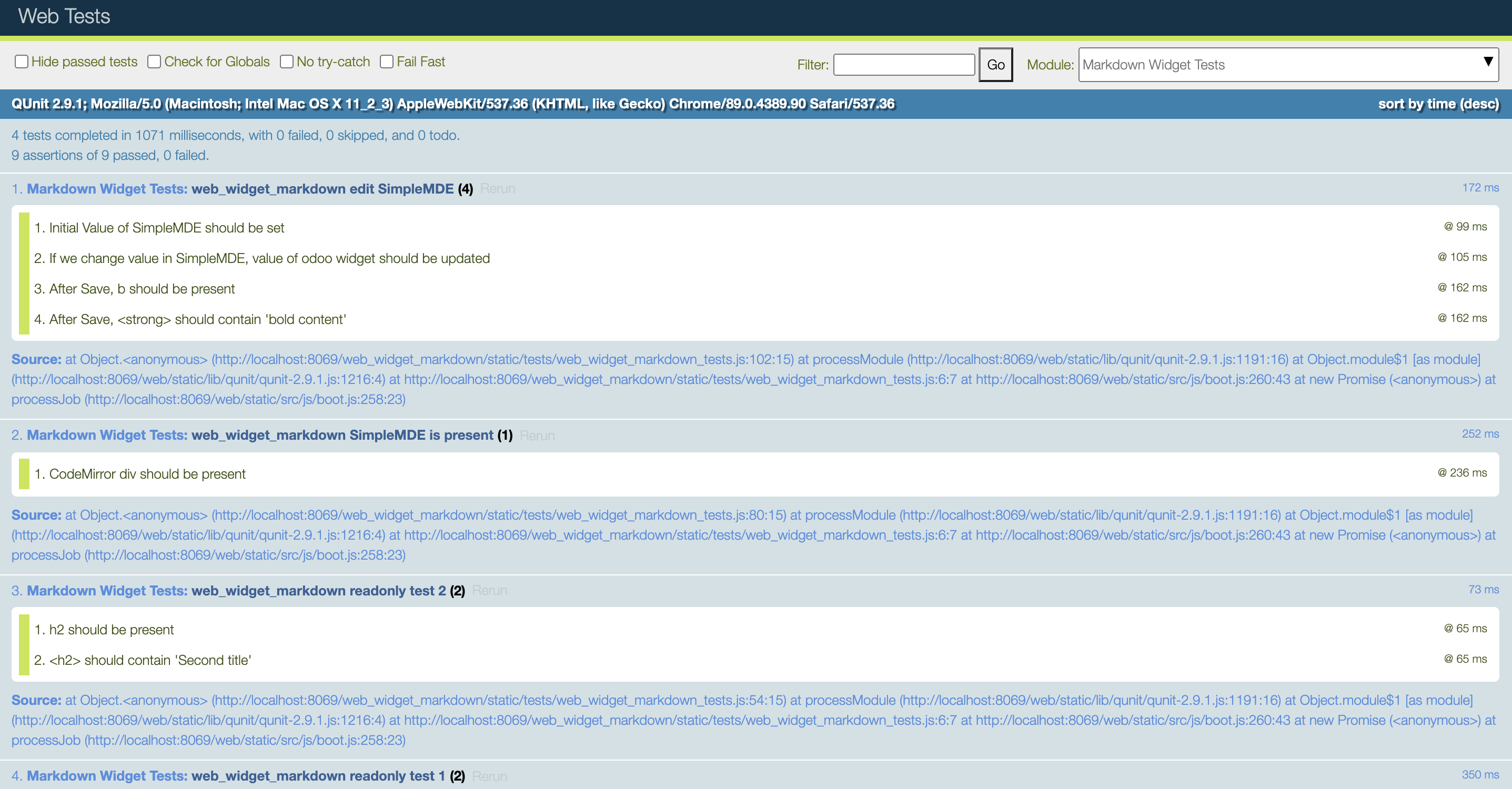
Everything seems OK ✅ and we can also edit our template to remove the data-auto_resize as it is no longer useful.
Handling KeyUp/Down events
We still have the problem of using the tab key inside the Editor.
Now that the inheritance chain is simplified we know that the logic handling the Key events is either inside DebouncedField or his parent AbstractField.
A quick look inside DebouncedField gives us nothing so the logic is inside AbstractField, the "super" class that is at the top of all field widgets in odoo/addons/web/static/src/js/fields/abstract_field.js
var AbstractField = Widget.extend({
events: {
'keydown': '_onKeydown',
},
//...
_onKeydown: function (ev) {
switch (ev.which) {
case $.ui.keyCode.TAB:
var event = this.trigger_up('navigation_move', {
direction: ev.shiftKey ? 'previous' : 'next',
});
if (event.is_stopped()) {
ev.preventDefault();
ev.stopPropagation();
}
break;
//...All fields have this events property that map an event bubbled up by the controller, here keydown, to a function _onKeydown.
And we see here that this where the logic about the TAB keyCode press happens. As a solution we will remove all the key events of our widget because the events are handled by SimpleMDE already, so we update our widget declaration like that:
var markdownField = basicFields.DebouncedField.extend({
supportedFieldTypes: ['text'],
template: 'FieldMarkdown',
jsLibs: [
'/web_widget_markdown/static/lib/simplemde.min.js',
],
events: {}, // events are triggered manually for this debounced widget
//...Run the tests again (after each refactoring) and test the UI to see that now we can press TAB Key again without leaving the Editor.
Directly bind CodeMirror changes to the debounceActions
We will also refactor that part to use the debounceAction function given by DebouncedField. We will also improve our widget to bind on the blur method (where the user clicks out of the markdown editor) so it saves the changes.
Change
this.simplemde.codemirror.on("change", function(){
self._setValue(self.simplemde.value());
})Replace with those lines
this.simplemde.codemirror.on("change", this._doDebouncedAction.bind(this));
this.simplemde.codemirror.on("blur", this._doAction.bind(this));Run the tests again, they should still be all green.
Making our widget translatable
Going away from FieldText inheritance made us lose the Translatable functionality, but it is okay, we didn't have any tests for that feature.
Writing the test suite for our translatable field
When a field has a translation feature, it has a little icon on the right with the code of the language.
Clicking on that button opens a Dialog with as many rows as languages installed on the environment, allowing the user to edit the source and translation value.
For these tests we will inspire us of the basic widget test suite, testing the CharField translatable feature. In our file web_widget_markdown/static/tests/web_widget_markdown_tests.js
QUnit.test('markdown widget field translatable', async function (assert) {
assert.expect(12);
this.data.blog.fields.content.translate = true;
var multiLang = _t.database.multi_lang;
_t.database.multi_lang = true;
var form = await testUtils.createView({
View: FormView,
model: 'blog',
data: this.data,
arch: '<form string="Blog">' +
'<group>' +
'<field name="name"/>' +
'<field name="content" widget="markdown"/>' +
'</group>' +
'</form>',
res_id: 1,
session: {
user_context: {lang: 'en_US'},
},
mockRPC: function (route, args) {
if (route === "/web/dataset/call_button" && args.method === 'translate_fields') {
assert.deepEqual(args.args, ["blog", 1, "content"], 'should call "call_button" route');
return Promise.resolve({
domain: [],
context: {search_default_name: 'blog,content'},
});
}
if (route === "/web/dataset/call_kw/res.lang/get_installed") {
return Promise.resolve([["en_US", "English"], ["fr_BE", "French (Belgium)"]]);
}
if (args.method === "search_read" && args.model == "ir.translation") {
return Promise.resolve([
{lang: 'en_US', src: '# Hello world', value: '# Hello world', id: 42},
{lang: 'fr_BE', src: '# Hello world', value: '# Bonjour le monde', id: 43}
]);
}
if (args.method === "write" && args.model == "ir.translation") {
assert.deepEqual(args.args[1], {value: "# Hellow mister Johns"},
"the new translation value should be written");
return Promise.resolve();
}
return this._super.apply(this, arguments);
},
});
await testUtils.form.clickEdit(form);
var $translateButton = form.$('div.o_field_markdown + .o_field_translate');
assert.strictEqual($translateButton.length, 1, "should have a translate button");
assert.strictEqual($translateButton.text(), 'EN', 'the button should have as test the current language');
await testUtils.dom.click($translateButton);
await testUtils.nextTick();
assert.containsOnce($(document), '.modal', 'a translate modal should be visible');
assert.containsN($('.modal .o_translation_dialog'), '.translation', 2,
'two rows should be visible');
var $dialogENSourceField = $('.modal .o_translation_dialog .translation:first() input');
assert.strictEqual($dialogENSourceField.val(), '# Hello world',
'English translation should be filled');
assert.strictEqual($('.modal .o_translation_dialog .translation:last() input').val(), '# Bonjour le monde',
'French translation should be filled');
await testUtils.fields.editInput($dialogENSourceField, "# Hellow mister Johns");
await testUtils.dom.click($('.modal button.btn-primary')); // save
await testUtils.nextTick();
var markdownField = _.find(form.renderer.allFieldWidgets)[1];
assert.strictEqual(markdownField._getValue(), "# Hellow mister Johns",
"the new translation was not transfered to modified record");
markdownField.simplemde.value('**This is new English content**');
await testUtils.nextTick();
// Need to wait nextTick for data to be in markdownField.value and passed
// to the next dialog open
await testUtils.dom.click($translateButton);
await testUtils.nextTick();
assert.strictEqual($('.modal .o_translation_dialog .translation:first() input').val(), '**This is new English content**',
'Modified value should be used instead of translation');
assert.strictEqual($('.modal .o_translation_dialog .translation:last() input').val(), '# Bonjour le monde',
'French translation should be filled');
form.destroy();
_t.database.multi_lang = multiLang;
});Explaining the test suite
This test suite begins by asserting that the translationButton is present. Then the test presses the button and checks that the Dialog opens and contains the right data.
The next step for the tests is to focus the input in that dialog and write something in the source (English), save it and verify that the changes are visible in our widget (SimpleMDE should have this new value).
Then we will change the value in our widget via SimpleMDE. Press the translate button again and inside the dialogue, the new source value should be what we just wrote in the widget. On the other hand, the value in French should have kept its value from the fake RPC Calls made.
Mocking RPC Calls
Each click to open the translate button actually makes multiple RPC calls to the server.
It queries the languages installed on the instance and then it queries for translations rows on that record for that field so we will have to mock the calls to the server.
We will mock the fetching of the translation languages, the fetching of the translation rows, and the writing of a new translation ( by returning an empty resolved Promise).
mockRPC: function (route, args) {
if (route === "/web/dataset/call_button" && args.method === 'translate_fields') {
assert.deepEqual(args.args, ["blog", 1, "content"], 'should call "call_button" route');
return Promise.resolve({
domain: [],
context: {search_default_name: 'blog,content'},
});
}
if (route === "/web/dataset/call_kw/res.lang/get_installed") {
return Promise.resolve([["en_US", "English"], ["fr_BE", "French (Belgium)"]]);
}
if (args.method === "search_read" && args.model == "ir.translation") {
return Promise.resolve([
{lang: 'en_US', src: '# Hello world', value: '# Hello world', id: 42},
{lang: 'fr_BE', src: '# Hello world', value: '# Bonjour le monde', id: 43}
]);
}
if (args.method === "write" && args.model == "ir.translation") {
assert.deepEqual(args.args[1], {value: "# Hellow mister Johns"},
"the new translation value should be written");
return Promise.resolve();
}
return this._super.apply(this, arguments);
},Adding the Translate button
The translation button and event handling logic is located inside a mixin class in odoo/addons/web/static/src/js/fields/basic_fields.js called TranslatableFieldMixin.
We will inherit that mixin to have access to the function to render buttons, so we change the declaration of our widget
var markdownField = basicFields.DebouncedField.extend(basicFields.TranslatableFieldMixin, {
//...
}Then, inside the start of our function, we will add the translate button in the edit mode condition
start: function () {
if (this.mode === 'edit') {
var $textarea = this.$el.find('textarea');
this.simplemde = new SimpleMDE({
element: $textarea[0],
initialValue: this.value,
});
var self = this;
this.simplemde.codemirror.on("change", function(){
self._setValue(self.simplemde.value());
})
if (this.field.translate) {
this.$el = this.$el.add(this._renderTranslateButton());
this.$el.addClass('o_field_translate');
}
}
return this._super();
},Running the tests
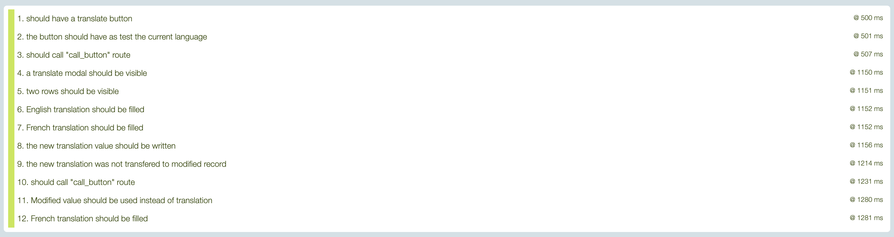
Every test passed ✅ ! It took us longer to write the tests than the functionality as it is oftentimes with TDD. But it gives us confidence in the future when we will have to refactor the code for any reason.
Passing attributes to our widget
Widgets often have an option attribute that you can pass directly inside the XML when you call the widget. These options are then accessible inside the widget itself via the nodeOptions property.
SimpleMDE has options that we can pass inside the configuration object, for example, there is a placeholder property that we can use if the SimpleMDE Editor is empty and show a text to invite the user to write something
var simplemde = new SimpleMDE({placeholder: "Begin typing here..."})We already use the configuration object in our start function to set the initialValue, we will do the same for other options.
In the end, we want to be able to use our widget like that:
<group>
<field name="content" widget="markdown" options="{'placeholder':'Write your content here'}"/>
</group>And see the placeholder text inside our instance of SimpleMDE
Writing the tests
The options will be available in our field simplemde instance with markdownField.simplemde.options object.
QUnit.test('web_widget_markdown passing property to SimpleMDE', async function(assert) {
assert.expect(1);
var form = await testUtils.createView({
View: FormView,
model: 'blog',
data: this.data,
arch: `<form string="Blog">
<group>
<field name="name"/>
<field name="content" widget="markdown" options="{'placeholder': 'Begin writing here...'}"/>
</group>
</form>`,
res_id: 1,
});
await testUtils.form.clickEdit(form);
var markdownField = _.find(form.renderer.allFieldWidgets)[1];
assert.strictEqual(
markdownField.simplemde.options.placeholder,
"Begin writing here...",
"SimpleMDE should have the correct placeholder"
);
await testUtils.form.clickSave(form);
form.destroy();
});Run the tests, they will fail obviously.
Handling the options
To handle the attributes passed in the XML declaration we have access to this.nodeOptions. With that in mind let's rewrite our instantiation inside the start function.
start: function () {
if (this.mode === 'edit') {
var $textarea = this.$el.find('textarea');
var simplemdeConfig = {
element: $textarea[0],
initialValue: this.value,
}
if (this.nodeOptions) {
simplemdeConfig.placeholder = this.nodeOptions.placeholder || '';
}
this.simplemde = new SimpleMDE(simplemdeConfig);
this.simplemde.codemirror.on("change", this._doDebouncedAction.bind(this));
this.simplemde.codemirror.on("blur", this._doAction.bind(this));
if (this.field.translate) {
this.$el = this.$el.add(this._renderTranslateButton());
this.$el.addClass('o_field_translate');
}
}
return this._super();
},Run the tests and you should see all green ✅
Refactoring the options assignment
We have 2 options:
- Inside the nodeOptions getting each option possible (that we want available) and passing them as config
- Letting the user pass any config options that he can find on SimpleMDE documentation.
We will try to do the latter by refactoring the way we map nodeOptions to config options via the Javascript ...spread operator to combine 2 objects.
if (this.nodeOptions) {
simplemdeConfig = {...simplemdeConfig, ...this.nodeOptions};
}If we run the tests again they are still green ✅ and now our user can pass any (for complex objects it will be complicated in the XML declaration) option he wants.
Conclusion
The source code for this Part 3 of the series is available here on GitHub.
In this long-running series, we tried to implement TDD in Odoo JavaScript development through the example of creating a new Field widget.
I hope you found it useful, we will use our widget later in another series where we create a totally new kind of view with Owl and use our widget inside. Become a member to have access to future posts so you don't miss any future articles.
If Odoo JavaScript interests you, check out this recent article about OWL
Coding Dodo]]>Introduction
This is the second part of an article series where we use TDD to develop an Odoo markdown widget.
Coding Dodo
In the last part (code available here) we ended up with a functional widget transforming pure text markdown content into HTML in render mode and behaving like a standard FieldText when in edit mode.
In this tutorial, we are going to use SimpleMDE Editor instead of the standard FieldText <textarea> input.
Refactoring and adding new tests
First of all, we are going to remove the test named web_widget_markdown edit form. As a reminder, this test was used to Edit the form and write into the input like that:
await testUtils.form.clickEdit(form);
await testUtils.fields.editInput(form.$('.o_field_markdown'), '**bold content**');
await testUtils.form.clickSave(form);The problem is that the editInput function will not work anymore because SimpleMDE will replace the whole <textarea> with his own editor and writing inside will not be possible.
How to test SimpleMDE presence
To test for SimpleMDE presence we have to analyze how this library insert its editor into the DOM, and a quick inspect gives us more info:
<div class="CodeMirror cm-s-paper CodeMirror-wrap">
<div style="overflow: hidden; position: relative; width: 3px; height: 0px; top: 15px; left: 38.8281px;" data-children-count="1">
<textarea autocorrect="off" autocapitalize="off" spellcheck="false" tabindex="0" style="position: absolute; padding: 0px; width: 1000px; height: 1em; outline: none;">
</textarea>
</div>
<div class="CodeMirror-vscrollbar" cm-not-content="true" style="bottom: 0px; width: 12px; pointer-events: none;">
...
</div>
</div>As we can see, SimpleMDE uses the underlying library CodeMirror to create his editor. So checking for the presence of the div with class .CodeMirror should validate the presence of the Editor. Let's write a new test.
QUnit.test('web_widget_markdown SimpleMDE is present', async function(assert) {
assert.expect(1);
var form = await testUtils.createView({
View: FormView,
model: 'blog',
data: this.data,
arch: '<form string="Blog">' +
'<group>' +
'<field name="name"/>' +
'<field name="content" widget="markdown"/>' +
'</group>' +
'</form>',
res_id: 1,
});
await testUtils.form.clickEdit(form);
assert.strictEqual(
form.$('.o_field_markdown').find("div.CodeMirror").length,
1,
"CodeMirror div should be present"
)
form.destroy();
});How to test that SimpleMDE is working
To test that simple MDE is working we should:
- First, go into Edit mode so SimpleMDE is initialized (previous test)
- Check that the initial value of our model (data) is passed to SimpleMDE
- Change the value of SimpleMDE content (mock behavior of user writing inside the WYSIWYG) and verify that Odoo widget value has been updated
- Save the Form and assert that our edits are saved and present
Writing the tests
To go through our test we will need to have access to the widget itself from the mocked FormView. Form object have a renderer attribute that will be helpful in that situation by inspecting it's allFieldWidgets property:
// [1] because in our form the first field is for the name of the blog
// So the first field is in [0] and ours is in [1]
var markdownField = _.find(form.renderer.allFieldWidgets)[1];Inside the test, we want to be able to have access to the SimpleMDE instance directly from the widget.
Often times, we write tests that drive us to implement the solution in a specific way. In this example we know that we want the Widget Object to hold a property object named simplemde containing the current instance of new SimpleMDE Editor. This will help us to initialize it, destroy it, set, or get its value. This is a powerful way of programming because the test help us make more robust APIs by directly needing us to implement the strict necessary functions for it to be functional.
So given the idea, we have that property available the test can be written like that
QUnit.test('web_widget_markdown edit SimpleMDE', async function(assert) {
assert.expect(4);
var form = await testUtils.createView({
View: FormView,
model: 'blog',
data: this.data,
arch: '<form string="Blog">' +
'<group>' +
'<field name="name"/>' +
'<field name="content" widget="markdown"/>' +
'</group>' +
'</form>',
res_id: 1,
});
await testUtils.form.clickEdit(form);
var markdownField = _.find(form.renderer.allFieldWidgets)[1];
assert.strictEqual(
markdownField.simplemde.value(),
"# Hello world",
"Initial Value of SimpleMDE should be set"
)
markdownField.simplemde.value('**bold content**');
assert.strictEqual(
markdownField._getValue(),
"**bold content**",
"If we change value in SimpleMDE, value of odoo widget should be updated"
)
await testUtils.form.clickSave(form);
assert.strictEqual(
form.$('.o_field_markdown').find("strong").length,
1,
"After Save, b should be present"
)
assert.strictEqual(
form.$('.o_field_markdown strong').text(),
"bold content",
"After Save, <strong> should contain 'bold content'"
)
form.destroy();
});We cannot properly interact with the CodeMirror editor with JQuery testUtils so we will refer to the CodeMirror user manual to see how to insert a value (this is also what happens when user type) and this is how we will do it from the test function:
markdownField.simplemde.codemirror.setValue('**bold content**');And to test that the Odoo field itself has the same value as the Markdown editor we make this assertion.
assert.strictEqual(
markdownField._getValue(),
"**bold content**",
"Value of odoo widget should be updated"
)General knowledge: Understanding _getValue() in Odoo Widget
_getValue() is a function first defined in the DebouncedField (FieldText inherits DebouncedField).
// Inside DebouncedField in odoo/addons/web/static/src/js/fields/basic_fields.js
/**
* Should return the current value of the field, in the DOM (for example,
* the content of the input)
*
* @abstract
* @private
* @returns {*}
*/
_getValue: function () {},A DebouncedField is a superclass that handles the debouncing of the user input.
Debouncing an input in JavaScript is a common technique to reduce the rate of execution of a function. If a user is typing inside an input and you execute a function on each change of that input (each letter typed) it can quickly lead to a lot of computation power being used on just that. The common technique is called debounced and it will delay the execution of the function listening to the input, only every X secondes. Odoo use _.debounce for this with the underscorejs library.This is a summarized view of the Odoo Fields Widget inheritance graph
// the super class
var AbstractField = {}
// handle debouncing
var DebouncedField = AbstractField.extend({})
// handle keystroke evnts, state and other things
var InputField = DebouncedField.extend({})
// more specific implementations using InputField logic
var FieldText = InputField.extend({})
var FieldChar = InputField.extend({})
var FieldDate = InputField.extend({})
var FieldDate = InputField.extend({})Most of all the field inheriting InputField are overriding this _getValue() function to return more than the basic this.value property of a widget and we will do the same.
Running the tests in the current state of our widget expectedly fail.
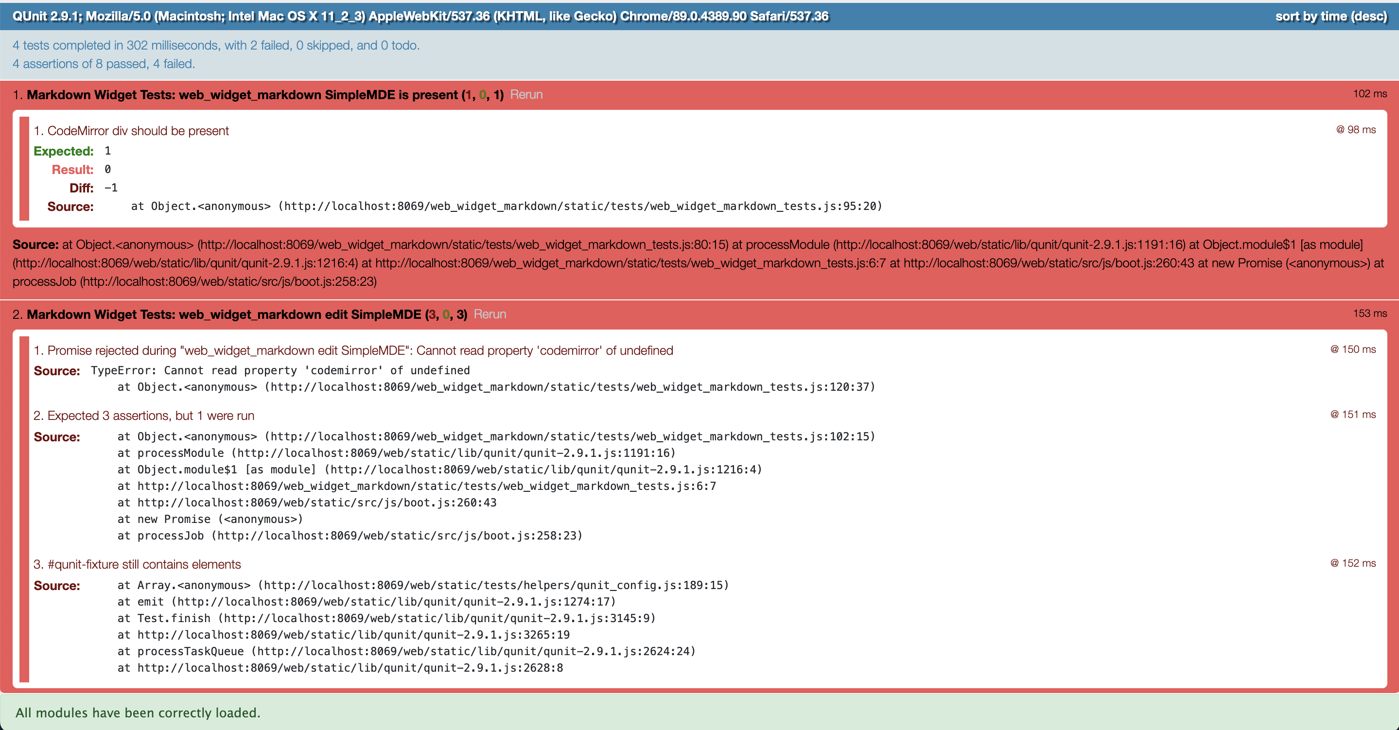
Initialize SimpleMDE editor in widget Edit mode
As we wrote our tests earlier, we know that we need to have simplemde as a property of our widget, let's then extend the init function of our widgetto do so:
/**
* @constructor
*/
init: function () {
this._super.apply(this, arguments);
this.simplemde = {}
},Attaching SimpleMDE to our Widget dom root element.
And in the start function (available in all Odoo Widgets) we will do this:
/**
* When the the widget render, check view mode, if edit we
* instanciate our SimpleMDE
*
* @override
*/
start: function () {
if (this.mode === 'edit') {
this.simplemde = new SimpleMDE({element: this.$el[0]});
}
return this._super();
},When we instantiate SimpleMDE we need to at least give him the element option or else it will attach itself to any <textarea> existing (this the the default behavior of the library).
What is this.$el[0] ?
this.$el is a JQuery object and not a pure dom Element as required by SimpleMDE, so by doing this.$el[0] we get the proper dom element.
Keep in mind that we inherit FieldText, and FieldText has some original logic about the HTML element it uses to render itself. In read-only mode, it is a <span> and in edit mode the tag change, as seen here in the source code of the FieldText :
/**
* @constructor
*/
init: function () {
this._super.apply(this, arguments);
if (this.mode === 'edit') {
this.tagName = 'textarea';
}
}Running the tests and analyzing the error
Now if we run the tests we will see this error
- Cannot read property 'insertBefore' of null@ 121 ms
| Source: | TypeError: Cannot read property 'insertBefore' of null
at http://localhost:8069/web_widget_markdown/static/lib/simplemde.min.js:12:1240
at new t (http://localhost:8069/web_widget_markdown/static/lib/simplemde.min.js:7:31640)
at new e (http://localhost:8069/web_widget_markdown/static/lib/simplemde.min.js:7:29476)
at e (http://localhost:8069/web_widget_markdown/static/lib/simplemde.min.js:7:29276)
at Function.e.fromTextArea (http://localhost:8069/web_widget_markdown/static/lib/simplemde.min.js:12:1213)
at B.render (http://localhost:8069/web_widget_markdown/static/lib/simplemde.min.js:15:4157)
at new B (http://localhost:8069/web_widget_markdown/static/lib/simplemde.min.js:14:28861)
at Class.start (http://localhost:8069/web_widget_markdown/static/src/js/field_widget.js:34:30)
at Class.prototype.<computed> [as start] (http://localhost:8069/web/static/src/js/core/class.js:90:38)
at http://localhost:8069/web/static/src/js/core/widget.js:440:25 |
|---|
The error actually comes from the simplemde library trying to insert itself into the DOM. We gave him $el[0] as an element. And as seen in the source code, the actual element given is a <textarea>, this is due to us inheriting FieldText.
But the problem actually comes from the surrounding of the <textarea> element. SimpleMDE will actually use parentNode on the element given to place itself. The element given as $el[0] as is has no parent due to the way the Odoo Framework inserts it in the DOM.
So the base template of our field cannot be as simple as a span, it has to be encapsulated by another div or something else.
Moving to a dedicated Qweb Template for our widget
To create a Template for a widget we need to create an XML file containing our template then explicitly use it in our javascript widget declaration.
The Qweb template
Create the file static/src/xml/qweb_template.xml with this content.
<?xml version="1.0" encoding="UTF-8"?>
<templates>
<t t-name="FieldMarkdown">
<div class="o_field_markdown">
<textarea name="o_field_markdown" id="o_field_markdown"></textarea>
</div>
</t>
</templates>
We gave our template the same name t-name="FieldMarkdown as the name we export in our JavaScript file for consistency.
Inside it is just a wrapper div class with the same class .o_field_markdown we used before and inside it a <textare> for SimpleMDE to attach to.
Add it to your __manifest__.py
"qweb": [
'static/src/xml/qweb_template.xml',
],Using the template in our JavaScript field widget
var markdownField = basicFields.FieldText.extend({
supportedFieldTypes: ['text'],
// className: 'o_field_markdown',
template: 'FieldMarkdown', // name of template in xml Qweb file
jsLibs: [
'/web_widget_markdown/static/lib/simplemde.min.js',
],
// ...We removed the className attribute because it is no longer useful.
Run the tests again and surely it fails again because we still tell SimpleMDE to attach itself to the root $el of our widget.
Refactoring our widget to use the new template
Inside the start function of the widget, we will target the <textarea> inside the <div> we created in the template.
start: function () {
if (this.mode === 'edit') {
var $textarea = this.$el.find('textarea');
this.simplemde = new SimpleMDE({element: $textarea[0]});
}
return this._super();
},Now if we run the tests again:
- Markdown Widget Tests: web_widget_markdown SimpleMDE is present (1) ✅
- Markdown Widget Tests: web_widget_markdown edit SimpleMDE (3, 0, 3) ❌
It means our SimpleMDE is well initialized but there is no communication of value between the widget and SimpleMDE editor.
Communication between SimpleMDE and the widget
Initialize SimpleMDE with data value
The first test we will try to pass is Initial Value of SimpleMDE should be set. To do so, we will refer to the SimpleMDE documentation on setting and getting value.
We see that there is a simple method set("value") but also an initialValue that can be passed at instantiation. We will choose the second solution and make these changes to the start function of our widget:
start: function () {
if (this.mode === 'edit') {
var $textarea = this.$el.find('textarea');
this.simplemde = new SimpleMDE({
element: $textarea[0],
initialValue: this.value, // this.value represents widget data
});
}
return this._super();
},Now we run the tests again and surely see that our first test passed ✅
In the first part, we handled the _renderReadonly function, now that we work on edit mode we will override the function _renderEdit to set the value into SimpleMDE, add these methods to the widget
_formatValue: function (value) {
return this._super.apply(this, arguments) || '';
},
_renderEdit: function () {
this._super.apply(this, arguments);
var newValue = this._formatValue(this.value);
if (this.simplemde.value() !== newValue) {
this.simplemde.value(newValue);
}
},SimpleMDE can't handle false or null value so the function _formatValue is there to help us return an empty string when there is nothing in the field.
_renderEdit and _renderReadonly are called by the main _render function that is defined in odoo/addons/web/static/src/js/fields/abstract_field.js. This main render function handles the conditional logic of the widget being in Edit or Readonly mode and call the correct function:
_render: function () {
if (this.attrs.decorations) {
this._applyDecorations();
}
if (this.mode === 'edit') {
return this._renderEdit();
} else if (this.mode === 'readonly') {
return this._renderReadonly();
}
},
Again we run the tests and everything is still green ✅ so we can go to the next step.
Listening to change in SimpleMDE to update our widget value.
In our previous test, we wrote that markdownField._getValue() should be equal to what we write inside the SimpleMDE editor.
Naturally we will add that _getValue() function and make it return the inner value of SimpleMDE.
/**
* return the SimpleMDE value
*
* @private
*/
_getValue: function () {
return this.simplemde.value();
},Since we have access to the property simplemde that we initialize in our widget it is very easy to get the data.
Then, to listen to changes, we have to get the CodeMirror instance of our SimpleMDE and listen to its change events that CodeMirror is triggering.
start: function () {
if (this.mode === 'edit') {
var $textarea = this.$el.find('textarea');
this.simplemde = new SimpleMDE({
element: $textarea[0],
initialValue: this.value,
});
var self = this;
this.simplemde.codemirror.on("change", function(){
self._setValue(self.simplemde.value());
})
}
return this._super();
},We had to declare var self = this to be able to use it in the callback function.
With that change made let's run the tests again
- The initial Value of SimpleMDE should be set@ 75 ms ✅
- If we change the value in SimpleMDE, the value of the odoo widget should be updated@ 81 ms ✅
- After Save, b should be present@ 380 ms ✅
- After Save, <strong> should contain 'bold content' ✅
Victory !
Now that our tests passed we can try the module from the user perspective
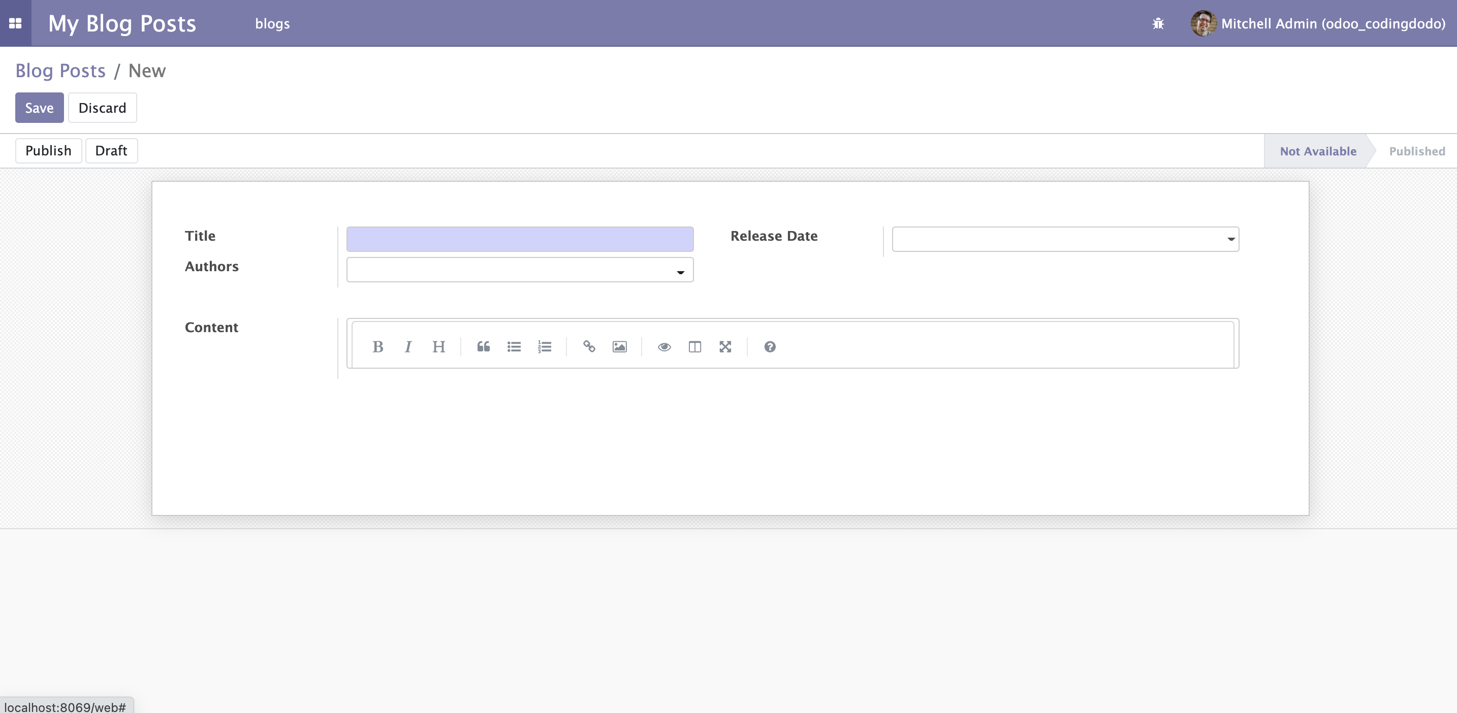
Unfortunately, we can see that there is some problem with the aspect of our Markdown Editor.
It seems that the height is fixed so there is not enough space for it. This is coming from the fact that we are extending the FieldText widget and it has built-in auto-resize features.
In the next part, we will see how to deal with that as we improve our widget.
The source code for this tutorial is available here on GitHub.
]]>